Studio Visit: Monique Woodward, architect
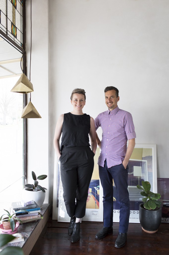
 It’s not often on just hearing a name that you get such a strong sense of the dynamism behind a creative duo, but this is just the case with WOWOWA (implied!) whose co-founders Monique and Scott Woodward forge a next-generation approach to architectural practice with a kind of positive charge often missing in professional creative circles.
In WOWOWA Architecture & Interiors, the pair have created the kind of practice they always wanted to work in, one that prioritises artistic expression, teaching and advocacy as essential to ongoing creativity. Alongside partner Scott, Monique is a vocal advocate for improved living standards and accessibility of quality design as a tenet of modern Australian culture.
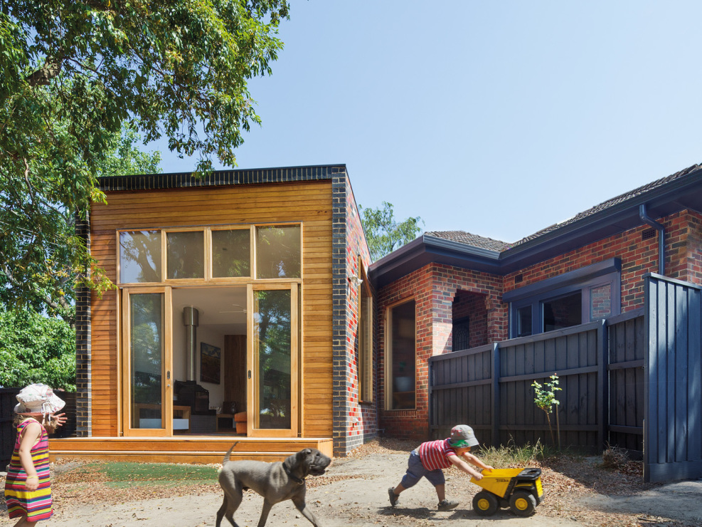
From their glittering Tin & Ed business cards to the bold glazed red brick façade of the Finn House, WOWOWA is unafraid of a playful nod to the kitch, and their declaration of a radical postmodernist style is one beautifully tailored to bring a fresh optimism to the architecture of the everyday – the humble family home. We spoke to Monique at WOWOWA’s shopfront studio in Melbourne’s leafy Carlton North about her passion for celebrating Australian culture and why more creatives should embrace the power of marketing.
As an emerging practice, WOWOWA has a strong brand and clear creative directive – what inspired that focus and how has it shaped the way you practice?
One of the biggest challenges we faced initially as a fledgling but ambitious creative practice was acknowledging that even if you were the greatest architect in the world, you need to be able to run a sustainable business to keep up that practice, and to successfully market yourself is a big part of that business’ success.
I undertook a marketing course at the local TAFE and we engaged a business coach, really immersed ourselves in marketing, read a lot of business and marketing literature alongside our favourite design journals.
We quickly realised that what we were saying to the world though our marketing - that we could do anything – was out of touch with the reality of our work at the moment. Whilst we do have a few small civic projects on the go and really enjoy the possibilities of larger scale projects, our current built reality is residential. Luckily, we love residential work, and it’s a big part of who we are as a practice, so it was important to acknowledge those roots and really emphasise its part in our core identity.
From this we developed a strategy that allowed us to focus in on the kind of clients we love working with – those who want to create their ‘forever home’. They’re committed to a place, and are prepared to do some soul searching, and explore what it is that they really want from a home environment.
Putting ourselves out there as a practice for professional families, with the tagline 'life is too short for boring spaces', we’ve found that people that subscribe to that will instantly recognise a kinship, and might know a little more of what to expect from us in the process. We can then work together and really bounce off each other in a super collaborative way. This makes the process a whole lot more enjoyable for both parties.
Image by John Gollings
How has this focus on creating a client’s ‘forever home’ influenced your work?
It gives us license to work with our clients in really rewarding creative depth, to find out what they think about colour, sculpture or pattern, and taking that through to find out how flexible and functional spatial solutions can work for them. I think that's one of our strengths, making small spaces work hard, and that's one of the reasons we love renovations, the challenge of really cranking up an existing space and making it truly multi-purpose.
Focusing on the small scale also allows us to really immerse ourselves in the application of the theory and art of creative practice. One thing is I’m a massive sucker for ornament. Ornament, in its three dimensions, really changes the way you perceive a space, and I think that's when a space really starts to get interesting.
What is your motivates you creatively?
My all-time favourite design inspiration has to be the humble Hills Hoist – there is so much ingenuity and kitsch beauty in perhaps undervalued elements of Australian design history that are ripe to be to explored creatively.
We see ourselves as a radically postmodern practice, propelling ideas forward to a new audience. Current trends suggest people are trying to revert back to modernism, and I find that quite unnatural, to be attempting to wind the clock back, and instead of creating spaces for living now, there is this tendency for blank spaces and miscellaneous design solutions; a blank floating shelf, a picture window to a non-descript view.
Society is always moving forward, and new technologies challenge the idea of the modernist home. We pride ourselves on not getting caught up on finicky modernist details but still having a very deep focus on embedding meaning in the quality of the interiors we create. We don’t necessarily prescribe what kind of curtains you should have, but we demand a high level of client engagement, that is often so rich that at the end of this day you can guide each other to the best solution for that space.
The nature of the construction industry means design and building programs can often stretch out over several years - how do keep up the creative energy between both clients and yourselves throughout that process?
From the very outset, we ask that our clients engage heavily in the design process, usually starting with inspiration scrapbooks, a simple cut and paste! Often in a 50c book or using sites like Pinterest, we get them to collect things from all kinds of sources, not just completed projects in design magazines. We want them to let us in on who they are, and the more information they can give, the greater depth of engagement we can have and the better the project outcome will be.
From a practice point of view - Mel (Bright) spoke at a recent AIA women's day breakfast about how there’s only really been three cycles of work in her ten years of practice, which is I think is an experience shared by many architects. It feels like we're about to hit our second cycle, which makes it exciting to see the development in our work and be proud of what we've achieved so far.
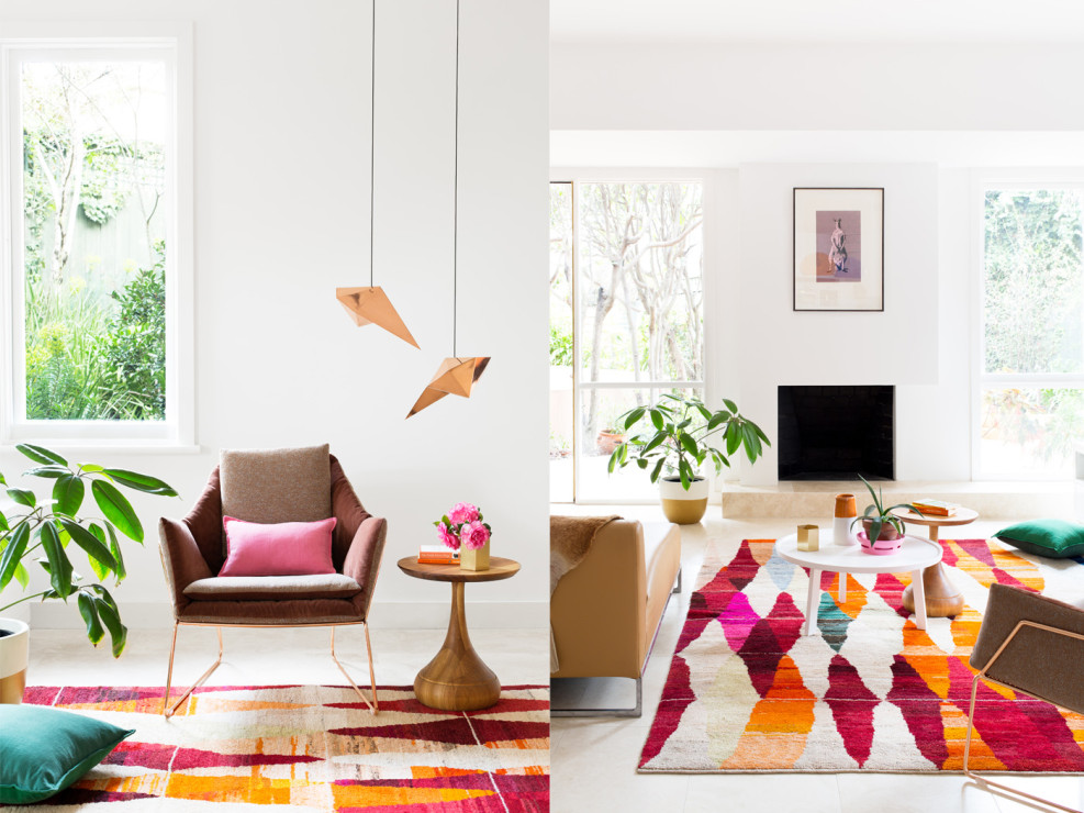
Image of Kooyong apartment by Martina Gemmola
How have you tailored your practice to allow ongoing teaching and community advocacy commitments alongside your design projects?
From the outset we wanted to create the studio that we had always wanted to work in, and one that would allow us to grow into as a practice. A lot of questions arose of what was important to us as a practice; it's collaborative, its deep in discussions, surrounded by plants, and embedded in the local community. We work fairly solidly from 9.30-5.30pm, respecting the workday, but recognise that we while could work till 10pm, it comes back to practicing what you preach - you can’t advocate to increase the standard of living and then work yourself to the bone in the process.
It means we’re able to maintain a lot of energy in the studio throughout the day, which is slightly more optimistic than spending half an hour on The Age website at midday then having to work late into the night. I’m reading managerial books and trying to look beyond being just technically good at what we do, because that doesn’t mean we're necessarily good managers or business owners, but we can be, so it's a skill that needs to be learned side by side with design.
We also implement 'cultural Sunday' which is to make sure we do something that a) recognises it's important to make time to experience new things to keep that fire of creative inspiration burning and b) can be instagrammed, so yes, we’re always looking for the marketing tool!
Keely Malady is a graduate architect living in Melbourne. Keely’s blog, Small Talk & Co. aims to hold a space open for a new conversation on the wonders of work, and all the small things that make up a life well lived. Follow her on Twitter, Facebook and Instagram
Five creative workspaces
Following my previous post, how to design your own creative workspace, I set myself the task of answering a few questions about creative women's workspaces: What is the ideal workspace? Are there any similarities between the workspaces of creatives in different industries? How do others personalise their work space?
Through The Circle Database, I found five CWC Members from varying industries and asked them to share some details of their own workspaces. Here's what I discovered...
The Photographer
Elizabeth Bull owns and manages One Fine Print, an business that collaborates with talented photographers to bring unique, bold and distinct photographic prints into the home.
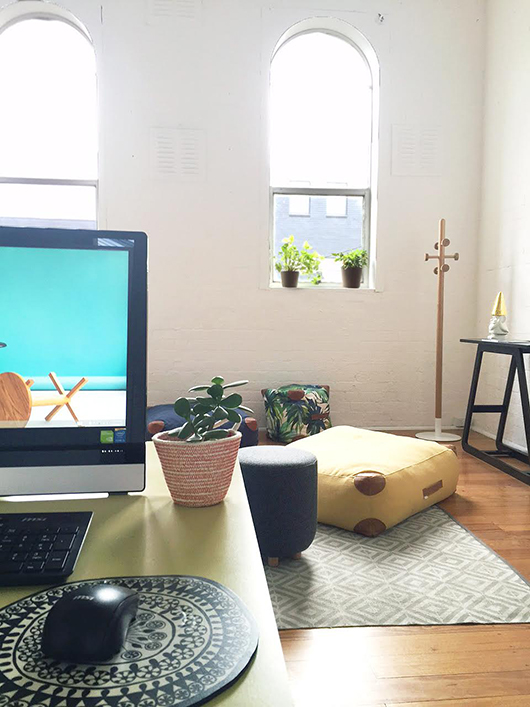
Describe your workspace (or spaces) in five words. Industrial - Creative - Light - Productive - Fun
Do you have more than one workspace? Occasionally, just for a change of scenery I'll work from home or if I'm finding I'm getting stuck on something, I'll wander to my local cafe with a note pad and work from there for a while. I usually find the change of scenery and the walk helps get the creativity flowing again.
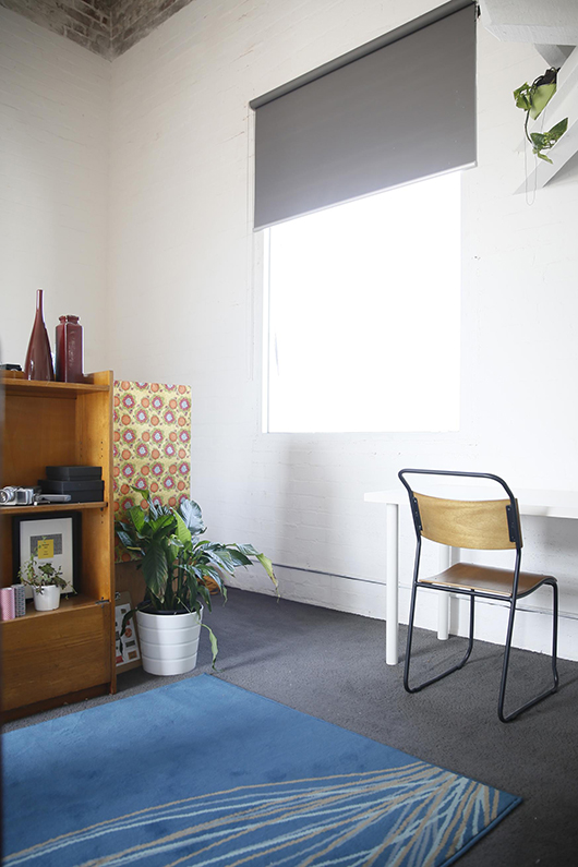
How have you personalised your own workspace? Many big beautiful bold photographic prints, timber desks, old cameras, greenery and a hammock!
Do you share your space with anyone else? A partner, pet? We are attached to a communal warehouse which houses many photographers and designers. We love being part of a community of creatives.
What are your essential ingredients for a productive but engaging workspace? I've worked from quite a few spaces, and I've learnt that the most important thing for me to look for in a space is natural light and big windows. That combined with great people makes for a place I want to work from every day.
The Florist
Meghan Fletcher, floral designer for weddings and events and director of her own business, Good, Grace and Humour.
Describe your workspace (or spaces) in five words. Homely - transient - innovative - tuneful - fragrant.
Do you have more than one workspace? The majority of my work is completed from home. But, if it counts, I would consider my second workspace or 'workspaces' to be the venues I install into for each event. I take along my tool kit and set up and pack down in some fantastic spaces.
How have you personalised your own workspace? For now, my workspace at home is transient so it's difficult to create a permanent workplace personality. My home needs to be functional for my family at the end of each day, so arrangements and tools need to be stored so they're not eaten by my toddler! If I were to separate my workspace from my home, as is the plan in the near future, I suspect the personalities would be similar - I'm a sucker for colour, abstract art and clean lines.
Do you share your space with anyone else? A partner, pet? Home and work can often be a colourful and collaborative coexistence. I share my space with my husband, our son and our cat. Part of the house is dedicated to storing GG&H items. One room used to be big enough for me to work in and store items, but as GG&H expands, I've had to become more innovative with storage and workspace solutions. Not that my husband or son seem to mind eating their brekky while I bring flowers into the kitchen!
What are your essential ingredients for a productive but engaging workspace? In my case, being able to balance work and home life with storage solutions, comfortable and waterproof (!) workspaces, and efficient and sustainable set-up and pack-down practices, along with a nice place to sit with the laptop and a cuppa. I'm hoping to have a permanent studio space for next season where I can incorporate all of these really practical elements, along with the little personal touches that permanence encourages.
The Furniture Maker
Anne-Claire Petre is a furniture designer and owner of her own business, Anaca Studio, which offers a range of furniture and accessories with a focus on using responsibly sourced timber and other sustainable material and finishes.
Describe your workspace (or spaces) in five words. Light-filled - uncluttered - inspiring - green - zen.
Do you have more than one workspace? I have one studio where I work from when I'm not doing pick-ups or visiting clients. However within this, I have two "workspaces", my main desk where I do most computer work and drawing / sketching and another desk for anything requiring assemblies / cutting / finishing or sewing / "crafting" at times…
How have you personalised your own workspace? I have only recently move into my Collingwood studio, so unfortunately I haven't yet done much in the way of personal decorative arrangement… Except for my little golden hatted gnome from Hunting for George which makes me smile… Walls are in great need of some artwork!! But to make up for that I have brought in quite a few plants and adding to the collection fairly frequently! Never enough green!
Do you share your space with anyone else? A partner, pet? No, it's just me and the gnome! Until recently, I was working from home so my two gorgeous cats were my companions, although quite distracting at times! The studio is part of a complex of other artists and designers so I always bump into other fellow creatives at some point in the day, which is nice. It gets a bit boring being in your own head for too long!
What are your essential ingredients for a productive but engaging workspace? For me, cluttered space = cluttered mind. So I try to keep the space as tidy as possible. Every night before I leave, I do a bit of a tidy up, feels so much better when you get in in the morning. I also turn on the music and plug in my essential oil diffuser. Plenty of natural light is key. That's what got me when I first visited the studio - massive windows and height ceiling… It felt really inspiring. Quirky objects are also essential to light up the mood!
The Lawyer
Yasmin Naghavi is a solicitor at Media Art Lawyers, a boutique entertainment and media law firm.
Describe your workspace (or spaces) in five words. Not - a - corporate - law - firm.
Do you have more than one workspace? I mostly work at my desk but also use the boardroom and meeting areas downstairs when I’m meeting clients. I sometimes meet clients in their workplace, but the majority of my work can be conducted by phone and email. I also get the opportunity to work from our Sydney and Auckland offices from time to time which is always a refreshing change.
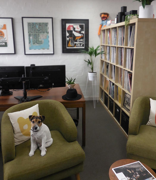
How have you personalised your own workspace? Mostly by bringing in plants, records, posters, books and a couple of comfy armchairs – I wanted the space to feel like my living room. Our space was initially just one room, but we added a bookshelf to store our vinyl records as well as act as a bit of a room divider. If I had my way we’d change the lighting, because fluorescents are just plain sad. Luckily we have a huge window above the stairwell which means we get heaps of natural light and a view of the treetops in front of our building.
Do you share your space with anyone else? A partner, pet? Well, there are up to 12 people in the building on most days but the type of work we do is very autonomous so we spend most of the day at our respective desks. I work on the second floor with one of the partners of the firm (who also doubles as my husband) and our dog, Wilco (pictured). Wilco prefers to conduct his business outdoors.
What are your essential ingredients for a productive but engaging workspace? Communication is always key to an effective workspace, but so is working with people you respect and colleagues who have a quick wit (you need a sense of humour in this line of work).
The Writer
Madeleine Dore is an arts writer and editor at ArtsHub by day, and in her free time, runs an online project called Extraordinary Routines, where she interviews creative people about their daily lives - from what time they wake up in the morning, to their views on life and creativity.
Describe your workspace (or spaces) in five words. Filled - with - to-do - lists.
Do you have more than one workspace? For my day job I work in a city based office, but have set up a desk in my share house to work on Extraordinary Routines. I also have a fondness for sitting in cafes – one of my favourite places to work is John Gorilla in West Brunswick. They have this adorable little nook by the window, which is perfect for just one person. Also Moat (below the Wheeler Centre) and £1000 Pound Bend are great places in the city.
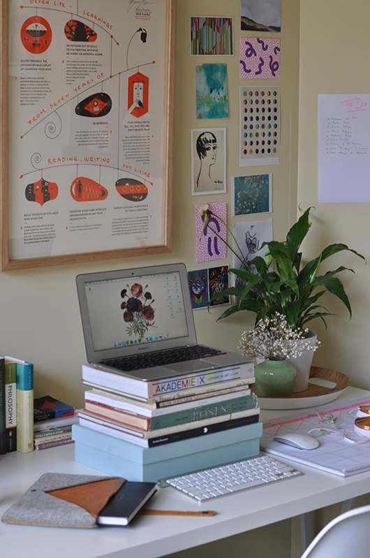
How have you personalised your own workspace? I recently got around to framing a watercolour by illustrator Monica Ramos and a beautiful embossed poster created by Maria Popova of Brainpickings - my favourite website. It’s nice to have something beautiful to stare at in those moments of absent-mindedness and distraction! I also like to collect cards from exhibitions and have them dotted on the wall. I’m not very good with plants, but have managed to keep a Sweet Chico alive for a month now, and so it has been nice to have some greenery on my desk. I also have a giant desk planner from Kikki K and I’m addicted to writing to do lists and pinning them around my desk.
Do you share your space with anyone else? A partner, pet? My desk is set up right beside my roommate’s identical IKEA trestle desk, so we often sit side by side in the evening working on our projects. It’s very cosy, and nice to have company when you’re working into the night!
What are your essential ingredients for a productive but engaging workspace? Even though my mind works best when I’m working on something individually, it really helps to have other people around me – if I can see them working, it motivates me to get cracking on something instead of just scanning Facebook! In the absence of people, there’s always Spotify. I really like having my planners, diaries, and lists nearby so I know what tasks I have ahead. Similarly, I don’t like clutter, and often need to neaten my desk before getting onto the task of writing. As I writer, I also think it is really important to make sure your screen is at eye level to avoid hunching – I stack my laptop on books and use a remote keyboard. Natural light never goes astray, too!
Interior Designer, Diana Scully owns and operates her own interior design firm, Spaces by Diana that’s all about designing beautiful, personalised homes to reflect the people who live in it. Diana also has her own lifestyle blog, Spaces + Places, where she regularly writes about inspiring spaces to see and visit from around the world and shares her recent travel adventures. This year she has plans to spend time abroad in the US. Follow Diana on Facebook,

