Title page designer: Carla Hackett
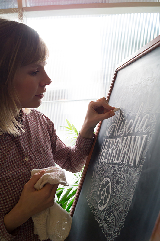
We talked to Carla Hackett a little while ago about her graphic design background and blossoming lettering and illustrative career. Today, we're happy to welcome Carla back to the blog, chatting about putting chalk to board for her title page design for Alischa Herrmann in Conversations with Creative Women: Volume Two. 
What is your art/design/career background? I grew up in Wagga Wagga NSW, a regional town that as it turns out has a thriving creative community! I went to a very creatively nurturing school and was heavily involved in performing and the arts. (Fun fact: I moonlighted as Crystal Chandelier in a 60’s girl band called The Fabulous Chandeliers for 7 years!). As a kid I would draw everything and had one of those Letraset typeface books and I would draw letters all over my notebooks and do bubble writing for my friends assignments.
I studied Graphic Design at university and then moved to Sydney and worked at some great design agencies for 6 years as an Art Director and Designer. But after a while, I felt a little creatively unfulfilled, so in 2011 I quit my job and moved to Berlin. It was a great time to hit the reset button and to soak up the inspiration of Europe! I like to call them my ‘Bowie years’.
To give myself that time to think really changed everything and it allowed me to start playing again! That’s when I discovered lettering. I went along to a hand lettering workshop with Ken Barber from House Industries and really enjoyed the simplicity of picking up a pencil again.
It was the perfect mix of my design skills, typography and using my hands to illustrate letters. I love that each piece of lettering is unique. It was then a natural progression to start lettering in chalk. I love the ephemeral nature of chalk but also how tactile each piece is. You can see the human hand has been involved.
I returned to Melbourne and found the lovely Little Gold Studios to set up shop and focus on hand lettering.
What drew you to the work of your interviewee? I have a deep appreciation for letterpress, and recently had the chance to print one of my own designs on a press that belongs to Saint Gertrude Lettering in Little Gold Studios. The labour of love that goes into printing is all worth it when you see the first impression come off the press. There’s something about the feel of the cotton paper and the impression is really quite special. Being someone who painstakingly hand crafts lettering, I was drawn to illustrating Alischa’s name. There’s also something about the nostalgic quality of chalk that resonates with the tangible nature of the letterpress machines. There is no electronic function involved, it was all done with a human touch by these indestructable and timeless machines.
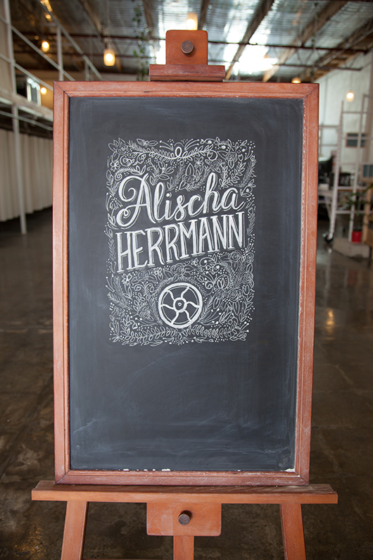
Tell us about the development of your title page design and how you arrived at your concept. I knew that I definately wanted to create the piece in chalk for that hand made touch. I wanted there to be some elegance in the lettering and also some beautiful detail just like Bespoke’s signature look. I looked closely at Bespoke’s website to get a feel for the kind of design they produce. I also looked at some of my vintage lettering books to get some inspiration for the lettering and floral detail. To include a letterpress element, I googled for images of the Chandler and Price machine and realised how beautiful this piece of machinery is. They certainly don’t make them like that anymore!
The fly wheel is what keeps the momentum of the rollers spinning, you get it going with a foot treadle. The fly wheel is such a beautiful and recognisable part of the letterpress I wanted to include that element surrounded by beautiful flower details.
What materials or computer programs did you use to create the title page, and how did you then prepare it to be submitted for the book? I started with paper and a pencil, sketching out my idea very roughly to get some ideas of composition. I knew I wanted to get a lot of detail into the piece, but knew a lot of that would happen as I drew it on the board.
I drew the piece on my chalkboard at 200% in good ol’ dusty chalk and photographed it so that it would retain the detail when scaled down. I didn’t want to do too much in Photoshop, as I wanted it to look like it was done on the chalkboard. I upped the contrast slightly so that the blacks were black and the whites were white.
 The final chalkboard design was photographed and then tweaked in Photoshop before submitting for the book.
What other fun projects are your working on now? I’m currently working on my first range of hand lettered greeting cards. I’m currently learning how to use a letterpress that is in my studio, so that I can print them with my very own hands!
I’m working on few custom hand lettering pieces for stationery and prints. And recently did some chalk lettering I did was the focus of the Westfield Christmas campaign.
I have a few wedding commissions for wedding season, creating chalk signage and hand lettered wedding stationery suites.
I’m also working with a coffee brand on some lettering for their packaging. Coffee and lettering are my favourite things!
You can find 'Conversations... Volume Two' in our online shop or at select stockists nationally. And be sure to check out Carla's new website at www.carlahackett.com
