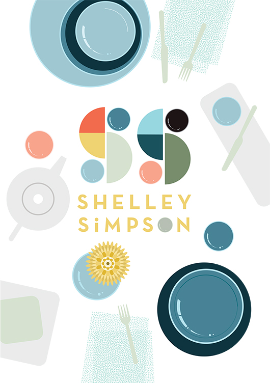
Title page designer: Emma Rickards
To have illustrator Emma Rickards design the title page for Shelley Simpson in 'Conversations with Creative Women: Volume Two' was a no-brainer - Emma is a big fan (and collector) of Shelley's ceramic wares, and both artist's love and celebration of colour, shape and line is evident in their respective work. Today we chat to Emma about her background and how she created the title page design for Shelley's interview. 
What is your design background? I originally trained as an art teacher many moons ago, and taught secondary school art and design for ten years. During that time, I also completed a Graduate Diploma in Graphic Design at RMIT. I wanted to see what it was like to work on my own projects, and to spend time ‘doing’ rather than giving myself completely to teaching. Shortly after, I left the classroom in search of new adventures, and began working on my own graphic design projects, lecturing in Art Education at The University of Melbourne and studying a Master of Design at Swinburne Uni. Nowadays, I combine lecturing and graphic design with raising two children, and life is completely bonkers.
What drew you to the work of Shelley Simpson? I’ve been a huge fan of Shelley’s tableware range Mud Australia for some time now, and I’m the lucky owner of a small collection of Mud bowels, plates and cups. Well, it’s an even smaller collection since my husband knocked one off the shelf last month, but let’s not revisit the horror. So naturally, I was keen to celebrate the creator of a product I loved. I knew the simple forms and delicious colour palette of Mud would suit my illustrative style, and I’m also going through a ‘bird’s-eye view of tabletops’ phase at the moment, so the subject matter fit like a glove.
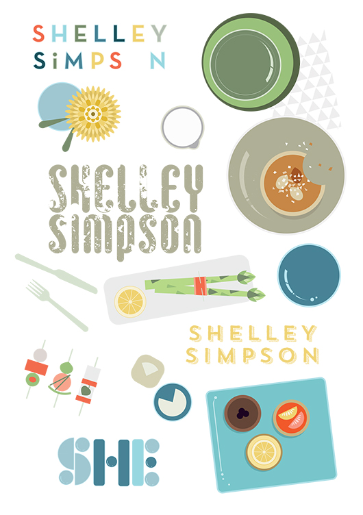
How did you develop your title page design, and arrive at the final concept? I began by compiling a Mud Australia Pinterest board full of lavishly styled shots of past collections, together with bird’s-eye pics of food and table arrangements. These images were referenced as I sketched possible page layouts, and considered how tableware pieces could be arranged into typographic forms. Once on the computer, I also considered stamping Shelley’s name onto a napkin or tablecloth, or creating the letterforms from noodles or spaghetti shapes. Superfluous drawings of food and distracting patterns were slowly discarded in favour of a design where Shelley’s creations could take centre stage. Symmetrical layouts gave way to more scattered, dynamic designs, while a centrally placed tray presented itself as the perfect spot for a title. As an asian-style meal evolved on the screen, ‘Shelley’ took shape from grains of rice, while ‘Simpson’ grew from a sympathetic typeface called Trend. A colour palette was chosen to reflect past Mud collections, with blue tones used to ‘quieten’ the busy scene, and warm accents providing some punch & pop.
What materials/computer programs did you use, and how did you prepare it for the book? Shelley’s title page was created using the Pen, Shape, Gradient & Type tools in Adobe Illustrator and the computer mouse, plain and simple! I’ll often trace a scanned sketch when developing an illustration, but this piece evolved as I played with the relationships of elements, and established a sense of movement, hierarchy and harmony.
What other fun projects are you working on now? I’m currently teaching Visual Art Education as part of the Master of Teaching: Secondary program at The University of Melbourne. It’s fun and challenging in equal parts, thanks to the juggle of mothering small children and having to turn up each week with my brain intact, clothes on and content prepared. I also create classroom resources (booklets, posters, teacher’s notes and a short movie) for teachers of Visual Communication Design, and sell these via my website. I’m really passionate about design education in secondary schools, and I love providing teachers with beautifully designed and useful stuff that will make their job that little bit easier. There are also some illustrated family portraits waiting to be completed in the lead up to Christmas. After that, I might sit on the couch for a couple of nights and watch reruns of The Bachelor.
You'll have to get the book to see the stunning result Emma created for Shelley's interview! Find it online or instore here.


