Title page designer: Laura Blythman
You may remember our interview with Laura Blythman recently. But did you know she also designed the title page for the interview with Ubabub founder and designer Natasha Dumais in our new book Conversations with Creative Women: Volume Two? Today we chat to Laura about her design. 
What is your art/design/career background? After completing a BA in Graphic Design, I cut my teeth working in-house at Hallmark Cards Australia, Cristina Re and Typo (Cotton On) before branching out into the freelance world.
Over the years I feel like I've designed pretty much everything under the sun: greeting cards, gift packaging, stationery, home office, home decor, textiles, apparel, custom illustration, hand-lettering, wedding and event stationery, brand identity, blogs, advertising, print collateral and website interface.
I've been lucky to work with many brands over my years as a freelance designer including: T2 teas, Clickon Furniture, Typo, Cotton Kids, A Skulk of Foxes, Lark, Peachy Gift, La De Dah Kids, Mr.Wolf Kids, Stuck On You, Zoo York, Kiitos - Living By Design and Swan Emporium. Not to mention some exciting new projects to be released in the coming months with some more dream clients!
What drew you to the work of your interviewee, Natasha Dumais of Ubabub? I’ve loved the clean and modern aesthetic of Ubabub products for a while now. Ubabub and Natasha have popped up on my radar quite a bit with features on TDF, Pinterest, Instagram and the like. Natasha is a super clever and inspiring local creative.
Tell us about the development of your title page design and how you arrived at your concept. My inspiration is drawn from the geometric shapes that form Ubabub’s branding elements as well as the delicious colour palette of Natasha’s now super famous jumbo ‘Sundae’ print. Concept development began with lots of scribbles, sketching layouts and a heap of ideas – some good and some bad!
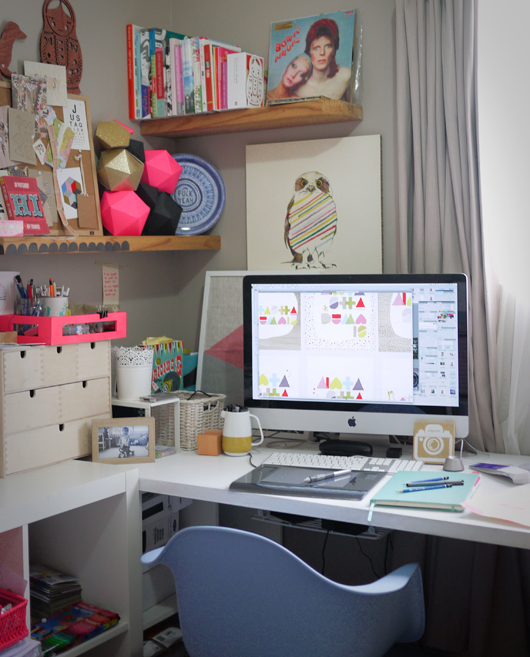
What materials or computer programs did you use to create the title page, and how did you then prepare it to be submitted for the book? I scanned my hand drawn shapes and then coloured and created the lettering and composition in illustrator. That’s it. Nice and simple.
What other fun projects are your working on now? So many! To name just a few, I am: - dreaming up and planning Stage 2 of my A Skulk Of Foxes collaborative range (the team at ASOF are so much fun to work with!) - branding and illustrating a cool kids’ web store - illustrating for a linen range collaboration with an artisan bakery - rebranding a vintage market - designing and illustrating a candle box collaboration - branding a cute kids look-book and other printed goods - compiling a range of my illustrations for totes, tees, etc for a super cool new artist collective - doing the brand and web illustrations for an ace jewellery/homewares label - designing a charity T-shirt - trying my hand at a tattoo design - creating a few commissioned artworks, inc paper feather hangings - working on some yardage and print designs for my own dream projects.
