Member profile: Andrea McArthur, Graphic Designer
Andrea McArthur Graphic Designer Website | Twitter
What is your professional or training background?
Queensland College of Art (Griffith University), Bachelor of Design Studies – Graphic Design Shillington College Lecturer (Cert 4) – Graphic Design (since 2009)
What do you make, create or do?
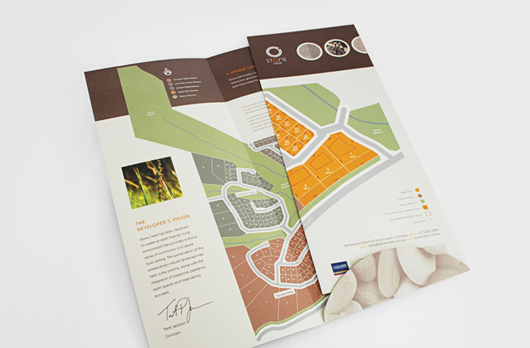
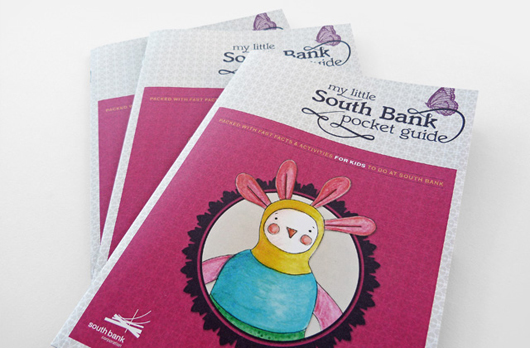
I believe in creating ideas driven visual solutions that are both beautiful and appropriate. Designs which add value to clients businesses in order to best achieve their vision. Working across all aspects of graphic design specialising in identity development, through to corporate communication, web design, eNewsletters, publication design and art direction.
What other creative areas would you like to explore as a side-project to your current work, or move into full-time?
A sideline passion for me is stationery, I would love to create a range of well designed products. Currently I am freelancing full-time and would like to focus on working with and building my client base.
What skills do you have that help you run your business, or what skills would you like to develop?
I have been designing for 13 years and have a wealth of design experience that I can bring to projects and problem solving skills allowing me to think outside the box. I would like to develop my digital front end design skills a little further.
List five people, businesses or websites/blogs that keep you motivated and inspired, and why?
www. presentandcorrect.com – An online store full of stationery goodness, so you can see what's happening in Paperie.
www.movingbrands.com – An amazing branding company who upload edited videos of their process and thinking.
www.anagrama.com – Brand Intelligence Group with some really different design outcomes.
www.swiss-miss.com – For all round good design fun.
Of course the www.creativewomenscircle.com.au – for lots of interesting reads and networking.
Women in Art: Abbey McCulloch as herself
By Lauren Treiser Often found on the 50 most collectable Australian artist list published by The Australian Art Collector, Gold Coast based artist Abbey McCulloch is a star! She is well known for her sublimely coloured female subjects with intriguing eyes and pouting lips, which manage to express feelings of both seduction and vulnerability at the same time.
 The Isolator, 2012
Image from Helen Gory Galerie
Two time Archibald finalist, McCulloch’s current exhibition at Helen Gory Galerie has one major difference to her other bodies of work which explore themes of femininity. And that is for the first time McCulloch has used herself as the subject matter.
 The Wimp, 2012
Image from Helen Gory Galerie
According to the artist, she is ‘quite a shy person and incredibly self conscious.’ This was her initial impetus to start painting and drawing; as a way to divert attention away from herself, so others could focus on something else, like a decoy. Well, it seems that McCulloch has matured since then, managing to make a 360 and in fact turn the attention directly onto herself. This all happened when McCulloch found herself a few weeks away from the deadline of the Doug Moran National Portrait Prize with no subject to paint. Despite years of avoiding painting herself, she found herself with no other option. Eventually, ‘The Wimp,’ which is part of the exhibition at Helen Gory Galerie, was selected as a semi finalist for the prize. I find the name of the work ironic because she is anything but that, having been able to paint herself and enter the piece into such a prestigious prize.
 The Black Iris, 2012
Image from Helen Gory Galerie
She found that painting herself gave her freedom and a vehicle to express ideas that otherwise she was unable to achieve. She could make the exact works she wanted to make and moved on to produce a series of self portraits. The next piece she created was, ‘The Black Iris’ which shows the duality of McCulloch’s personality. The artist is shown cutting her own hair and her doppelgänger is simultaneously cutting a black iris. One of her moves with nonchalance whilst her doppelgänger seems to be screaming.
 The Intervention, 2012
Image from Helen Gory Galerie
Moving on from these two initial works, the series got lighter and more playful. She is represented in each one with more confidence. The characters that she creates of herself emerge from flat painted ice-cream coloured backgrounds. The pieces come across to me as being quite girly, so I would be interested to know what a male audience’s take on them would be.
With only hints to the narrative, McCulloch puts a lot of clues in the eyes. Her subjects seem both brave and vulnerable at the same time, offering the viewer quite a real version of beauty.
 I can feel myself sinking into the ground, 2012
Image from Helen Gory Galerie
The contradictions inherent in McCulloch’s subject matter is mirrored in her medium. Carefully drawn elements alternate with undefined edges, flattened background hues are overlaid with textured areas of colour where the brushstrokes are quite evident. McCulloch’s process is to begin with charcoal onto canvas, building up to washes and then to thicker oils. McCulloch notes that it is always hard deciding when to stop and when to let the painting breathe.
 Good Things Great Things, 2012
Image from Helen Gory Galerie
My favourite piece in the exhibition is ‘Good Things Great Things.’ The ostentatiously dressed girls with their desserts captures a moment in time which is raw and unconstrained.
A few years ago McCulloch was featured on Art Nation which really gives you an insight into her personality and a better understanding of her work.
I was completely enthralled by this exhibition so if anyone wants to buy me one of these beauties as a present, I wont be saying no!
Abbey McCulloch: A New Normal Helen Gory Galerie 25 St Edmonds Rd, Prahran, VIC 12 September – 6 October Wed - Sat 11am-5pm
Lauren is graphic designer and founder of patchyrugs.com.au. She loves all things design (see her blog at blog.ilovelollies.net) and is particularly passionate about fine art, interior design and jewellery. Lauren is currently studying Gold & Silversmithing and doing graphic design on a freelance basis.
Bricks & Mortar: Old School – The New School for Graphic Design & Typography
By Diane Leyman Old School – The New School for Graphic Design and Typography is exactly what its name suggests: a back-to-basics, community-centered school for graphic designers and other creative types who want to learn outside of the traditional university or college setting. Old School is the creative vision of its founder, Veronica Grow. Veronica graduated from Swinburne in 1998 and has spent her years since teaching as a design lecturer and tutor at RMIT and Box Hill Institute, where she created and delivered design courses in Australia and overseas alongside working on her own design projects. Veronica’s love of teaching led her to set up Old School, and after months of planning and collaborating with another designer to develop the school’s identity and website (Veronica says the most difficult thing was deciding on the name), she opened up her doors in January this year.
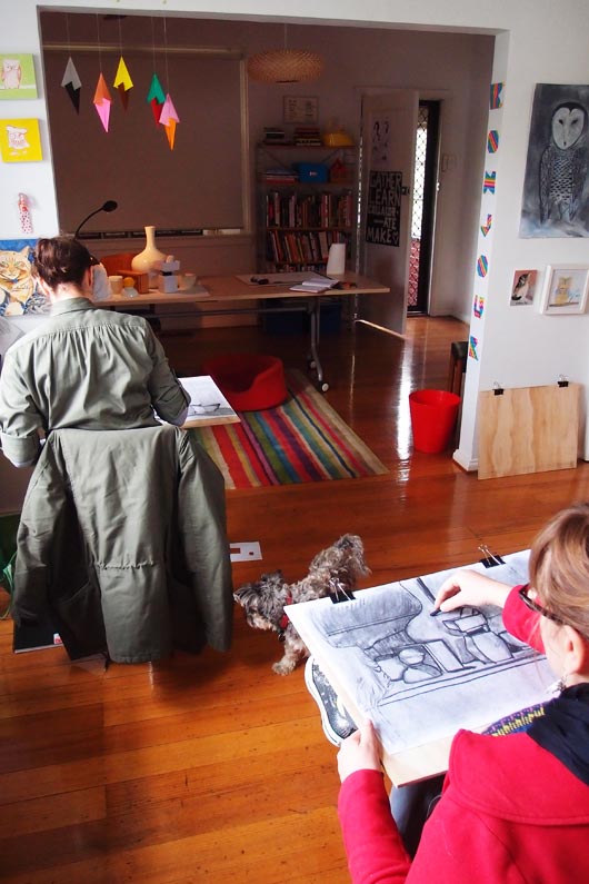
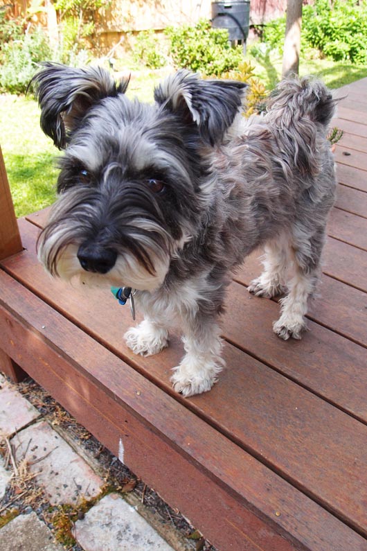
Old School is currently run out of Veronica’s lovely home Coburg, and it’s a friendly, welcoming and non-intimidating creative space. I felt immediately at home when I walked in, and Veronica’s welcoming personality (and her adorable dog Gertie) certainly help to make her students feel comfortable and at ease.
So far this year Veronica has run short courses on publication design, hand made type and observational drawing (which I gatecrashed on my visit and was damn impressed by what the girls were working on), and in the next few months will be offering a class called Voice, which is designed to help illustrators find their unique style, and the Lost Art of Walking, which is all about exploring the outdoors as a source of inspiration. In July Veronica also launched her first two-year communication design program. The course walks students through core design skills and also has a social and community emphasis, and this is really what’s at the heart of Veronica’s philosophy at Old School – that design has the ability to influence positive social change and help make this crazy world of ours a better place.
Veronica has, in a short time, managed to achieve what she set out to do – create a down to earth school driven by a love of learning – and I’m sure this is just the beginning. To find out more and to see what classes Veronica has coming up, visit the Old School website.
Diane Leyman is a freelance editor, proofreader and project manager with more than six years of experience working in non-fiction illustrated trade book publishing. She has a passion for all things design, and writes a design blog called Notes to a Further Excuse. She also likes taking photographs, crafting, drinking coffee and obsessing over mid-century homewares.
Don't feed the trolls
There has been increasing conversation regarding 'trolling' in the last few weeks after some Australian public figures received threats via Twitter. Thus, several news outlets began campaigns to Stop the Trolls which has taken the conversation offline and into the mainstream. The term 'trolling' is used to represent faceless, anonymous bullies who set up accounts on social media sites solely to find targets and attack them, which isn't necessarily the definition that is known by online communities. Trolling usually refers to playing a bit of a joke on someone, being a prankster as it were and not maliciously attacking people.
Definitions aside, there may be times when you come across people in online communities and social networks who will relentlessly attack without logic or reason and who it's not possible to engage with in a conversation. There is a simple mantra when dealing with these people, 'don't feed the trolls'.
- Do not reply, it just gives satisfaction and additional ammunition
- Block and report. If they make a new account, block and report again
- Take a screen shot of the tweet, message or reply and keep it as a record if it's needed
There's a great quote, 'the internet has given us the ability to be anyone we want to be, it's a pity so many people choose to be stupid'. The reality is that there is a minority of people who enjoy causing hurt or humiliation to others these people exist in real life just as readily as they exist online.
Instead of adding to the issue simply don't let the conversation even start.
Ellison Bloomfield is a Digital Content Developer at Deloitte. Her blog – Humane Resource has received world-wide attention and Ellison is frequently quoted as a thought leader on HR issues both within Australian and international publications. She can be found on twitter @EllisonAmy
Eco Friendly Creative Practice: Kim Stark from Emiti
 Kim Stark has followed a highly creative yet diverse career path, from child actor to assistant director, masseuse, and now the founder and designer behind Emiti, a range of gorgeous accessories and homewares.
Originally hailing from Western Australia, Kim was a child actor before going on to work behind the scenes in film and tv. After deciding to pursue acting again, she started her own massage practice to support herself. During this time, she began sewing wheat bags for clients and friends. When they proved to be a hit, she decided to put her other creative skills to use by designing and printing her own fabric to give the eco-friendly products a more unique, personal touch.
Before long, Kim realised this creative outlet was what she kept coming back to and enjoyed the most and so she set about expanding her range into other products such as handbags, cushions and jewellery.
Sustainable and ethical design and production is central to the Emiti business model, from the use of organic fabrics and low carbon leather in the handbags, through to sourcing recycled plastic bottle inserts for cushions and FSC certified wood for jewellery products. Kim has kindly taken some time to share what she has learnt (and is still learning) along the way.
Emiti cushions
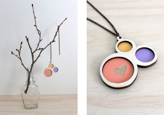
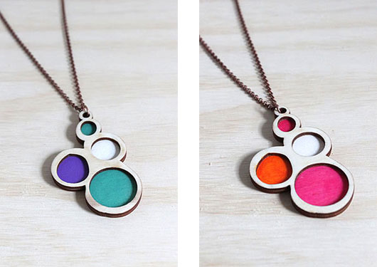
Necklaces from the new Emiti jewellery range
How do you approach sustainability and environmental awareness in your creative practice?
For me it’s about choices. There are a lot of decisions to be made in a creative business and I always try to choose materials and processes that are environmentally friendly. It’s not that much harder, it just requires a bit more patience and perseverance.
Some examples of what I’m currently doing is using organic cotton/hemp fabrics that I screenprint with water based inks, using recycled card for all my packaging and swing tags, posting everything out in secondhand boxes I source from local businesses, using FSC certified wood, low carbon leather, designing patterns so that there’s almost no wastage of fabric and then composting any fabric and cardboard scraps that later ends up on my vegie patch!
I think all of these choices are important because I don’t want to be just another business producing stuff that other people can buy and then later throw out. If people are going to buy pretty things that make them happy (and make me happy to make!) then I’d much rather they buy products from businesses that actually think about these environmental decisions.
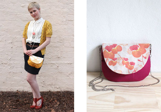
The Florence bag from the South West Collection
What key challenges have you come up against in trying to reduce the environmental impact of your work and how did you overcome them?
The main challenge I’ve come across is the lack of supplies available in Australia for environmentally sustainable products and the increased prices of those supplies. Especially when it comes to fabric – there’s only a few sources of fabric, which limits what the end product will look like. I especially find it limited in terms of colours of fabrics available.
But on the flip side of that sometimes being restricted in what you can design can bring about an end result that works beautifully and wouldn’t have happened in the first place without the restriction. The main reason I chose to screenprint my own organic fabric was because there isn’t that wide choice available and that’s become a large part of what I do, so there’s always a positive!
As more and more consumers choose to buy environmentally friendly products, there’ll be a flow on effect in that more supplies will become available at a lower price. Are there any particular resources you draw on to learn about issues around sustainability, in particular regarding design and production?
I always find magazines, such as Peppermint, a great resource on what other groups are doing and interesting articles about processes.
I also find talking to different makers through markets and trade fairs a great way to swap knowledge and ideas. Also talking to the businesses that supply your materials as they are usually on top of what’s happening in their particular field. And let's not forget about our friend Google…
Necklaces from Emiti's new jewellery range
Is there anything you’d like to do or learn to further increase the environmental sustainability of your work?
I’d love to use more recycled materials in my products, especially in my new jewellery range, and hopefully I will find the time very soon to really do some solid research into what businesses are chucking out and how it can be reused. I love the idea of the creative process being informed by what’s available, you never know what the end result might be!
Some of my future goals are to become carbon neutral and to be in the position to donate a percentage of profits back to environmental causes.
Who are the other creative women doing new or interesting things with a focus on environmental sustainability that you admire or are inspired by?
I really admire what the girls at Harvest are doing. They host amazing craft workshops and have their own range of products made from organic and natural fabrics. The community they’ve built around sustainable craft is a great business model that I hope will soon spread far and wide.
Clutch bag from the South West Collection
What advice would you give to a young woman who hoped to launch their own label with a sustainable focus? Make sure you leave yourself enough time to do lots of research into every aspect of what you make and where you can source the best materials. Unfortunately there isn’t a magical website that lists all of best places so it can take a bit of detective work!
Make sure you know what your values are and what’s important to you when you start because it’s easy to get pushed into a direction that is maybe easier but isn’t necessarily better, so it’s good to know what your goals are.
But also be aware that when you’re starting out you can’t make your business 100% perfectly environmentally friendly. You have to be realistic about what is achievable at each stage of your business and know that as your business grows you can take those bigger environmental steps.
Phoebe Miller is a Brisbane-bred, Sydney-fled, Melbourne-embedded gal who enjoys making, spruiking, collecting, exploring, telling her friends where to eat and posting photos of doors on instagram. After several years working in corporate marketing and communications, Phoebe followed the urge to explore her creative side. These days she divides her time between her sustainable fashion accessories label, Simply Phoebe, and freelance PR consulting.
CWC Member Feature: Mandy Wood
By Roslyn Russell I'm excited to welcome Mandy Wood to the CWC blog today as our featured member. She is a girl after my own heart - inspired by the needle and thread. Mandy's creativity and skills in the area of sewing and design has led to cushion range, olive thread, and she is currently developing and almost ready to launch her online store at Blue Caravan.
What do you create? I design and hand make the cushion range - olive thread.
Have you done training in your creative field or has it come about informally? I have always loved creating and sewing and although I have done a few short sewing courses and am hoping to do a more in-depth design course soon - my sewing skills have developed mainly through the help and guidance of my mum and grandmas who are all really good sewers. My learning process is definitely a bit more hit and miss as I am willing to give anything a go - for example teaching myself to insert invisible zippers by hand (that was fun!)... it might take a few goes to get everything to exactly how I want it but the final outcome always makes it worthwhile!
What are your main creative inspirations? My main inspirations would have would have to be fabric and colour! I am obsessed and I love finding new fabrics that I have to work with because they are just so fabulous. The latest - olive thread BRIGHTS - is a perfect example of this as I had the cream/tan fabric for about 6 months before I decided the tigerlilly cotton fabric would work perfectly with it for this collection (see the cushion line up for the final product). It is also fantastic to have access to so many other creative inspirations and creative people through blogs, magazines, facebook, instagram, pinterest and networking groups like CWC. I am constantly inspired and impressed by the countless talented creatives and get my daily blog fix through personal favourites like The Daily Imprint, The Design Files, Decor 8 and Absolutely Beautiful Things to name a few. If I am ever stuck or feeling in need of a spruce, these are my go to places which often leads to me getting lost in the online world and discovering new exciting people and their work/projects.
How do you balance your creative projects with the administration aspect of creative work? I find I do get really excited and just want to keep designing and sewing ... but at the same time I do like doing the admin side. Call me crazy but I think it has something to do with a long term obsession with paper and stationery :] I am also a big fan of the trusty excel spreadsheet and I am never without a notebook (containing the current to-do list) of some size. As olive thread is a new business I try to spend a considerable amount of time profile building and linking with other like minded people in order to learn, grow and establish the brand. It is exciting because olive thread keeps evolving and building and my administration/research plays a large role in this.
What do you do when you experience a creative block? Step away from the project that I am working on. I know myself and my creative process well enough that I cannot force it... the answer or idea will come to me and quite often at the most unexpected time and places. This is especially helpful as I often get overwhelmed from so many ideas that I need to clear my head and prioritise. As much as I would like to, I can't do everything at once and anything worth doing takes time. I also find public transport/commuting a space where I have the time to let the thoughts come ... on a train/tram with a notebook is where most of my current plans have developed. So I just jump on a train and see where I end up (which is usually at work :}).
What future goals do you have for your creative pursuits?
My future goals are to grow my customer base and open up avenues into the home decor marketplace. It is such an exciting time for olive thread and I would love to be able to make an income off it but mostly I love seeing when people connect with my cushions - everyone has their favourites, it is so individualistic! I also plan to establish a base of stockists and thinking big I would love to develop an olive thread home wares range... lots to do - I love it :}
 If you want to keep up to date with olive thread 'like' the facebook page or follow me on Instagram olive_thread or Pinterest. Blue Caravan online store coming very soon but feel free to email with any enquiries or just to say hello mandytwood@hotmail.com :}
Thank you so much Mandy for sharing your creativity on the CWC blog today.
Roslyn Russell is a sewist, blogger and teacher. Her blog, Sew Delicious, is where she showcases her latest projects, designs and sewing tutorials. Roslyn also enjoys cake baking and decorating, exploring Melbourne cafes and restaurants, and hunting through op-shops for vintage sewing and kitchen treasures.
Stress & Wellness: Tips for a well workspace
By Emily Harrison With spring time comes the phrase ‘spring clean’ …where we turf out wardrobes, dust off exercise equipment and create space for all the exciting projects and ideas ahead.
Well in an ideal world that is what would happen.
I myself was lucky to find the keyboard to write this column under what I would like to defend as a “system of organised chaos” …but really is just a cluttered workspace.
And so with some spring-time vigour I took a look at what aides a healthy workspace. To help me I had a chat with a lady who knows more about feng shui than I and with her French accent and full hand gestures, Christiane taught me a lot more than just tips for workspace wellness.
“You know Emilleee, clutter on ze desk means clutter in ze mind” (hmm clearly she wasn’t aware of my extraordinary touch typing abilities under forests of paper…but she could be on to something).
“To be able to create, you have to be organised in life,” she continued. Lucky the CWC have a columnist dedicated to ‘Organise Me’.
So what practical steps could one take to help bring a sense of harmony and balance to a workspace?
- Step 1 is to de-clutter. Clutter is stale energy so start moving it, literally. Clutter or mess adds a heavy weight to your environment so when you de-clutter you create space for positive energy to flow in. Place everything into its own spot (and if it doesn’t have one then do you need it?).
- Create time to clear…regularly. We know what it’s like to become absorbed in a piece or find “the zone” … but we can forget to create time to clear and find we’ve become covered in piles of thread, material cut-offs, or in my case…a forest of paper. Give yourself 30mins to refocus and create space to allow the creative genius to flourish.
- Let’s talk lighting. Aim for natural lighting where possible and consider supporting lights and/or using a magnifying glass for fine tasks such as needlework.
- Cleanliness – it goes without saying. We’ve all heard the revealing reports on keyboard hygiene. Pick up the tea-bags, clear off the crumbs. Stat.
- Work in nature - while I was tempted to move my office to the park, Christiane was referring to incorporating natural elements in to your office or home– or in her words “humans cannot be at peace unless nature is present” (think earth, water, stone, wood, metal elements etc). Which is why plants or flowers in a vase of water are great to have around. Plants, while also looking good, help to absorb negative energy. They also seem more manageable than goldfish for me.
- Work in inspiration – someone once said to surround yourself only with things that are useful, beautiful or that uplift. Wise words whether you apply it to the home or the office.

So with that in mind, I am armed with helpful tips (and no more excuses) for tweaking my workspace to let the energy and creativity flow to its best potential.
I’d love to hear your tips or ideas?
With thanks to landscape architect and feng shui expert Christiane Seletto for sharing her wisdom.
Emily Harrison is a writer and yoga teacher with an interest in what makes us healthy, thriving creative beings. She also finds herself stuck under piles of paper at times. You can read more at iamem.com


