Title page designer: Amy Constable
Today we chat to Amy Constable, who designed the title page for the interview with stylist Megan Morton in Conversations with Creative Women: Volume Two.

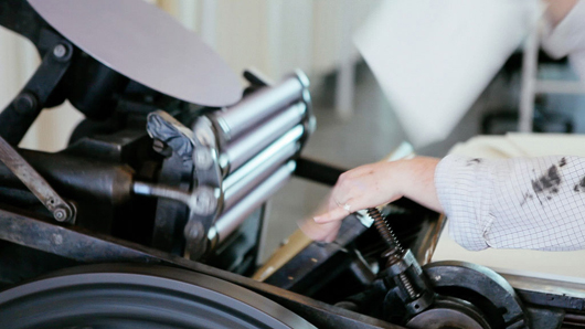
What is your art/design/career background? I began my career at 21 as an aspiring creative copywriter at an ad agency (I had heard that's how Bryce Courtenay got his big break and in typical Gen Y fashion, I assumed copywriting was to an aspiring writer the equivalent of burger-flipping to an aspiring chef). The reality was I spent my days cutting ads out of newspapers, researching small town rags and writing the occasional classified ad. I met a designer there who said my handwriting would make a great font, so as a fun little side-project we began working on 'Amy Sans' together. He coaxed out of me some lettering and typography skills that I'd all but ignored in my pursuit to become a writer and encouraged me to side-step into the visual side of the industry. I created a portfolio, landed a job working as an Art Director's assistant and over the next 6 years, I built up my design and typography skills on the job. I decided I wanted to get more hands-on with my work at about the same time I first discovered letterpress. I doesn't get more hands-on than letterpress and for the last 4 years my little business, Saint Gertrude, has kept me busier (and my hands grubbier!) than I ever imagined possible.
What drew you to the work of your interviewee? Megan Morton is a total design industry celebrity, but what I love most about her is her approachable and slightly eccentric attitude! Her styling projects go beyond the aesthetics of 'what's hot right now' and have a sense of intelligence and individuality to them. I aspire to the same kind of attitude in my own work.
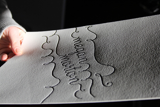
Tell us about the development of your title page design and how you arrived at your concept. One of the things that Megan has played a very valuable role in, is the rise of The School. She isn't precious about her creative process, rather she wants to share it. Styling is a very tactile medium, with shadows and textures playing a lead role in conveying atmosphere, so my concept was a letterpress print, in her signature whimsical handwriting style, and a flat lay photo with retro school props around her letterpressed name. It was a long (but fun!) process trying to maximise the print, props, light and shade for optimum effect.
What materials or computer programs did you use to create the title page, and how did you then prepare it to be submitted for the book? I created the type-based design using Illustrator. Then I had a photopolymer printing plate made and loaded it into my 110-year-old manual printing press. I made about 20 letterpress prints on cotton paper stock, picked the best one, then added the school props in flat lay. I spent almost an entire day with my friend/stylist/collaborator/fellow-eccentric Caroline Buckle who helped me to style and photograph it. And lastly, I took the final photo to Photoshop to get it print ready.
What other fun projects are your working on now? In the footsteps of Megan Morton, I am now working on my proudest project to-date: Letterpress Academy. I'll be running monthly letterpress workshops with designers and illustrators, helping them turn their love projects into prints and sharing with like-minded folk the inky-handed joy of letterpress.


