CWC Summer Reading
Summer is upon us, and along with the festivities of the silly season, the summer days lend themselves wonderfully to some solitary reading time. Whether on the beach or in the bush, for improving the mind or just plain unashamed escapism, I love getting stuck into a book. It’s not something I get to do very often in my day-to-day. So when I get some time off during a holiday period, the lure of a good book and a well-worn couch is simply too hard to resist.
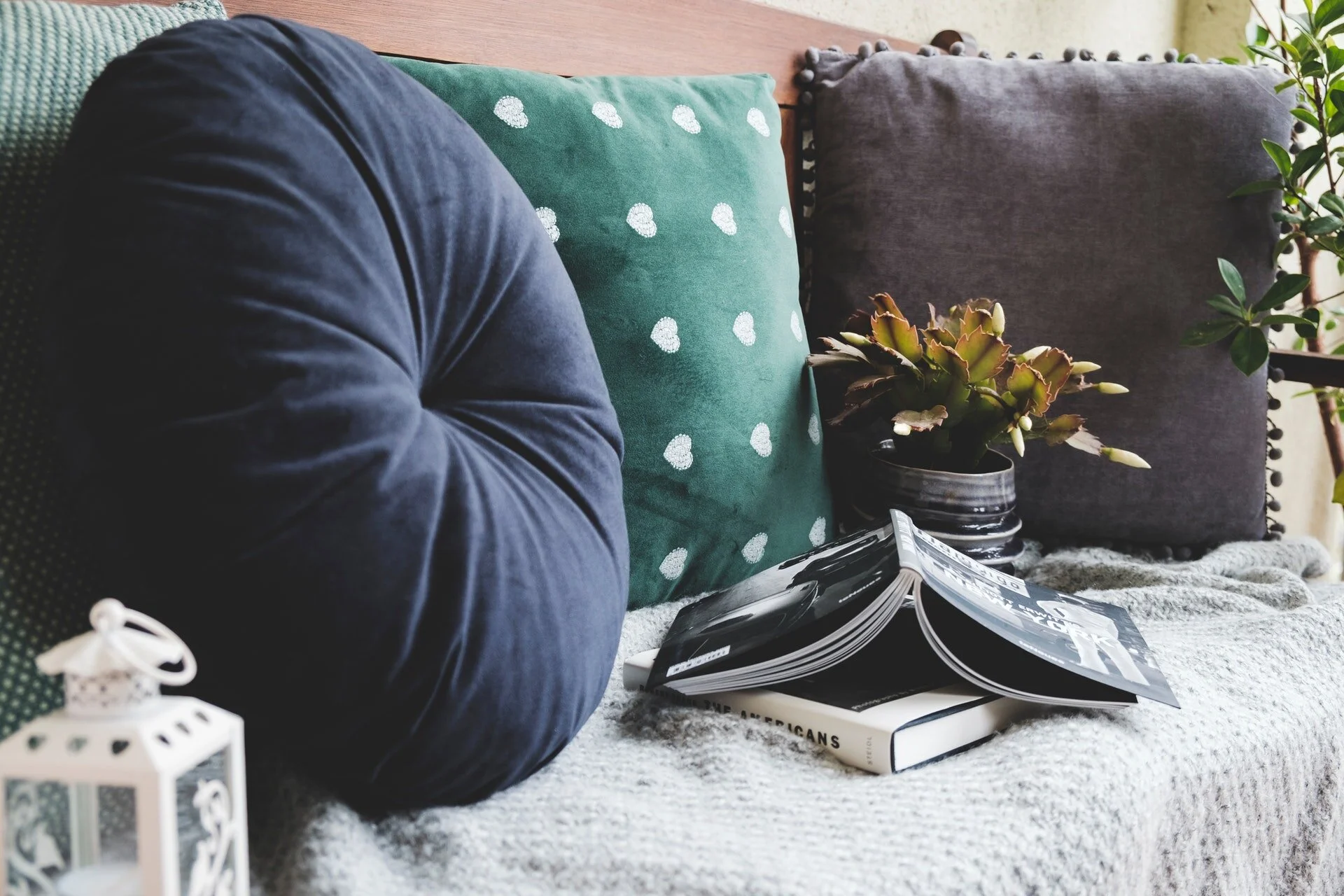
Photo by Krisztina Papp. Source: Pexels
Summer is upon us, and along with the festivities of the silly season, the summer days lend themselves wonderfully to some solitary reading time. Whether on the beach or in the bush, for improving the mind or just plain unashamed escapism, I love getting stuck into a book. It’s not something I get to do very often in my day-to-day. So when I get some time off during a holiday period, the lure of a good book and a well-worn couch is simply too hard to resist.
I remember that time in my 20’s where I read Alex Garland’s The Beach, on the beach in Thailand, reliving the story it in-situ like all the other tourists. Then there was that year I read all of Harry Potter and the Deathly Hallows in one uninterrupted sitting, bleary-eyed but determined to get closure from a decade-long literary journey.
This summer, I’m working my way through A.S Byatt’s The Children’s Book. Set in Victorian England through to WW1, a famous children’s author writes a story for each of her children. I’ve been promised a tale of family secrets, betrayal, lies, and treachery and so far it does not disappoint.
I’m always out for new titles to try from friends and family who have given their seal of approval before it gets into my hands. So when it came time to put together this post, I called out to some people (including the trusty CWC board) to send through their favourite reads.
So, in no definitive order and with no particular genre in mind, here are 12 recommendations and why you should read them, without giving away too much. And if they don’t make your summer reading schedule this time, you now have one book to read a month for the upcoming year.
Quiet: The Power of Introverts in a World That Can't Stop Talking - Susan Cain
Susan Cain delves into the power and value of the introvert in a world that seems to worship the extrovert. But this is not just a beneficial read for introverts to learn that their approach has merit. It’s also an important book for extroverts to pick up to better understanding of the introverts in their lives.
Unpolished Gem – Alice Pung
Alice Pung’s memoir takes the reader through her childhood and adolescence growing up in working-class Footscray. She describes three generations of women - herself, her mother and grandmother - navigating through their worlds from war-torn Cambodia to suburban Melbourne . It is witty, vivid, nuanced and shows a girl’s experience of moving between cultures and identities in contemporary Australia.
How to be Both – Ali Smith
How to be both has an interesting way of telling the story of two very different lives that exist in completely different times, but the book subtly shows how we are all intertwined as humans. Ali Smith paints people in their purest form with their purest thoughts, which makes it a book that can really ground the reader.
This is Marketing – Seth Godin
This is the quintessential marketing book of the decade. Seth Godin speaks about the value of making connections with customers that last over a lifetime. It’s about the long term success over the short term buzz that people will quickly forget about. A solid read if you want to refresh your marketing approach or don’t have much experience with marketing.
Uprooted - Naomi Novik
Uprooted is a delightful read. It’s a high fantasy tale with roots in Polish folklore. Naomi Novik crafts an intricate world and her prose carries strong characters such as the heroine Agnieszka. It was one of the most highly lauded and award winning fantasy novels of 2016. Best thing is that it’s a stand-alone book, which can be quite rare in the fantasy genre.
The Rosie Project - Graeme Simsion
As a professor of genetics, the protagonist Don lives an orderly predictable life in an academic setting. The Rosie Project explores the romantic and comedic errors of a man with undiagnosed Asperger’s Syndrome as he looks for a wife. It’s funny, empathetic and beautifully written.
Crazy Rich Asians – Kevin Kwan
The book is always better than the movie, they say. So if you’ve seen the film and liked the bling, extravagance and crazy rich relatives, check out Kevin Kwan’s original words. And if you like this book, you might as well stay for the sequels. It’s a witty trilogy full of drama and couture, and it’s a whole lot of escapist fun.
Women of Letters: Signed, Sealed, Delivered - Michaela McGuire & Marieke Hardy
This is a part of the Women of Letters series of book that is curated by Michaela McGuire & Marieke Hardy. It champions the lost art of letter-writing and showcases the humour, sentiment and wisdom of these notable Australians. This is a great non-fiction option to dip in and out of when you have a bit of free time.
Stardust – Neil Gaiman
Another book that’s been adapted to film, Stardust is Neil Gaiman’s much loved fairy tale about a young man who seeks to capture a fallen star. A wonderful book that is not too long, it is sweet, funny and a cheeky departure from reality.
Born to Run - Christopher McDougall
If you want an uplifting story that will make you want to hit the running trails after an overindulgent Christmas, then this is for you. Christopher McDougall’s tale begins with him looking for answers to his running injury woes, which leads him on an incredible quest to discover a hidden Mexican tribe who run 100’s of kilometres, often barefoot. McDougall makes a great case for the simple pleasures of running.
Where the Crawdads Sing – Delia Owens
Set in 1969 on the North Carolina coast, Where the crawdad’s sing is a story of a woman, Kya Clark, who defies her circumstances to create her own success. It’s a coming of age story intertwined with a bit of crime. A movie adaptation is currently in the pipeline, set to be produced by Reese Witherspoon and Lauren Levy Neustadter.
Book of Dust: The Secret Commonwealth – Phillip Pullman
This is the second book of the The Book of Dust trilogy by Phillip Pullman. It is part of the His Dark Materials universe, now a HBO show currently on Foxtel. The His Dark Materials universe has always walked the line of young adult/adult fiction with a rich tapestry of fantasy, character building and deep philosophical themes. This new book explores the world and perspective of the protagonist Lyra (Belacqua) Silvertongue as an adult in college who witnesses a murder. A great read for fans of the broader series.
So there you go, hopefully some of these provide your summer with some solitary indulgence.
Happy holidays to you all, and see you on the other side!
Owning It: A Creative’s Guide to Copyright, Contracts and the Law - pre-order now!
 Today is the day, ladies! The HIGHLY anticipated Owning It: A Creative's Guide to Copyright, Contracts and the Law by lawyer and former CWC speaker Sharon Givoni is finally available to order.
What a massive project this has been and you - the CWC audience - have been overwhelmingly supportive throughout the whole process.
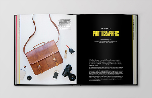
I'm excited to share with you here some images from within the book, featuring the works of many female creatives such as Hours After, Fromage La Rue, The Gently Unfurling Sneak, The Bell Jar, Nancybird, Marnie Hawson. In fact, there are over 140 images by local creatives within the book, which makes it as much a delight to look at as it is informative to read.
Much more detail about what is inside this 560-page tome can be found at the Creative Minds website, and for a little more insight into how it all came together, you can check us out on The Design Files today... thanks Lucy and Lisa for the feature!
The book is available to pre-order through our shop from today, and copies will be posted out from 9 April 2015. Join our mailing list or stay tuned to our social media for details of the upcoming book launch too - you're all invited!
New eBook from CWC: On Creativity and Business
By Tess McCabe Did you know that it's been 10 years of CWC this year? True. Over that time, there has been so much advice given, taken, and shared here, that it is hard to fathom the ripple effect of so many women connecting and sharing over that time and how it has strengthened the community.
As a celebration of sorts, over the last few months CWC's first intern Madeleine Dore poured over the hundreds of blog posts on this site and curated a collection of the best snippets of advice, tips, thoughts and musings from the women we have featured or who have contributed to our blog in some way.
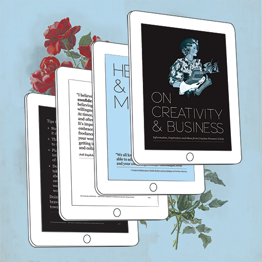
The result is On Creativity and Business: Information, Inspiration and Ideas from Creative Women's Circle. It's 37 pages long, and available now for free for our Members... those who support us to keep going in this manner.
2015 is going to be an exciting year for CWC (with plans underway that will be revealed in due time!). But as the weather warms up and the year winds down, we hope our Members will enjoy this little gift.
And for those who are yet to join or who like to join in from afar, we encourage you to revisit our blog archives this summer and refuel your inspiration stores so that you too have a creative and productive 2015!
Graphic Design Speak: Tips, Advice and Jargon Defined for Non-Graphic-Designers... paperback edition!
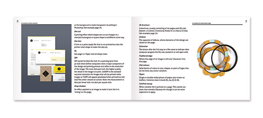
 Last year we released the eBook Graphic Design Speak: Tips, Advice and Jargon Defined for Non-Graphic-Designers, to lots of great feedback and hundreds of copies sold. By popular demand, we're soon to be releasing Graphic Design Speak in paperback format through our sister-biz Creative Minds Publishing, and you can pre-order it now to get it first!
This handy 44-page paperback guide explains:
- Basic colour terms like Pantone, CMYK, RGB and what they mean
- Common file types and where you use them (a.k.a. Why can’t my printer just get my logo from my website and put it on my business card?)
- How to distinguish a high-resolution image from a low-resolution one (a.k.a. A journalist has asked for a high-resolution image for a story about me, but how do I know which one of these image files to send?!)
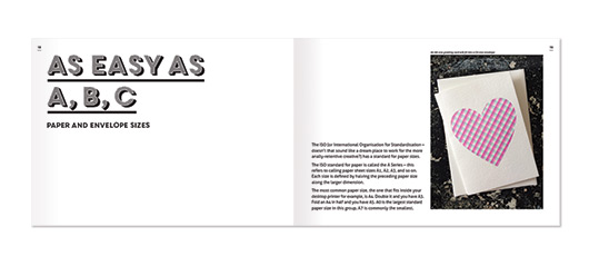
- The standard paper and envelope sizes
- Facts about fonts
- And over 95 common words and phrases us graphic designers throw around willy nilly.
Here's what's new in the paperback edition:
- More common words explained including video production and web design jargon
- Tweaks and edits to make the book more helpful and the information easier to comprehend!
- Beautiful, colour images that illustrate key concepts within the book from local designers Kylie Thevenau, Louise Jones, One Fine Print, Saint Gertrude Design and Letterpress, Brand By Name, Pom by Pomegranate, Andrea McArthur, and Serena Sundai.
Plus, it's printed in full colour in Melbourne, Victoria using environmentally friendly printing methods and paper.
Read more here or pre-order here! Books will be posted in early September.
Title page designer: Carla Hackett
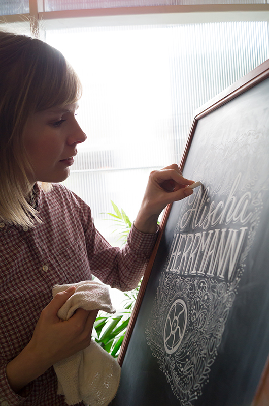
We talked to Carla Hackett a little while ago about her graphic design background and blossoming lettering and illustrative career. Today, we're happy to welcome Carla back to the blog, chatting about putting chalk to board for her title page design for Alischa Herrmann in Conversations with Creative Women: Volume Two.
What is your art/design/career background? I grew up in Wagga Wagga NSW, a regional town that as it turns out has a thriving creative community! I went to a very creatively nurturing school and was heavily involved in performing and the arts. (Fun fact: I moonlighted as Crystal Chandelier in a 60’s girl band called The Fabulous Chandeliers for 7 years!). As a kid I would draw everything and had one of those Letraset typeface books and I would draw letters all over my notebooks and do bubble writing for my friends assignments.
I studied Graphic Design at university and then moved to Sydney and worked at some great design agencies for 6 years as an Art Director and Designer. But after a while, I felt a little creatively unfulfilled, so in 2011 I quit my job and moved to Berlin. It was a great time to hit the reset button and to soak up the inspiration of Europe! I like to call them my ‘Bowie years’.
To give myself that time to think really changed everything and it allowed me to start playing again! That’s when I discovered lettering. I went along to a hand lettering workshop with Ken Barber from House Industries and really enjoyed the simplicity of picking up a pencil again.
It was the perfect mix of my design skills, typography and using my hands to illustrate letters. I love that each piece of lettering is unique. It was then a natural progression to start lettering in chalk. I love the ephemeral nature of chalk but also how tactile each piece is. You can see the human hand has been involved.
I returned to Melbourne and found the lovely Little Gold Studios to set up shop and focus on hand lettering.
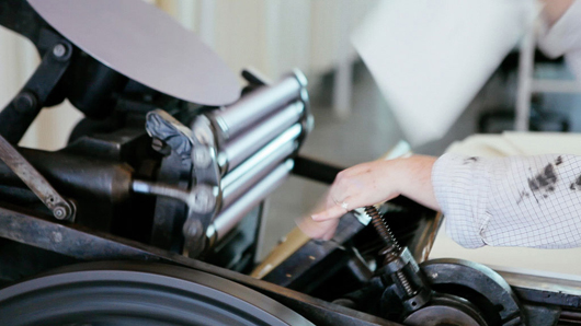
What drew you to the work of your interviewee? I have a deep appreciation for letterpress, and recently had the chance to print one of my own designs on a press that belongs to Saint Gertrude Lettering in Little Gold Studios. The labour of love that goes into printing is all worth it when you see the first impression come off the press. There’s something about the feel of the cotton paper and the impression is really quite special. Being someone who painstakingly hand crafts lettering, I was drawn to illustrating Alischa’s name. There’s also something about the nostalgic quality of chalk that resonates with the tangible nature of the letterpress machines. There is no electronic function involved, it was all done with a human touch by these indestructable and timeless machines.
Tell us about the development of your title page design and how you arrived at your concept. I knew that I definately wanted to create the piece in chalk for that hand made touch. I wanted there to be some elegance in the lettering and also some beautiful detail just like Bespoke’s signature look. I looked closely at Bespoke’s website to get a feel for the kind of design they produce. I also looked at some of my vintage lettering books to get some inspiration for the lettering and floral detail. To include a letterpress element, I googled for images of the Chandler and Price machine and realised how beautiful this piece of machinery is. They certainly don’t make them like that anymore!
The fly wheel is what keeps the momentum of the rollers spinning, you get it going with a foot treadle. The fly wheel is such a beautiful and recognisable part of the letterpress I wanted to include that element surrounded by beautiful flower details.
What materials or computer programs did you use to create the title page, and how did you then prepare it to be submitted for the book? I started with paper and a pencil, sketching out my idea very roughly to get some ideas of composition. I knew I wanted to get a lot of detail into the piece, but knew a lot of that would happen as I drew it on the board.
I drew the piece on my chalkboard at 200% in good ol’ dusty chalk and photographed it so that it would retain the detail when scaled down. I didn’t want to do too much in Photoshop, as I wanted it to look like it was done on the chalkboard. I upped the contrast slightly so that the blacks were black and the whites were white.
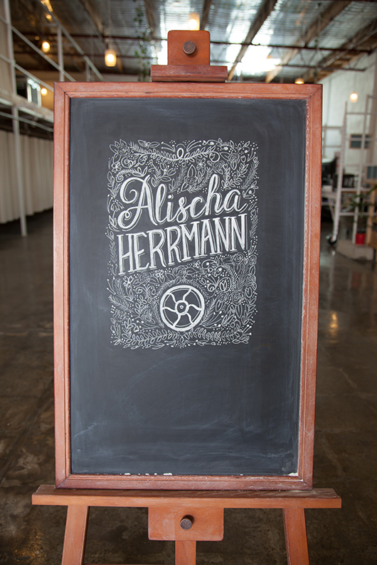 The final chalkboard design was photographed and then tweaked in Photoshop before submitting for the book.
What other fun projects are your working on now? I’m currently working on my first range of hand lettered greeting cards. I’m currently learning how to use a letterpress that is in my studio, so that I can print them with my very own hands!
I’m working on few custom hand lettering pieces for stationery and prints. And recently did some chalk lettering I did was the focus of the Westfield Christmas campaign.
I have a few wedding commissions for wedding season, creating chalk signage and hand lettered wedding stationery suites.
I’m also working with a coffee brand on some lettering for their packaging. Coffee and lettering are my favourite things!
You can find 'Conversations... Volume Two' in our online shop or at select stockists nationally. And be sure to check out Carla's new website at www.carlahackett.com
Title page designer: Laura Blythman
You may remember our interview with Laura Blythman recently. But did you know she also designed the title page for the interview with Ubabub founder and designer Natasha Dumais in our new book Conversations with Creative Women: Volume Two? Today we chat to Laura about her design.
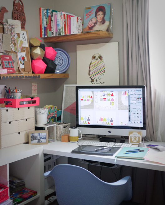
What is your art/design/career background? After completing a BA in Graphic Design, I cut my teeth working in-house at Hallmark Cards Australia, Cristina Re and Typo (Cotton On) before branching out into the freelance world.
Over the years I feel like I've designed pretty much everything under the sun: greeting cards, gift packaging, stationery, home office, home decor, textiles, apparel, custom illustration, hand-lettering, wedding and event stationery, brand identity, blogs, advertising, print collateral and website interface.
I've been lucky to work with many brands over my years as a freelance designer including: T2 teas, Clickon Furniture, Typo, Cotton Kids, A Skulk of Foxes, Lark, Peachy Gift, La De Dah Kids, Mr.Wolf Kids, Stuck On You, Zoo York, Kiitos - Living By Design and Swan Emporium. Not to mention some exciting new projects to be released in the coming months with some more dream clients!
What drew you to the work of your interviewee, Natasha Dumais of Ubabub? I’ve loved the clean and modern aesthetic of Ubabub products for a while now. Ubabub and Natasha have popped up on my radar quite a bit with features on TDF, Pinterest, Instagram and the like. Natasha is a super clever and inspiring local creative.
Tell us about the development of your title page design and how you arrived at your concept. My inspiration is drawn from the geometric shapes that form Ubabub’s branding elements as well as the delicious colour palette of Natasha’s now super famous jumbo ‘Sundae’ print. Concept development began with lots of scribbles, sketching layouts and a heap of ideas – some good and some bad!
What materials or computer programs did you use to create the title page, and how did you then prepare it to be submitted for the book? I scanned my hand drawn shapes and then coloured and created the lettering and composition in illustrator. That’s it. Nice and simple.
What other fun projects are your working on now? So many! To name just a few, I am: - dreaming up and planning Stage 2 of my A Skulk Of Foxes collaborative range (the team at ASOF are so much fun to work with!) - branding and illustrating a cool kids’ web store - illustrating for a linen range collaboration with an artisan bakery - rebranding a vintage market - designing and illustrating a candle box collaboration - branding a cute kids look-book and other printed goods - compiling a range of my illustrations for totes, tees, etc for a super cool new artist collective - doing the brand and web illustrations for an ace jewellery/homewares label - designing a charity T-shirt - trying my hand at a tattoo design - creating a few commissioned artworks, inc paper feather hangings - working on some yardage and print designs for my own dream projects.
Title page designer: Amy Constable
Today we chat to Amy Constable, who designed the title page for the interview with stylist Megan Morton in Conversations with Creative Women: Volume Two.

What is your art/design/career background? I began my career at 21 as an aspiring creative copywriter at an ad agency (I had heard that's how Bryce Courtenay got his big break and in typical Gen Y fashion, I assumed copywriting was to an aspiring writer the equivalent of burger-flipping to an aspiring chef). The reality was I spent my days cutting ads out of newspapers, researching small town rags and writing the occasional classified ad. I met a designer there who said my handwriting would make a great font, so as a fun little side-project we began working on 'Amy Sans' together. He coaxed out of me some lettering and typography skills that I'd all but ignored in my pursuit to become a writer and encouraged me to side-step into the visual side of the industry. I created a portfolio, landed a job working as an Art Director's assistant and over the next 6 years, I built up my design and typography skills on the job. I decided I wanted to get more hands-on with my work at about the same time I first discovered letterpress. I doesn't get more hands-on than letterpress and for the last 4 years my little business, Saint Gertrude, has kept me busier (and my hands grubbier!) than I ever imagined possible.
What drew you to the work of your interviewee? Megan Morton is a total design industry celebrity, but what I love most about her is her approachable and slightly eccentric attitude! Her styling projects go beyond the aesthetics of 'what's hot right now' and have a sense of intelligence and individuality to them. I aspire to the same kind of attitude in my own work.
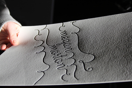
Tell us about the development of your title page design and how you arrived at your concept. One of the things that Megan has played a very valuable role in, is the rise of The School. She isn't precious about her creative process, rather she wants to share it. Styling is a very tactile medium, with shadows and textures playing a lead role in conveying atmosphere, so my concept was a letterpress print, in her signature whimsical handwriting style, and a flat lay photo with retro school props around her letterpressed name. It was a long (but fun!) process trying to maximise the print, props, light and shade for optimum effect.
What materials or computer programs did you use to create the title page, and how did you then prepare it to be submitted for the book? I created the type-based design using Illustrator. Then I had a photopolymer printing plate made and loaded it into my 110-year-old manual printing press. I made about 20 letterpress prints on cotton paper stock, picked the best one, then added the school props in flat lay. I spent almost an entire day with my friend/stylist/collaborator/fellow-eccentric Caroline Buckle who helped me to style and photograph it. And lastly, I took the final photo to Photoshop to get it print ready.
What other fun projects are your working on now? In the footsteps of Megan Morton, I am now working on my proudest project to-date: Letterpress Academy. I'll be running monthly letterpress workshops with designers and illustrators, helping them turn their love projects into prints and sharing with like-minded folk the inky-handed joy of letterpress.
