Title page designer: Kristen Willis
Today we welcome multidiciplinary designer Kristen Willis to the blog, who designed the title page for the interview with film and television director Shirley Barrett in our new book Conversations with Creative Women: Volume Two.
What is your art/design/career background? My creative streak was developed and encouraged from a very early age by playing shop assistant (at 4 years old) in my Nonna's Singer sewing shop. I was constantly exposed to textiles and patterns which dictated creative projects such as drawing all over tables, designing and pattern-making fashion for my dollies and gluing my fingers together crafting paddle-pop structures for my Smurf figurines… The perfect playground for creativity, I was in heaven.
Through my adolescence, fine art became a prominent attribute as I regularly participated in Qld Regional Youth Exhibitions and Competitions. This active envolvement naturally lead to the pursuit of a Bachelor in Visual Arts, majoring with Honours in Printmaking and Drawing in 2006, and enrolment into Shillington College– School of Graphic Design in 2011.
Now as a creative freelancer, I continue to expand my interests by liaising with Graphic Design studios, Creative Contractors and sourcing my own little clientele for those special one-on-one projects.
What drew you to the work of your interviewee, film and television director Shirley Barrett? As an avid follower/junky towards various Australian produced television series, my creative mind exploded at the thought of representing the fantastic film production visionary, Shirley Barrett. What an unbelievable opportunity this is, to show tribute to such a successful industrious icon.
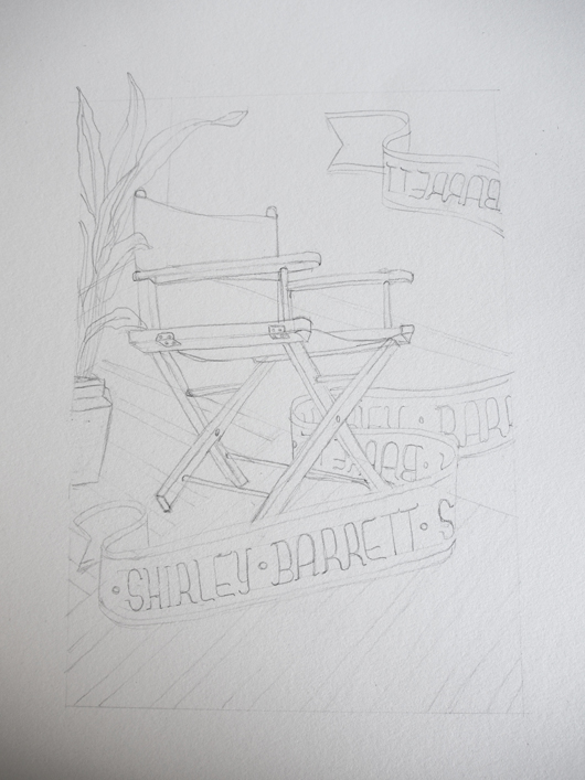
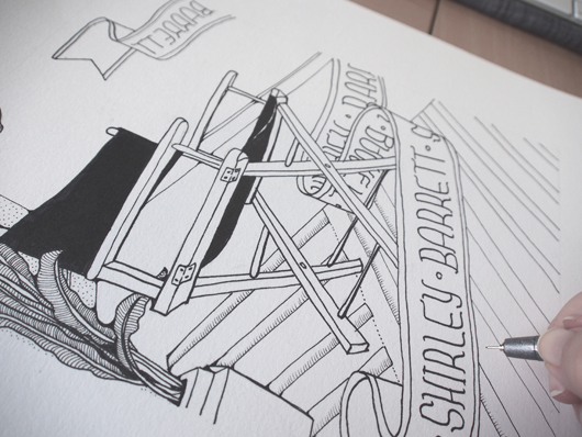
Tell us about the development of your title page design and how you arrived at your concept? With a little background research, black ink and piece of acid-free rag-paper, I decided to hand-draw a highly detailed illustration of a director's chair, prominently placed with in a warm, inviting, eclectic room. This is a celebratory piece, playing tribute to Barrett's creative endeavours and industry achievements.
What materials or computer programs did you use to create the title page, and how did you then prepare it to be submitted for the book? As a mixed-media artist, I literally utilise as many creative platforms as possible. I achieve this by wearing my Printmaker's hat and approach the piece in layers. The composition was initially sketched out in graphite, and then delicately inked in with a fine-tip black marker by hand. The second stage of the process is to scan and digitally colourise the illustration on-screen by using Adobe Photoshop CS6. For this piece I have used both flat colours and textures to create a further sense of depth. The overall outcome is a smooth, clean piece of modern design with a print-art 'touch'. With the click of a button, I was then able save the artwork in a suitable file-type ready for publication.
What other fun projects are you working on now? I have a few really interesting projects on the go right now; such as iPhone graphics for an upcoming zombie game (yes, zombies), illustrative panels for Queensland Museum, art direction and design for a children's storybook, and an ever-going expanding series of illustrative artworks called 'Animalia' which explores the quirky connections between animals and human personality-characteristics.


