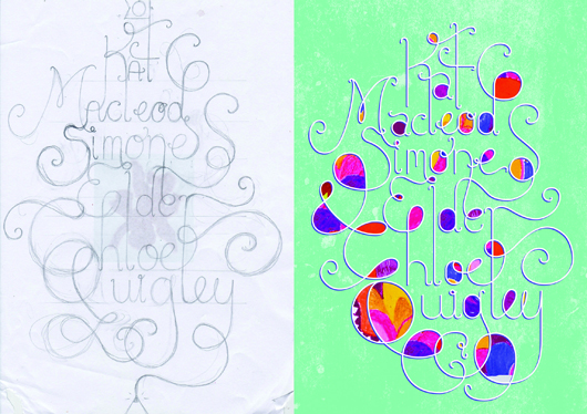
Title page designer: Louise Walker
Today we welcome Louise Walker to the blog. Louise designed the title page for the interview with designers Kat Macleod, Chloe Quigley and Simone Elder of Orotolan in our new book Conversations with Creative Women: Volume Two.

What is your art/design/career background? In 2011 I completed year 12 with a perfect score in Visual Communication Design and was chosen for the VCE Top Designs Awards. In 2012 I began studying Visual Communication Design at Monash University, a course that I am very passionate about.
Alongside university I work as the Graphic Designer for Salvatore Malatesta, the successful owner of many Melbourne cafes such as St Ali. In this job I have designed everything from café menus, to merchandising, vehicle ‘wrap’ designs, cycling gear, and been the Creative Director of the St Ali food stall(s) at Melbourne’s Big Day Out music festival 2013.
I have also been involved in design/art competitions, group exhibitions, and have had work featured in various publications. I was most recently selected for the Melbourne Threesome Typographic Exhibition (2013) where I worked along side Hofstede Design studio and a successful design graduate to produce a fantastic collaborative poster.
What drew you to the work of your interviewees, the ladies at Ortolan? Out of all the women interviewed in this volume, I felt the three women working at Ortolan design studio were one of the most relevant and relatable to me. I love their use of bold patterns and illustrative designs. Illustration is one of my favourite parts of being a designer, so I really admire Kat Macleod’s strong talent in that field. It’s such an inspiration to see how successful Kat, Chloe, and Simone have been in achieving some wonderful graphic designs.
Tell us about the development of your title page design and how you arrived at your concept. To begin my creative process I researched Ortolan’s website and familiarized myself with their particular design style. It was evident there was a strong collective input into their designs, as they clearly work well together as a team.
With these concepts in mind, I began sketching. I initially started working in the hand-sketched style that was used in many of Ortolan’s brandings, but I found my designs just didn’t suit the look I wanted to achieve. Leaving the ink and watercolours, I went back to basics using pencil and paper. I began sketching the three names in a design that joined each name together and weaved all the lines around each other. I wanted to emphasis the collaborative nature of Ortolan’s beautiful studio work.
My best sketch was then scanned and used as a guide for creating a digital version in Adobe Illustrator. From there, I went back and forth between Illustrator and Photoshop until I was happy with my final design.
What materials or computer programs did you use to create the title page, and how did you then prepare it to be submitted for the book? I usually begin a project manually with pen or pencil. So for the title page, I started by playing around with pencil and paper and, after a few roughs, came up with a more consolidated idea. Though still in it’s rough stages, I scanned in my sketch and brought it into a new file in Illustrator. I made it my bottom layer, and built up my layers on top. Using a drawing tablet is essential for this stage. I then use other programs like Photoshop to make further edits and play around with colour, scale, and texture. I decided to add some patterns from Ortolan’s work into my title page design, as to better illustrate their bright and friendly style. Then it was just a matter of sending it off, ready for print!
What other fun projects are your working on now? I am always working on something new and interesting, whether it’s designing tattoos for a university project, creating a logo for an upcoming event in Melbourne, or working on some business cards for a new client. I always enjoy what I do as no two jobs are the same!
Thanks Louise! There's less than a month until 'Conversations with Creative Women: Volume Two' is released, and I can't wait to see this page in print. Have you ordered your copy?.
