Women from History: May Morris
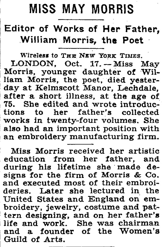
By Julia Ritson May Morris was an embroiderer, jeweller and editor who lived her life overshadowed by her famous father - the arts and craft doyen William Morris.
The Morris family were craft makers who extolled the virtues of a pre-mechanised world. They were living in a world where the word Master had come to mean Master of others, rather than Master of a craft. They preferred the mastery of craft concept.
The Arts and Crafts movement they were part of looked back to the medieval world with a focus on textiles, wood, metal work, and interior design. Plus a little medieval poetry thrown in.
The family business sold medievally themed items to the emerging English middles classes in the late 19th century.
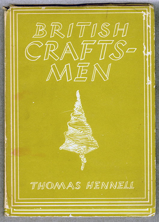
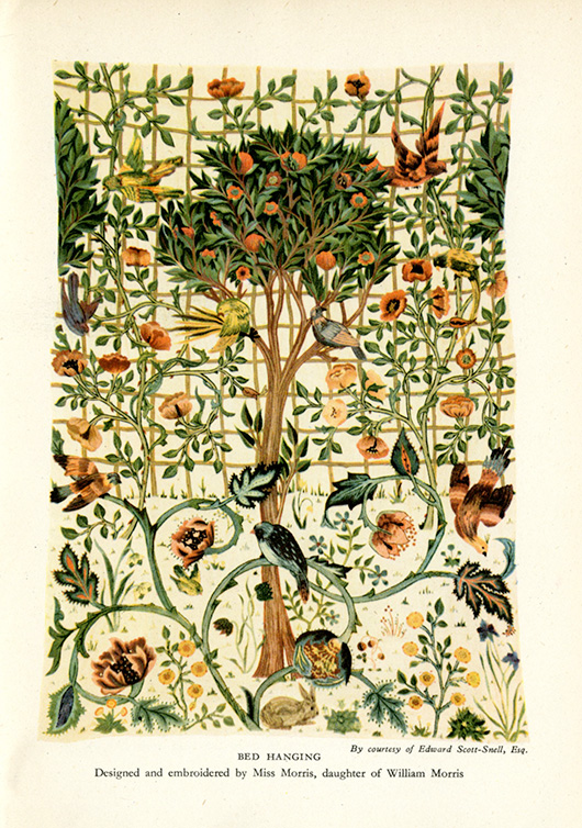
I first came across the work of May Morris in this British Craftsmen book written in the 1940s.
May Morris' work was featured.
The William Morris company resurrected the concept of free-form embroidery. The idea of "Art needlework" highlighted freehand stitching and shading in silk threads to achieve a more expressive result, rather than the formulaic templates of the typical embroidery of the mid-19th century.
May Morris trained at the South Kensington School of Design and at the age of 23 took over the management of the embroidery section of Morris & Co from her father. A very capable young lady.
May Morris went on to write a wonderful book called "Decorative Needlework."
"Chain-stitch has been so called because it imitates, more or less, the links of a simple chain. It is the foremost and most familiar of all similar stitches. It has a very definite character of its own, and though apt to become a little monotonous, is from its laborious and enduring- nature well suited to work that may be subjected to much wear and tear. In the accompanying diagram it will be seen that each little loop grows out of the last; the needle follows the exact direction in which the line of stitches is to lie."
May's insights on colour are worth sharing.
"Of blue choose those shades that have the pure, slightly grey, tone of indigo dye (varying somewhat, of course, on different materials). The quality of this colour is singularly beautiful, and not easy to describe except by negatives : it is neither slatey, nor too hot, nor too cold, nor does it lean to that unutterably coarse green-blue, libellously called ' peacock ' blue ; it has different tones - brilliant sometimes, and sometimes quiet - reminding one now of the grey-blue of a distant landscape, and now of the intense blue of a midday summer sky - if anything can resemble that.
Of reds, we have first a pure central red, between crimson and scarlet (for in the pure colour neither blue nor yellow should predominate), but this is a difficult shade to use; by far the most useful are those 'impure' shades which are modified by yellow, as, for instance, flesh-pink, salmon, orange, and scarlet; or by blue, as rose-pink, blood-red, and deep purple-red. The more delicate of such shades can be freely used where a central red, overpowering in its intensity, cannot. A warning, however, against abuse of warm orange and scarlet, which colours are the more valuable the more sparingly employed, and as dainty little spots of colour treasures indeed.
The most valuable colour next to blue is green, or, rather, equally valuable in its different way, being to some people more restful to the eye and brain.
Here, again, we see the force of the positive and relative value of colours : a cold, strong green, not in itself very pleasing, placed against a clear brilliant yellow, gathers depth and force which it would otherwise lack ; a blue-green may strike the right note in a certain place, but if its use be exaggerated may blemish all. Now, there are certain greens which are brilliant and rich, and, when employed broken with other colours, produce a fine effect; but when a green is to be largely used, it should be chosen of a greyer, soberer shade, such as the eye rests on without fatigue. Avoid like poison the yellowish-brown green of a sickly hue that professes to be ' artistic,' and looks like nothing but corruption, and avoid also a hard metallic green, which, after all, would not easily seduce a novice, as it is very obtrusive in its unloveliness.
Certain definite sets of green will be necessary ; full, pure yellow-green, greyish-green, and blue-green, two or three shades of each. The brilliant pure green that we admire in a single spring leaf is impossible to use in large masses, nor does Nature, whose all-pervading colour is green, give us these acute notes in unbroken mass. You have only to look at the effect of light and shade in a tree in full spring foliage, with the browns and greys of its twigs, to realise this fact: the great masses of green meadow-land, besides showing a variety of colour that may be overlooked in a careless glance, have a tenderness of tone that is quite beyond and above any possible imitation in art.
For a central yellow choose a clear, full colour that is neither sickly and greenish, nor inclined to red and hot in tone. Of impure yellows, pale orange and a warm pinkish shade that inclines to copper are useful, besides the buff and brownish shades that will sometimes be wanted for special purposes. These, I think, include all the yellow shades that you need trouble about. A certain experience is wanted for the successful use of yellow, so that those who take a special delight in the intrinsic beauty of this fine colour will do well to avoid too enthusiastic an introduction of it into their work.
Purple again is one of the 'difficult' colours with which we must, as it were, hit upon the exactly right tones to use. There are two valuable purples - a rather full red-purple, tending to russet, and a dusky grey-purple, which is, if the right tone is obtained, a very beautiful, and, if I may say so, poetic colour."
A poetic lady.
Julia Ritson is a Melbourne artist. Her paintings investigate colour, abstraction and a long-standing fascination with the grid. Julia has enriched and extended her studio practice with a series of limited edition art scarves. She also produces an online journal.


