
Title page designer: Carla Hackett
We talked to Carla Hackett a little while ago about her graphic design background and blossoming lettering and illustrative career. Today, we're happy to welcome Carla back to the blog, chatting about putting chalk to board for her title page design for Alischa Herrmann in Conversations with Creative Women: Volume Two.
What is your art/design/career background? I grew up in Wagga Wagga NSW, a regional town that as it turns out has a thriving creative community! I went to a very creatively nurturing school and was heavily involved in performing and the arts. (Fun fact: I moonlighted as Crystal Chandelier in a 60’s girl band called The Fabulous Chandeliers for 7 years!). As a kid I would draw everything and had one of those Letraset typeface books and I would draw letters all over my notebooks and do bubble writing for my friends assignments.
I studied Graphic Design at university and then moved to Sydney and worked at some great design agencies for 6 years as an Art Director and Designer. But after a while, I felt a little creatively unfulfilled, so in 2011 I quit my job and moved to Berlin. It was a great time to hit the reset button and to soak up the inspiration of Europe! I like to call them my ‘Bowie years’.
To give myself that time to think really changed everything and it allowed me to start playing again! That’s when I discovered lettering. I went along to a hand lettering workshop with Ken Barber from House Industries and really enjoyed the simplicity of picking up a pencil again.
It was the perfect mix of my design skills, typography and using my hands to illustrate letters. I love that each piece of lettering is unique. It was then a natural progression to start lettering in chalk. I love the ephemeral nature of chalk but also how tactile each piece is. You can see the human hand has been involved.
I returned to Melbourne and found the lovely Little Gold Studios to set up shop and focus on hand lettering.
What drew you to the work of your interviewee? I have a deep appreciation for letterpress, and recently had the chance to print one of my own designs on a press that belongs to Saint Gertrude Lettering in Little Gold Studios. The labour of love that goes into printing is all worth it when you see the first impression come off the press. There’s something about the feel of the cotton paper and the impression is really quite special. Being someone who painstakingly hand crafts lettering, I was drawn to illustrating Alischa’s name. There’s also something about the nostalgic quality of chalk that resonates with the tangible nature of the letterpress machines. There is no electronic function involved, it was all done with a human touch by these indestructable and timeless machines.

Tell us about the development of your title page design and how you arrived at your concept. I knew that I definately wanted to create the piece in chalk for that hand made touch. I wanted there to be some elegance in the lettering and also some beautiful detail just like Bespoke’s signature look. I looked closely at Bespoke’s website to get a feel for the kind of design they produce. I also looked at some of my vintage lettering books to get some inspiration for the lettering and floral detail. To include a letterpress element, I googled for images of the Chandler and Price machine and realised how beautiful this piece of machinery is. They certainly don’t make them like that anymore!
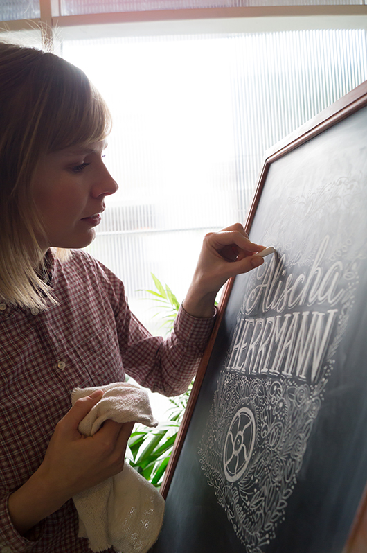
The fly wheel is what keeps the momentum of the rollers spinning, you get it going with a foot treadle. The fly wheel is such a beautiful and recognisable part of the letterpress I wanted to include that element surrounded by beautiful flower details.
What materials or computer programs did you use to create the title page, and how did you then prepare it to be submitted for the book? I started with paper and a pencil, sketching out my idea very roughly to get some ideas of composition. I knew I wanted to get a lot of detail into the piece, but knew a lot of that would happen as I drew it on the board.
I drew the piece on my chalkboard at 200% in good ol’ dusty chalk and photographed it so that it would retain the detail when scaled down. I didn’t want to do too much in Photoshop, as I wanted it to look like it was done on the chalkboard. I upped the contrast slightly so that the blacks were black and the whites were white.
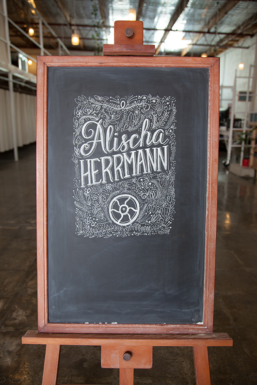 The final chalkboard design was photographed and then tweaked in Photoshop before submitting for the book.
What other fun projects are your working on now? I’m currently working on my first range of hand lettered greeting cards. I’m currently learning how to use a letterpress that is in my studio, so that I can print them with my very own hands!
I’m working on few custom hand lettering pieces for stationery and prints. And recently did some chalk lettering I did was the focus of the Westfield Christmas campaign.
I have a few wedding commissions for wedding season, creating chalk signage and hand lettered wedding stationery suites.
I’m also working with a coffee brand on some lettering for their packaging. Coffee and lettering are my favourite things!
You can find 'Conversations... Volume Two' in our online shop or at select stockists nationally. And be sure to check out Carla's new website at www.carlahackett.com
Title page designer: Laura Blythman
You may remember our interview with Laura Blythman recently. But did you know she also designed the title page for the interview with Ubabub founder and designer Natasha Dumais in our new book Conversations with Creative Women: Volume Two? Today we chat to Laura about her design.
What is your art/design/career background? After completing a BA in Graphic Design, I cut my teeth working in-house at Hallmark Cards Australia, Cristina Re and Typo (Cotton On) before branching out into the freelance world.
Over the years I feel like I've designed pretty much everything under the sun: greeting cards, gift packaging, stationery, home office, home decor, textiles, apparel, custom illustration, hand-lettering, wedding and event stationery, brand identity, blogs, advertising, print collateral and website interface.
I've been lucky to work with many brands over my years as a freelance designer including: T2 teas, Clickon Furniture, Typo, Cotton Kids, A Skulk of Foxes, Lark, Peachy Gift, La De Dah Kids, Mr.Wolf Kids, Stuck On You, Zoo York, Kiitos - Living By Design and Swan Emporium. Not to mention some exciting new projects to be released in the coming months with some more dream clients!
What drew you to the work of your interviewee, Natasha Dumais of Ubabub? I’ve loved the clean and modern aesthetic of Ubabub products for a while now. Ubabub and Natasha have popped up on my radar quite a bit with features on TDF, Pinterest, Instagram and the like. Natasha is a super clever and inspiring local creative.
Tell us about the development of your title page design and how you arrived at your concept. My inspiration is drawn from the geometric shapes that form Ubabub’s branding elements as well as the delicious colour palette of Natasha’s now super famous jumbo ‘Sundae’ print. Concept development began with lots of scribbles, sketching layouts and a heap of ideas – some good and some bad!

What materials or computer programs did you use to create the title page, and how did you then prepare it to be submitted for the book? I scanned my hand drawn shapes and then coloured and created the lettering and composition in illustrator. That’s it. Nice and simple.
What other fun projects are your working on now? So many! To name just a few, I am: - dreaming up and planning Stage 2 of my A Skulk Of Foxes collaborative range (the team at ASOF are so much fun to work with!) - branding and illustrating a cool kids’ web store - illustrating for a linen range collaboration with an artisan bakery - rebranding a vintage market - designing and illustrating a candle box collaboration - branding a cute kids look-book and other printed goods - compiling a range of my illustrations for totes, tees, etc for a super cool new artist collective - doing the brand and web illustrations for an ace jewellery/homewares label - designing a charity T-shirt - trying my hand at a tattoo design - creating a few commissioned artworks, inc paper feather hangings - working on some yardage and print designs for my own dream projects.
Interview: Julia Denes of Woodfolk
By Andrea McArthur

For my final interview of 2013, I am delighted to reveal the story behind a creative new accessories label, Woodfolk.
I discovered Woodfolk at the Finders Keepers Market held recently in Sydney, but it was not long before this that Woodfolk was officially launched at Life Instyle Melbourne. Despite its infancy, word of this stylish label is certainly spreading fast.
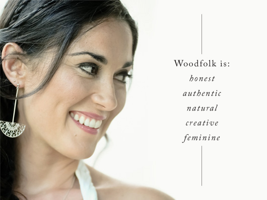
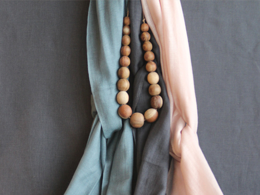
Julia Denes is the founder and jewellery designer behind Woodfolk. Julia created the label as a break from the fast moving modern world in which we live, with the aim to bring you down to earth. Woodfolk achieves this through simple design, a gentle colour palette and by using only natural materials and fabric.
All Woodfolk products are Australian designed and proudly made by Nepali artisans, throughout local and remote areas of Nepal. The Nepali artisans use their master skills to create beautiful and quality accessories through traditional carving, natural dying, knitting and weaving techniques.
What led you down your current path?
I originally studied a Bachelor of Fine Arts at COFA majoring in Photography, before taking off around the world on a two-year travel adventure that took me to 21 different countries. After spending the last six months of my trip in Central America stringing seeds and shells on banana tree vines, I knew jewellery was my calling.
When I got home I straight away enrolled at Enmore Design Centre, got myself an apprenticeship and began learning to hand-make fine jewellery. Over the years I worked for some of Sydney’s most prominent jewellers both designing and making. In 2009 I started my first business Julia Denes Jewellery that specialised in custom one-off pieces.
Starting Woodfolk felt like a very natural progression. The idea was born after feeling the need to work with more earthy materials and all things natural, combined with my love of travel. I worked on the business for about a year before I launched it at Life Instyle Melbourne a few months ago. It’s got such heart to it, I absolutely love working on it and love the response I’ve been getting from stores and customers.
Who do you admire in Australian accessories design?
I have a lot of admiration for natural, authentic, down to earth businesses like Elk, Nancybird and Ink and Spindle, just to name a few. I find it very inspiring the way they run their businesses. I also love and appreciate all the (much needed) real life, motivational work Clare Bowditch is doing.
What has been your greatest career achievement to-date?
Starting my new business Woodfolk has been my greatest and proudest achievement so far. One of the obstacles I faced in the earlier stages was finding the right people to work with overseas to make the wooden components of my jewellery. I knew I could have gone somewhere like China or India and work with a factory, however that seemed to defeat the purpose of my business. So after lots of research and time spent in Nepal, I found the most lovely, talented family to work with and I’m so happy to be supporting them. I already have my eyes set on a couple of other countries for new product ranges as well.

Describe a typical day at work…
I don’t really have a typical day as I’m running two businesses at the moment and wearing many hats. However, mornings generally start with emails and lots of cups of tea. Days can be filled with stringing and finishing all the wood jewellery; making the ceramic jewellery; getting Woodfolk orders ready and sent; preparing for different design markets and trade shows; liaising with stockists and contacting new stores; creating custom jewellery pieces; developing new ideas to build on the Woodfolk range; all the usual business stuff; and the list goes on. I do like to finish my day with some yoga, pilates or a walk to clear my head – otherwise I start to become a crazy person!
What future plans do you have for Woodfolk?
I have a lot of plans for Woodfolk and see a lot of potential. I’m planning to expand the jewellery line to include more ceramic pieces which have had a great response. A new line of natural style market bags and hand-dyed cotton scarves are already in progress, and I’m considering including some homewares to the range for next year. I’m in no rush though, so I’ll let the nature of this business take its course rather than try and do everything at once.
5 Questions in 5 minutes – Getting Personal:
Studio Sounds, what's playing?
Always something chilled like Ray LaMontagne or Birdy.
What are you currently reading?
Daring Greatly by Brene Brown.
What are you looking forward to?
My upcoming (and much needed) holiday to Vietnam with my husband.
Can you share your go to resource for inspiration?
Blogs like The Design Files, Design Sponge, Books Kinokuniya on George St in Sydney (such a great book store) and I’m a total Pinterest addict (find my page at pinterest.com/woodfolknatural)
What is your local area's best kept secret?
There aren't many secrets left unfortunately in Sydney but I can share some favourite spots: Bondi Beach Farmer’s Markets every Saturday; Breakfast at Bread and Circus in Alexandria; and afternoon/evening walks in Centennial Park.
-----
If you've fallen in love with Woodfolk like I have, enquiries can be directed via Julia's website, Facebook or follow her on her blog.
Andrea McArthur has a passion for all things visual and works as a freelance Graphic Designer. Type is her true love and goes weak at the knees over beautiful design. You'll find her sharing design related musings via @andyjane_mc
Title page designer: Amy Constable
Today we chat to Amy Constable, who designed the title page for the interview with stylist Megan Morton in Conversations with Creative Women: Volume Two.

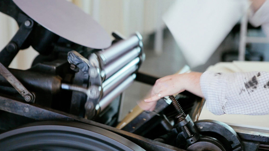
What is your art/design/career background? I began my career at 21 as an aspiring creative copywriter at an ad agency (I had heard that's how Bryce Courtenay got his big break and in typical Gen Y fashion, I assumed copywriting was to an aspiring writer the equivalent of burger-flipping to an aspiring chef). The reality was I spent my days cutting ads out of newspapers, researching small town rags and writing the occasional classified ad. I met a designer there who said my handwriting would make a great font, so as a fun little side-project we began working on 'Amy Sans' together. He coaxed out of me some lettering and typography skills that I'd all but ignored in my pursuit to become a writer and encouraged me to side-step into the visual side of the industry. I created a portfolio, landed a job working as an Art Director's assistant and over the next 6 years, I built up my design and typography skills on the job. I decided I wanted to get more hands-on with my work at about the same time I first discovered letterpress. I doesn't get more hands-on than letterpress and for the last 4 years my little business, Saint Gertrude, has kept me busier (and my hands grubbier!) than I ever imagined possible.
What drew you to the work of your interviewee? Megan Morton is a total design industry celebrity, but what I love most about her is her approachable and slightly eccentric attitude! Her styling projects go beyond the aesthetics of 'what's hot right now' and have a sense of intelligence and individuality to them. I aspire to the same kind of attitude in my own work.
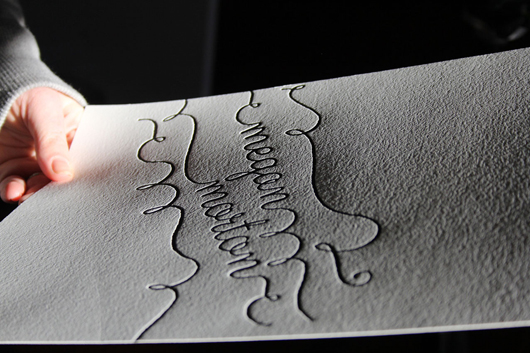
Tell us about the development of your title page design and how you arrived at your concept. One of the things that Megan has played a very valuable role in, is the rise of The School. She isn't precious about her creative process, rather she wants to share it. Styling is a very tactile medium, with shadows and textures playing a lead role in conveying atmosphere, so my concept was a letterpress print, in her signature whimsical handwriting style, and a flat lay photo with retro school props around her letterpressed name. It was a long (but fun!) process trying to maximise the print, props, light and shade for optimum effect.
What materials or computer programs did you use to create the title page, and how did you then prepare it to be submitted for the book? I created the type-based design using Illustrator. Then I had a photopolymer printing plate made and loaded it into my 110-year-old manual printing press. I made about 20 letterpress prints on cotton paper stock, picked the best one, then added the school props in flat lay. I spent almost an entire day with my friend/stylist/collaborator/fellow-eccentric Caroline Buckle who helped me to style and photograph it. And lastly, I took the final photo to Photoshop to get it print ready.
What other fun projects are your working on now? In the footsteps of Megan Morton, I am now working on my proudest project to-date: Letterpress Academy. I'll be running monthly letterpress workshops with designers and illustrators, helping them turn their love projects into prints and sharing with like-minded folk the inky-handed joy of letterpress.

Title page designer: Jasmine Mansbridge
Today I'm pleased to introduce Jasmine Mansbridge, who designed the title page for the interview with Nancybird founder and designer Emily Wright in Conversations with Creative Women: Volume Two.
What is your art/design/career background? I started painting when I was seventeen and it is something I truly love doing. In March this year I had a solo exhibition in New York, which was a real highlight for me. I often spend time drawing and playing around with a pencil and paper and this is how my ideas develop.
What drew you to the work of your interviewee, Emily Wright of Nancybird? I moved to Victoria three years ago, and one of the first things I did was visit the NGV, where I first saw Emily's Nancy Bird products. I loved them for their quality and original aesthetic. I purchased my first Nancy Bird bag not long after that and I still use it most days. It is practical and still looks as good as new. So, It was a wonderful feeling, and a privilege to be given the opportunity to illustrate for Emily. Probably about time for a new one though??!
Tell us about the development of your title page design and how you arrived at your concept. I drew up four rough designs before visiting Emily in her Northcote studio, I wanted to get a visual of her and her space and (most importantly) get her opinion on what she thought suited best with her brand. We chatted about the elements she liked best and this gave me direction for the final illustration. I loved the collaborative aspect of the design process and the input she gave me was very helpful.
What materials or computer programs did you use to create the title page, and how did you then prepare it to be submitted for the book? I simply used pencil, pen and acrylic paint to create my design. I like the good old fashioned approach to art making, and truthfully, I never learnt to do anything clever on a computer and so it's all I have to work with anyhow.
What other fun projects are your working on now? Right now and am busy creating work for a solo exhibition at the Rtist Gallery in Prahran in March 2014! I like being busy and always have a painting on the go. I feel blessed to be able to be doing something I love.
Interview: Anna Lonsdale & Meghan Fletcher of Good Grace and Humour
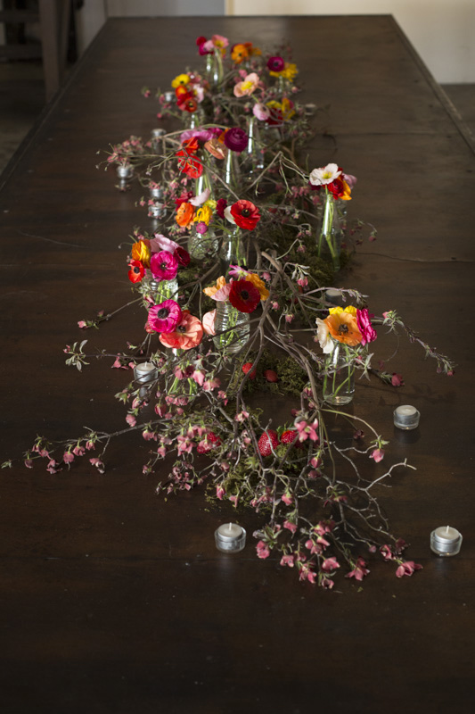
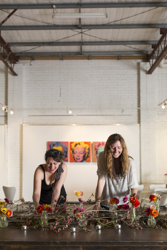
Good Grace and Humour were the creative force behind the design and installation of beautiful hanging bouquets at our recent book launch. A relatively new business, their story is unique and a testament to the idea that two heads are often better than one! Please welcome Meghan Fletcher and Anna Lonsdale...

Tell us about your backgrounds, how you met and what spurred you to launch GG&H?
Meghan: I’ve spent most of my working life in various editorial positions at different book publishing companies in Melbourne. I really enjoyed creating beautiful books and being a part of the creative industry, but was disheartened by the publishing industry becoming depressed because of flagging book sales. I met Anna during my last editorial job. We both lived in the inner-west and drove to the outer-east, so we carpooled to work. We’d spend around two hours a day driving together – chatting and dreaming and drinking coffee. We soon realised that if we had each gone down a different career path, we’d probably be working with flowers. So we threw caution to the wind, and gave it a go.
Anna: I'd spent all of my professional career in the publishing industry – my most recent role as Executive Assistant supporting the dynamic CEO at the company where Megs and I met. I had this strong drive to be a corporate babe, but deep down I knew that I had more creative and wholesome aspirations! The irony is that although we had worked together for over two years before we started carpooling, I had very little to do with Megs and we didn't really know each other. I think she was a little surprised to discover I was actually this funk-loving hippie masquerading as a ‘girl friday’. I had always mucked around with flowers – experimenting andplaying – and I was looking at ways I could get into the industry and lead a more balanced life outside of an office. Once I learned Megs not only had the same passion but the same design aesthetic it was like,‘Well, the stars have aligned for a reason! We’d better give this a go!’. We launched the business at a backyard ‘Beer and Bouquets’ party which was kind of setting the tone forGG&H – eliminating the wank and breaking the traditional rules of floristry.

Did you juggle full-time work and the business in the beginning, and at what stage did you decide to give GG&H your full attention?
Meghan: I juggled full-time work and GG&H for three months before giving GG&H my full attention. I left publishing sooner than originally planned because I wanted to fully immerse myself in the new floral industry. I knew there was a lot to learn but, equally, I knew many of my skills were transferable. I’d spent nearly 10 years critiquing narrative, themes, design, colour and space, so I couldn’t wait to start working with this new, flexible and variable design element.
A: I still work part-time managing a Physiotherapy and Pilates clinic. This is a challenge because I am so conscious that Megs is handling a lot of the operational day-to-day business functions, while I'm there for the hands-on, creative aspects. I have a habit of going hard till I keel over and so Megs is very good at saying ‘Take a break, and don't feel guilty’. I guess that's my juggling act –not juggling the two jobs as such,but remembering to schedule in my own time. My team at the clinic are also incredibly supportive and understanding, so I am very lucky.

What are your favourite floral design projects to work on?
Meghan:I love a good wedding! Each wedding is unique with its own story, which makes each floral design interesting to work on. I really enjoy meeting the brides and collaborating with them to create a killer event. I absolutely love it when a bride is willing to take a risk and choose something extraordinary over the ordinary.
Anna: I get a real kick out of styling projects –trusting our instincts and being led by the colourful and seasonable bounty at the markets.
I do love working with wedding clients –developing and fine tuning a concept and then seeing it come to fruition on the big day.Somehow our weird and wonderful ideas pay off as envisaged!
I also enjoy the ongoing supply to cafes, probably because I love the idea of feeling part of the rhythm of the city. I like the banter and I do appreciate a good cup of Joe!
What skills do each of you bring to your business and what do you think is a key ingredient of going into business with someone?
Meghan: I’m steady and precise and Anna is quick and systemic. We work best when we work together because our skills and personalities complement each other.
Our balanced approach is entirely an accident, of course. When we threw caution to the wind earlier this year, we barely knew each other. Therefore, I think the key ingredient of going into business with someone is being able to laugh until you snort while you’re trapped in peak-hour traffic for a couple of hours together. It’s also about having supportive friends and family (particularly an amazing husband whois the Good, if Anna and I are the Grace and Humour!), who can laugh with you when you drag them along for the floral ride. As long as everyone is still laughing at the end of the day/week/month/year, GG&H will be fine.
Anna: We are an incredibly complementary duo! I move fast but I need to be tidy and organised in my set-up and routine. Megs is meticulous and focussed on the detail –she's definitely quality control.She could have chaos going on around her and her attention will be 100% on that bouquet she's working on! I'm more, ‘I need to change the music, the vibe’s not right for my method today’ ...Megs is,‘Do we have music playing?’
In terms of a ‘secret’ to going into business together, I would have to say we have learnt to be very intuitive. When things aren't gelling there is always a reason and we'll go, ‘Hang on, why are struggling? Oh, we haven't eaten or we haven't had a break!’. It has been a real blessing to be in a situation where we can support each other and be empathetic as friends as well as business partners. The unique thing is that we weren't twofriends who went into business –the friendship has developed from living in each other's pockets as we've grown the business! I also need to mention the incredible support from Megs’ husband, Paul, who has been a champion of GG&H since day one and has graciously let us work from their home, despite being woken up by my cackle in the early hours of the morning! I guess another secret would be that we are both pretty chipper in the morning –Paul might say annoyingly so –but we think we're pretty hilarious.
What are your goals for Good Grace and Humour in 2014?
Meghan: My goals for 2014 are to steadily increase the number of weddings and interesting events we’re involvedin, to meet and partner with motivated and talented people (partnering with the Creative Women’s Circle for a couple of events this year was so much fun!), to move into a new workspace and decorate it in a fabulous way (I’m a massive fan of interior design so I’m itching to get into a new blank space), and to juggle the demands of GG&H with those of becoming a new mum (the newest member of the GG&H team will obviously be a flower baby – girl or boy!).
Anna: We are so itching to move into a new workspace and that's got to happen in the first half of the year.
Following sustainable practices is very important to us, and I am interested in learning more about the process before we get our cut flowers from our suppliers and ensuring that those we buy from have a similar ethos. There are some incredible growers in Victoria and I want to connect with more of them. That collaborative aspect and feeling part of a community is very important to me –it's why we have found the Creative Women's Circle so incredible and why we choose to do things like support a radio show on PBS. For me that's what being in a creative industry is about. It's about supporting and giving high-fives to other creative cats out there who have at some point chosen to follow a less conventional path –that's where new ideas are born, and it's a lovely place to be!
Thanks for the insights, Anna and Megs! You can see more of their stunning floral work at their website or follow on Instagram @goodgraceandhumour.
All photos by Martina Gemmola
Title page designer: Nikki Donald
Nikki Donald has a raft of skills - interior design educator, artist, textile designer and... Conversations with Creative Women: Volume Two title page illustrator! Nikki took on the task of illustrating a title page for Georgia Hobart of Hobes. Today we chat about the design and her larger body of work...
What is your art/design/career background? From sign-writing, graphic design, design education and now surface art and design - it keeps evolving! I love doing things by hand and on the computer.
What drew you to the work of your interviewee? Anyone who designs something shiny in leopard print (for example, the Sparkler Hobe) is my friend for life! I'm also really inspired by Georgia's leap of faith in starting her brand - it encourages me to keep focused on my design dream!
Tell us about the development of your title page design and how you arrived at your concept. Oh...I'm so bad at this! I'm really, ummm, "organic". Seriously, I just immerse myself in my subject matter and start playing with my favourite materials - papers, feathers, thread and stitching and a bit of mixed media. I always work on 3 or 4 ideas at the same time then see how they evolve. I LOVED doing this project - I was obsessed, every night for about 2 weeks I just played with the materials. It always comes together, and I've learned to trust the process and really enjoy it, not just the end result.
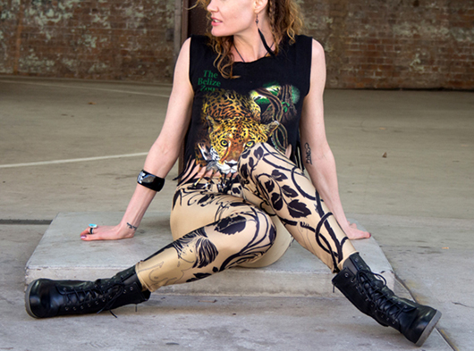
What materials or computer programs did you use to create the title page, and how did you then prepare it to be submitted for the book? I got the Mad Hatter from an old copy of Through the Looking Glass and the shoes are a photo from Georgia's website which I traced onto watercolour. The background colour is mixed media: pearlescent ink and bleach. I've also used some old wallpaper in there...um, I think there's a bit of a paper doily as well, ha ha! Then finished off with some metallic thread which I've hand stitched. I scanned the image into Photoshop and added the text, just really simple as there's alot going on in the image itself.
What other fun projects are your working on now? LEGGINGS! Part of my business, Coup De Foudre, is a fashion range called Art For Your Ass. I'm about to start work on the summer range - some long tube skirts, singlet dresses and maybe some cozzies.
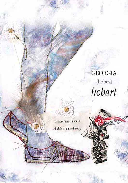 The final product by Nikki.