Title page designer: Emma Rickards
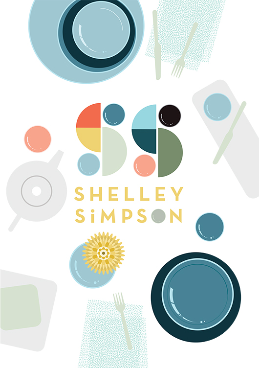
To have illustrator Emma Rickards design the title page for Shelley Simpson in 'Conversations with Creative Women: Volume Two' was a no-brainer - Emma is a big fan (and collector) of Shelley's ceramic wares, and both artist's love and celebration of colour, shape and line is evident in their respective work. Today we chat to Emma about her background and how she created the title page design for Shelley's interview.

What is your design background? I originally trained as an art teacher many moons ago, and taught secondary school art and design for ten years. During that time, I also completed a Graduate Diploma in Graphic Design at RMIT. I wanted to see what it was like to work on my own projects, and to spend time ‘doing’ rather than giving myself completely to teaching. Shortly after, I left the classroom in search of new adventures, and began working on my own graphic design projects, lecturing in Art Education at The University of Melbourne and studying a Master of Design at Swinburne Uni. Nowadays, I combine lecturing and graphic design with raising two children, and life is completely bonkers.
What drew you to the work of Shelley Simpson? I’ve been a huge fan of Shelley’s tableware range Mud Australia for some time now, and I’m the lucky owner of a small collection of Mud bowels, plates and cups. Well, it’s an even smaller collection since my husband knocked one off the shelf last month, but let’s not revisit the horror. So naturally, I was keen to celebrate the creator of a product I loved. I knew the simple forms and delicious colour palette of Mud would suit my illustrative style, and I’m also going through a ‘bird’s-eye view of tabletops’ phase at the moment, so the subject matter fit like a glove.
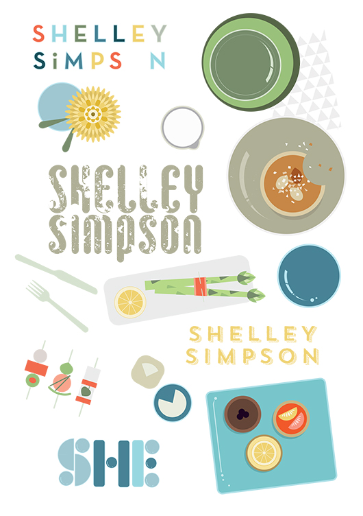
How did you develop your title page design, and arrive at the final concept? I began by compiling a Mud Australia Pinterest board full of lavishly styled shots of past collections, together with bird’s-eye pics of food and table arrangements. These images were referenced as I sketched possible page layouts, and considered how tableware pieces could be arranged into typographic forms. Once on the computer, I also considered stamping Shelley’s name onto a napkin or tablecloth, or creating the letterforms from noodles or spaghetti shapes. Superfluous drawings of food and distracting patterns were slowly discarded in favour of a design where Shelley’s creations could take centre stage. Symmetrical layouts gave way to more scattered, dynamic designs, while a centrally placed tray presented itself as the perfect spot for a title. As an asian-style meal evolved on the screen, ‘Shelley’ took shape from grains of rice, while ‘Simpson’ grew from a sympathetic typeface called Trend. A colour palette was chosen to reflect past Mud collections, with blue tones used to ‘quieten’ the busy scene, and warm accents providing some punch & pop.
What materials/computer programs did you use, and how did you prepare it for the book? Shelley’s title page was created using the Pen, Shape, Gradient & Type tools in Adobe Illustrator and the computer mouse, plain and simple! I’ll often trace a scanned sketch when developing an illustration, but this piece evolved as I played with the relationships of elements, and established a sense of movement, hierarchy and harmony.
What other fun projects are you working on now? I’m currently teaching Visual Art Education as part of the Master of Teaching: Secondary program at The University of Melbourne. It’s fun and challenging in equal parts, thanks to the juggle of mothering small children and having to turn up each week with my brain intact, clothes on and content prepared. I also create classroom resources (booklets, posters, teacher’s notes and a short movie) for teachers of Visual Communication Design, and sell these via my website. I’m really passionate about design education in secondary schools, and I love providing teachers with beautifully designed and useful stuff that will make their job that little bit easier. There are also some illustrated family portraits waiting to be completed in the lead up to Christmas. After that, I might sit on the couch for a couple of nights and watch reruns of The Bachelor.
You'll have to get the book to see the stunning result Emma created for Shelley's interview! Find it online or instore here.
Meet the Makers featuring me, Tess McCabe!
Since the release of the book, a couple of people have (jokingly, I hope) suggested that I should interview myself for the Conversations with Creative Women series. To which I reply, "Um, how weird and awkward would that be!?", teehee. But if you are curious as to how I ended up in this small-time publishing game, or would like to know more about CWC and my career to date, you're in luck - Shelley Panton (one of the book's retail stockists) has invited me as her guest at her next Meet the Makers event!
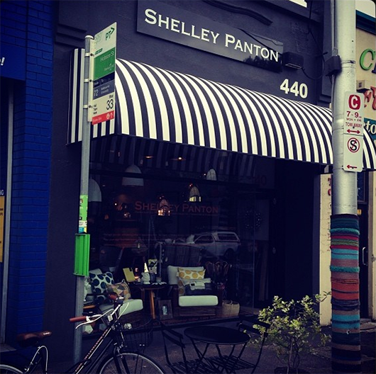
Image from Shelley's Instagram
Meet the Makers is a monthly series of talks and evening soiree. At these events, Shelley interviews the artisans behind the products she stocks in front of a 'live shop audience', to learn about their motivations, process and background.
My interview with Shelley will be the first Meet the Makers at her gorgeous new store front on Malvern Road, Prahran. There will be wine, nibbles, and a chance for you to spend time in a beautiful space with like minded folk and/or get all your Christmas shopping done in one hit!
Event details as follows:
Wednesday 27 November 6.30-8.30pm 440 Malvern Road, Prahran
Tickets are available here.
Conversations with Creative Women: Volume Two - a big thank you...
What a weekend! Conversations with Creative Women: Volume Two was officially launched, and good fun was had by all.
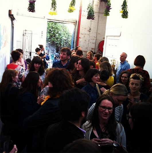
The Launch!
We raised $500 for Seven Women via our mammoth raffle, and our taste buds were tantalised thanks to our generous sponsors Ben Haines Wine, Two Birds Brewing and Sweet Valentyne.
Big thanks to our sponsors Good Grace and Humour for their beautiful floral display - it really made the space at Albert St Studios come alive! And extra high fives to my helpers on the night - Martina Gemmola, Caroline Kennon, Liz Ickiewicz, Sarah Chapman, Sean Box and Amy Vuleta.
Stockists
So now, with the book officially 'launched', where can you find it? Well, apart from purchasing online, the following retailers have copies for sale in their lovely stores:
Melbourne:
Shelley Panton 440 Malvern Road, Prahran VIC (03) 9533 9003
Pieces of Eight Gallery / Edition X 28 Russell Place Melbourne VIC (03) 9663 3641
Craft 31 Flinders Lane Melbourne VIC 03 9650 7775
Perth:
Aspects of Kings Park Fraser Avenue West Perth WA (08) 9480 3900
Sydney:
Follow 380 Cleveland Street Surry Hills NSW 02 8068 2813
Brisbane:
Nook 19 Browning St West End, Brisbane Qld (07) 3255 3589
Adelaide:
Booked at North Adelaide North Adelaide Shopping Village 81 O'Connell Street North Adelaide SA phone: 08 8361 9866
So pop in store and pick up one for your special creative lady friend for Christmas :)
Pre-orders posted
Thanks again to everyone who pre-ordered a copy of the book... if you're based in Australia you should have received your copy by now, and if you're international it has been posted and is on its way.
eBook now available
One last thing... if you're so inclined you can also get Volume Two as an eBook for your iPad, Kindle or as a PDF. Save a tree, save storage space, save money! Ebooks are only available via our online store.
Our book launch raffle prize pack. Wowsers.
If you follow CWC on social media, you're probably well aware of this by now. But it begs repeating: tomorrow night we officially launch Conversations with Creative Women: Volume Two! It's shaping up to be a fun night to mingle with the local creative community and celebrate the work of the 30 women involved in the book.
I've been overwhelmed by the response to my call out for donations to the raffle which will be held on the night, profits of which will go to an fantastic not-for-profit organisation called Seven Women.
There will be three prize packs comprising a selection of the following...
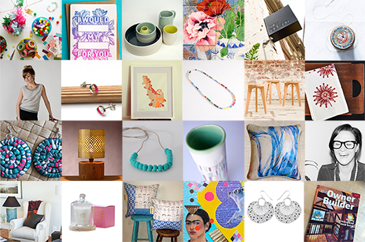
One ticket to Unleash Creative Melbourne --- Stationery package from The Hungry Workshop ---Ceramic set by Cone 11 Ceramics --- Greeting card set by Gabby Malpas --- Lunch for two at Miss Jackson cafe --- Photo print by Kirsten Bresciani --- Cygnet Tunic by Jack of Diamonds --- Earrings by Liz Ickiewicz --- Framed art print by Jasmine Mansbridge --- Necklace by Shuh Lee --- Stools by Gratton Design --- Tea towel by Pinch River --- Earrings by Maryann Talia Pau --- Lamp by Reduxr --- Necklace by Tote --- Ceramic vessel by Ichimu --- Two cushions by Unearth Co ---Personal styling session with Sarah Egan --- Interior design consultation with Siobhan Donoghue --- Scented candle by Murphy & Daughters --- Two cushions by Balala --- Handmade journal by Kitty Baroque --- Earrings by Polli --- Subscription to The Owner Builder Magazine
Thank you so much to everyone who generously donated!
We will also have books for sale at the launch, packaged in the limited edition Frankie & Swiss/Emily Green/Catherine Campbell/Lara Cameron fabric wraps. It will be your last chance to get one of these, if you missed the pre-order special offer. Note though that all sales will be cash only!
Here are the details for the launch again:
Friday 15 November 6-8pm 87-89 Albert Street, Brunswick (entry via laneway)
So bring your friends and partners, and if you have a spare minute, please RSVP.
See you there!
Extra thanks to our awesome book launch sponsors: Ben Haines Wine, Two Birds Brewing, Sweet Valentyne, Good Grace & Humour, Gratton Design, The Public Studio and Tribe Communications.
Title page designer: Camille Condon
Today we welcome Camille Condon to the blog, who is probably better known around the internet as Ms Curlypops! Cam designed the title page for the interview with illustrator and artist Dawn Tan in our new book Conversations with Creative Women: Volume Two.

What is your art/design/career background? I’m a self taught designer. I studied art through my early high school years, but then chose to focus on maths and science and received a Bachelor Degree in Manufacturing Technology.
The creative bug always remained within, and although manufacturing was my day job, I spent any free time painting, drawing and creating.
A few years ago, I decided to teach myself to sew, which in turn led to an obsession with fabrics. It seemed to be kind of a natural progression to move into the world of fabric design.
What drew you to the work of your interviewee, illustrator and artist Dawn Tan? I’ve been following Dawn’s career online for quite a few years now. I love her playful, joyous sense of style, and of course, I’m drawn to her wonderful use of colour!
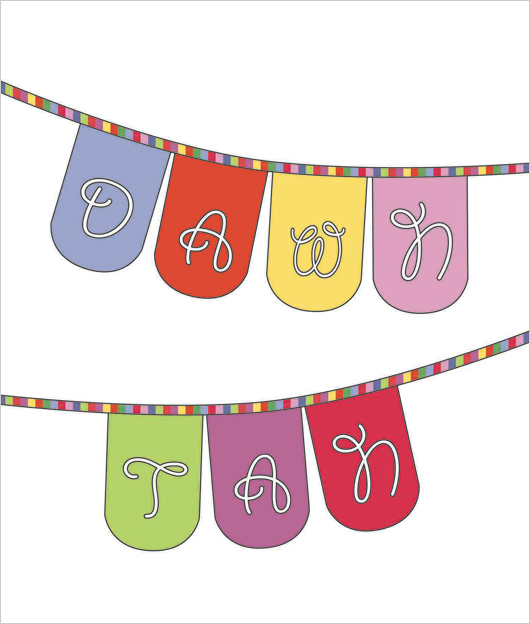
Tell us about the development of your title page design and how you arrived at your concept. I really wanted to design a title page which fitted Dawn’s aesthetic while still staying true to my design style. Luckily we both love colour, and I think we both have a really fun style.
What materials or computer programs did you use to create the title page, and how did you then prepare it to be submitted for the book? To create the title page, I really wanted to combine all my creative skills, and I definitely wanted to design a fabric especially for this project.
The concept sketch was designed using Illustrator. I then created another Illustrator file with all of the elements that were needed to create a digitally printed fabric. I fell in love with Dawn’s Native Flower print so I tried to colour match my fabric designs to that print.
The next step was to send my fabric printing file to Frankie and Swiss in Melbourne to have it printed onto their 295gsm 100% cotton canvas base cloth.
Once the fabric arrived in my letterbox, I put my sewing skills to use and turned it into personalised bunting for Dawn. It was then just a matter of photographing and editing to match my initial concept.
Of course, an original concept drawing doesn’t always end up being as perfect as I’d like! I wasn’t happy with the bunting just hanging in a blank space, so I took my finished photo and digitally added a frame. I’m really happy with the end product.
The extra bonus is that I can gift the personalised bunting to Dawn to keep :)
What other fun projects are your working on now? I’m a bit of a multi-tasker, so I’m always working on lots of things at once. I’ve just designed a new fabric which I’m waiting to have printed. I’ve branched out into wallpaper design and I have a new range of brooches featuring my own laser cut designs combined with my wallpapers.
I also have a stall at The Finders Keepers market in Brisbane this weekend!
Well Cam, we'll miss you at our book launch but if you happen to be in Brisbane this weekend, pop along to Finders Keepers and check out her wares. You can also purchase the book at the Follow stall at the market.
Scenes From Sydney: When Creative Worlds Collide
By Jaclyn Carlson A few months back I wrote about a strange phenomenon I had witnessed about the creative scenes between Melbourne & Sydney. Much like the cities themselves, the creative scenes seemed competitive. Sydney it appeared, was a tad bit jealous of Melbourne’s creative status and resented the cool persona that just oozed from every lane way. Sydney rallied and slowly picked up creative momentum with events and exhibitions popping up throughout the year and artists, crafters and business owners banding together to make their mark – which they have. I have personally witnessed a growing, vibrant and talented group of creative women (many of whom I’ve featured here!) coming into their own here in Sydney and I think 2014 will only see that movement grow stronger – don’t you agree?
But despite the rivalry at the surface I was relieved and humbled to see these two creative worlds collide on a recent weekend when I went to co-host not one but two events in Melbourne. Yes, Sydney and Melbourne co-hosts worked together as a team and brought together a variety of creative ladies to eat, drink and craft to our hearts content. The first event was a Kinfolk dinner, where I dined with some Melbourne folks from all backgrounds, drinking wine and sharing our own creative stories.
From there it only got better, on Sunday I was lucky enough to team up with two incredible ladies (both CWC members!) - Kylie Lewis (Of Kin) and craft queen Laura Blythman for a creative collaboration that was dreamed up months ago. All three of us wanted to do something fun, to spend an afternoon just playing and creating. The result was Paper Platdate, an afternoon of making with our own hands and escaping with other people who valued and found the fun in piles of paper, scissors, glue and paint.
As I flew back to Sydney after such a whirlwind weekend I couldn't help but feel that maybe more interstate events would help ease the sibling rivalry and get us back on track to being one happy, creative family. I for one found that my Melbourne CWC sisters where just as open to interstate collaboration, so let's make it happen more often ladies!
Originally from Boston, Massachusetts, Jaclyn Carlson is the founder of Blog Society, a community for bloggers & creatives as well as the author behind the Sydney-based blog, Little Paper Trees. When not documenting her expat adventures, she can be found working for one of Australia’s top design & homewares trade shows. Passionate and prone to wasting hours on Pinterest, she has years of experience in marketing, advertising and PR and aims to put Sydney’s creative women in the spotlight with her monthly column.
Interview: Carla Hackett
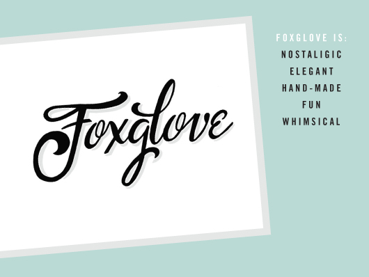
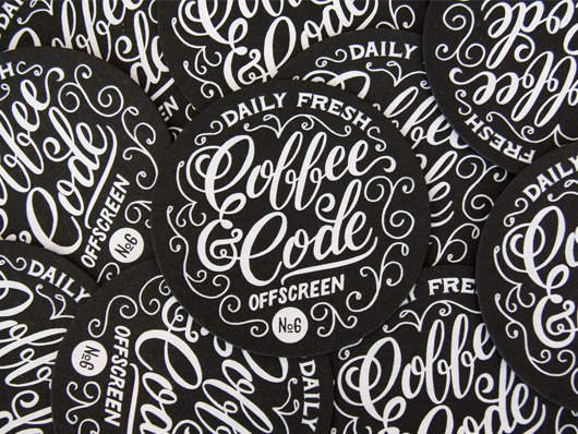
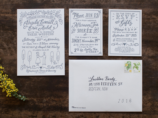
Carla Hackett has taken her love of type and turned it into a blossoming boutique lettering and design studio called Foxglove Lettering. Foxglove is based in Melbourne at Little Gold Studios, a shared creative space where Carla hand-crafts lettering for a range of clients in creative industries, including fashion, music, food, branding, retail, hospitality, magazines, books, weddings and conferences. Carla established Foxglove Lettering with the aim of bringing a warm, unique, human element to a world dominated by digital fonts and design.
What led you down your current path?
After studying graphic design at university and six years’ working at some of Sydney’s top agencies, I escaped to Berlin to soak up some international inspiration. It was a fantastic city to be based in as the living expenses are a lot lower than Australia and there is lots going on there creatively. Not to mention being on the doorstep of Europe for travel fun times!
I went along to a two-day hand lettering workshop with Ken Barber from House Industries. From that moment I was completely hooked! It was the perfect mix of illustration and typography that really appealed to me. After the workshop, I began feverishly lettering a bunch of personal work. I had a side project called Deutsch Doodles where I illustrated funny German words and it lead to a commission where I illustrated Berlin Bingo, a hipster guide to Berlin.
Once I’d had my ‘Bowie years,’ I decided to move to lovely Melbourne at the end of 2012. I’d always wanted to live here and it really was the best decision as I’ve found there is a great supportive community of creative business owners here. I decided to focus on my lettering and move into Little Gold Studios and start Foxglove Lettering in March this year. It’s been a journey to really take a step back and hit a reset button before finding what I am really passionate about.
Since then it’s been gaining momentum. I had a little boost of inspiration in March, winning a scholarship to go to Clare Bowditch’s Big Hearted Business Conference. Clare saw my chalkboard in my video and asked me to be the first BHB Inspiration Bomb artist. It was that fantastic exposure and going to the conference that really solidified in my mind that I was on the right path to doing what I love and making a living.
Who do you admire in the industry?
There are some amazing letterers who inspire me greatly. They’ve managed to carve a niche career with this specialty skill. Jessica Hische, Erik Marinovich, Mary Kate McDevitt, Jon Contino and Dana Tanamachi. And locally Gemma O’Brien, Dave Foster and Luke Lucas are producing phenomenal work. My studio buddies at Little Gold inspire me everyday with their energy and passion for their creative businesses. It’s amazing to be around.
Do you think hand-lettering is having a resurgence? Why?
Definitely! I think there is a real yearning for hand-crafted things in this digital age. The nostalgia and ephemeral nature of chalk has its own appeal nowadays. My mentor is a former ‘Ticket Writer’. She made a career out of hand lettering signage for department stores in the 1950s and 1960’s. The sign writing courses have cut most of the hand painting part of the course - it’s all done on the computer. I want to learn this skill so that it can live on!
Can you talk about the difference between hand-lettering and other type-related terms?
By definition, lettering is drawing. Lettering is closer friends with illustration than typography. Let’s also just clear up that calligraphy is writing and typography is a predictable and repeatable system of letters - a typeface.
What has been your most favourite project in recent years?
Earlier this year I got to work with my great friend Irena Macri from Eat Drink Paleo who runs Australia’s most popular paleo recipe site. Irena commissioned me to art direct, letter and illustrate the book's cover, chapter introductions and feature pages. All images were chalked by hand and photographed alongside the ingredients and prepared dishes. The best part was getting to eat all of the healthy delicious food once it was photographed!

What does a typical day at work involve for you?
I ride my bike to my studio in Brunswick where I’ll make my Aeropress coffee. Just this short bike ride and sitting down at my desk is a trigger to switch into creative mode. I try to do most of my creative work first up when I have energy and do some business/admin stuff later in the day. My days could be quite varied, some days I could be out on an on-site chalk job, some days I could be lettering on paper or lettering on my chalkboard, or lettering with paint and a brush! It depends on the project. But as long as I have picked up a drawing instrument everyday, I have practiced my craft so I can get better and learn. There’s also emails and business stuff to stay on top of and posting behind the scenes pictures to Instagram and Facebook!
What future plans do you have for your lettering business?
I really want to keep honing my craft and practicing lettering in all forms. This will mean making time for personal work amongst client work. I feel some great momentum happening, and I’m super excited for more great opportunities for collaborating with interesting brands and Creative Directors on some super fun projects. I’m also learning the ways of combining creativity and business so that I can continue to make a living doing what I love.
I’m working on producing a small range of hand lettered greeting cards as a side-product with my soon to be letterpress printing skills. I eventually would like to run workshops to teach people the process of lettering. I’ve had a few enquiries already!
5 Questions in 5 minutes – Getting Personal:
Studio Sounds, what's playing?
We have rdio set up on a mini iPad in the studio so everyone can control the music from their computer so we always listening to our collection on random rotation. But in particular we’ve been loving the new Snakadaktal - Sleep in the Water. We also love 60’s girl band ditties!
What are you currently reading?
Manage Your Day-to-Day by 99U. It has some fantastic interviews with people like Seth Godin and Stephan Sagmeister on how they manage to do great creative work in these times of many distractions.
What are you looking forward to?
I am super excited to be doing a letterpress workshop with Amy from St Gertrude Design. Amy is going to teach a few designers how to use her 100 year-old press ‘Gordon’ (who moved in Little Gold Studios two months ago) so that eventually we can print our own designs. This is an inaugural workshop and will be open to other designers in the future.
I’m also looking forward to getting back to nature in late December down in Tasmania. We’ll be camping at Freycinet National Park with some hiking, relaxing, sampling the local wine and food, and also get over to the amazing Mona for some art inspiration.
Can you share your go to resource for inspiration?
I have some fantastic lettering books from Louise Fili - ‘Scripts’ and ‘Vintage Type and Graphics’ full of her personal collection of vintage lettering and my 1959 Photo Lettering Catalogue full of original hand-lettered typefaces that Don Draper would have used!
I love seeing behind the scenes work of other letterers and artists on Instagram. On the web, I follow Friends of Type and Type Everything blog amongst others. But there is lettering and type all around us everyday that I find really inspiring.
What is your local areas best kept secret?
It’s probably not so secret with the Brunswick hipsters, but when I found Dejour Jeans I was so excited! $50 jeans in lots of colours with free tailoring? Yes please! I must also mention Los Hermanos for great Mexican food and the cute little Save Yourself designer boutique in Sparta Place that sells my favourite Lime Crime lipsticks.
-----
After reading all of this type and lettering goodness I'm inspired to pull out the brush pens and chalk! If you would like to contact Carla please see all her details below.
Carla Hackett / Foxglove Lettering Website: carlahackett.com Email: carla@carlahackett.com Instagram: @carlahackett Twitter: @canarycarla Facebook: /carla.hackett.lettering
Andrea McArthur has a passion for all things visual. Type is her true love and goes weak at the knees over beautiful design. Andrea works as a freelance graphic designer in Brisbane by day and lectures in graphic design by night. You will find her sharing design related goodness via @andyjane_mc
