Bushfire recovery effort: Tea towels from Cloth's Julie Paterson
We've all seen on the news the devastation the recent fires throughout New South Wales have caused. But it's closer to home - literally - for former CWC speaker Julie Paterson of Cloth.
Julie is an active advocate for animal welfare and is also an ambassador for The Foundation for National Parks and Wildlife. In recent weeks her home in the Blue Mountains has been spared destruction, but many of her neighbour's properties and the surrounding wilderness have unfortunately not been so lucky. Her partner Amanda wrote this blog post describing the decision to leave their home and the haunting return days later.
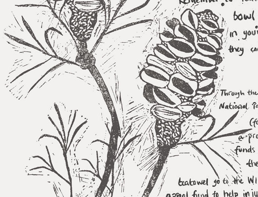
To help raise funds for the recovery effort, Julie has put her creative hands to work and is selling a range of limited edition, 100% linen, hand screen printed tea towels through her website. There will be a few designs, and the first 'Banksia' (pictured below) is based on an original lino cut.
The tea towels are $38.00 and funds will go to The Foundation for National Parks and Wildlife to be distributed where they are needed most.
Title page designer: Kristen Willis
Today we welcome multidiciplinary designer Kristen Willis to the blog, who designed the title page for the interview with film and television director Shirley Barrett in our new book Conversations with Creative Women: Volume Two.
What is your art/design/career background? My creative streak was developed and encouraged from a very early age by playing shop assistant (at 4 years old) in my Nonna's Singer sewing shop. I was constantly exposed to textiles and patterns which dictated creative projects such as drawing all over tables, designing and pattern-making fashion for my dollies and gluing my fingers together crafting paddle-pop structures for my Smurf figurines… The perfect playground for creativity, I was in heaven.
Through my adolescence, fine art became a prominent attribute as I regularly participated in Qld Regional Youth Exhibitions and Competitions. This active envolvement naturally lead to the pursuit of a Bachelor in Visual Arts, majoring with Honours in Printmaking and Drawing in 2006, and enrolment into Shillington College– School of Graphic Design in 2011.
Now as a creative freelancer, I continue to expand my interests by liaising with Graphic Design studios, Creative Contractors and sourcing my own little clientele for those special one-on-one projects.
What drew you to the work of your interviewee, film and television director Shirley Barrett? As an avid follower/junky towards various Australian produced television series, my creative mind exploded at the thought of representing the fantastic film production visionary, Shirley Barrett. What an unbelievable opportunity this is, to show tribute to such a successful industrious icon.
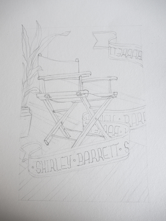
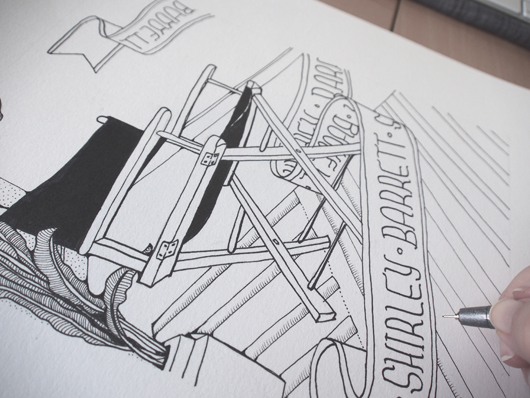
Tell us about the development of your title page design and how you arrived at your concept? With a little background research, black ink and piece of acid-free rag-paper, I decided to hand-draw a highly detailed illustration of a director's chair, prominently placed with in a warm, inviting, eclectic room. This is a celebratory piece, playing tribute to Barrett's creative endeavours and industry achievements.
What materials or computer programs did you use to create the title page, and how did you then prepare it to be submitted for the book? As a mixed-media artist, I literally utilise as many creative platforms as possible. I achieve this by wearing my Printmaker's hat and approach the piece in layers. The composition was initially sketched out in graphite, and then delicately inked in with a fine-tip black marker by hand. The second stage of the process is to scan and digitally colourise the illustration on-screen by using Adobe Photoshop CS6. For this piece I have used both flat colours and textures to create a further sense of depth. The overall outcome is a smooth, clean piece of modern design with a print-art 'touch'. With the click of a button, I was then able save the artwork in a suitable file-type ready for publication.
What other fun projects are you working on now? I have a few really interesting projects on the go right now; such as iPhone graphics for an upcoming zombie game (yes, zombies), illustrative panels for Queensland Museum, art direction and design for a children's storybook, and an ever-going expanding series of illustrative artworks called 'Animalia' which explores the quirky connections between animals and human personality-characteristics.
Organise Me: 5 Tips for Avoiding Burn Out in the Lead Up to the Silly Season
 It still might feel like there’s plenty of time before Christmas and the deadlines - both self-imposed and actual! - that come with the end of the year are upon us. But it never hurts to have a game plan going in to this crazy time, to avoid burn out and end 2013 on a high note.
Here are my tips for avoiding burn out:
- Get a to-do list note pad and a printed calendar Take 10 minutes to write down all the things you know you have to get ready before the end of the year, both for home and work. Mark them in different colours if you like, and then schedule them into your calendar. Put a reminder in your phone if it helps. It may seem overwhelming now, but better the devil you know.
- Schedule some down time As things get busier the time for fun seems to disappear. So block out time in your calendar to go do something fun that’s just for you. After a long winter it's the perfect time to get out in the sunshine and it does wonders for your health.
- Keep hydrated and well fed Try to eat properly and make sure to drink water as the weather heats up - nothing is more exhausting than feeling dehydrated in a meeting you should be paying attention to.
- Be willing to say no Around this time of year, requests may come in thick and fast for little things that aren’t really what you should be focusing on. Be ready to say no to those that aren’t the right fit, or see if you can reschedule for the new year. It won’t always work, but being ready to offer an alternative to ‘right now’ can be really helpful.
- Be kind to yourself Don’t forget to take care of you. Buy presents online if you can't fathom the crowds (even if you want to support local and handmade this year, there are many online stores that will deliver to your home or workplace!). And keep in mind that couch time is an essential part of recharging and not just wasted time.
Remembering that last step is definitely key for me. Hopefully these tips will help you to not feel so stressed as the busy season approaches and lets us all avoid that burn out that comes when we feel overwhelmed. May the warmer weather bring some time to get out and enjoy it.
Dannielle is a blogger, serial organiser and passionate traveller. She has a secret love of ’90s teen movies and can often be found on Twitter. In 2013, Dannielle packed up her life in Melbourne into one suitcase and moved to Canada to make her crazy dream of a more adventurous life happen. But she quickly found the inspiration she was searching for was in Melbourne and has returned home. She’s recently started a new project on creating a happy (organised) home which you can see here.
Title page designer: Louise Walker
Today we welcome Louise Walker to the blog. Louise designed the title page for the interview with designers Kat Macleod, Chloe Quigley and Simone Elder of Orotolan in our new book Conversations with Creative Women: Volume Two.
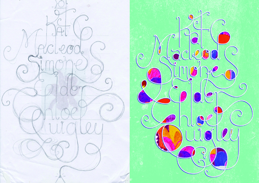
What is your art/design/career background? In 2011 I completed year 12 with a perfect score in Visual Communication Design and was chosen for the VCE Top Designs Awards. In 2012 I began studying Visual Communication Design at Monash University, a course that I am very passionate about.
Alongside university I work as the Graphic Designer for Salvatore Malatesta, the successful owner of many Melbourne cafes such as St Ali. In this job I have designed everything from café menus, to merchandising, vehicle ‘wrap’ designs, cycling gear, and been the Creative Director of the St Ali food stall(s) at Melbourne’s Big Day Out music festival 2013.
I have also been involved in design/art competitions, group exhibitions, and have had work featured in various publications. I was most recently selected for the Melbourne Threesome Typographic Exhibition (2013) where I worked along side Hofstede Design studio and a successful design graduate to produce a fantastic collaborative poster.
What drew you to the work of your interviewees, the ladies at Ortolan? Out of all the women interviewed in this volume, I felt the three women working at Ortolan design studio were one of the most relevant and relatable to me. I love their use of bold patterns and illustrative designs. Illustration is one of my favourite parts of being a designer, so I really admire Kat Macleod’s strong talent in that field. It’s such an inspiration to see how successful Kat, Chloe, and Simone have been in achieving some wonderful graphic designs.
Tell us about the development of your title page design and how you arrived at your concept. To begin my creative process I researched Ortolan’s website and familiarized myself with their particular design style. It was evident there was a strong collective input into their designs, as they clearly work well together as a team.
With these concepts in mind, I began sketching. I initially started working in the hand-sketched style that was used in many of Ortolan’s brandings, but I found my designs just didn’t suit the look I wanted to achieve. Leaving the ink and watercolours, I went back to basics using pencil and paper. I began sketching the three names in a design that joined each name together and weaved all the lines around each other. I wanted to emphasis the collaborative nature of Ortolan’s beautiful studio work.
My best sketch was then scanned and used as a guide for creating a digital version in Adobe Illustrator. From there, I went back and forth between Illustrator and Photoshop until I was happy with my final design.
What materials or computer programs did you use to create the title page, and how did you then prepare it to be submitted for the book? I usually begin a project manually with pen or pencil. So for the title page, I started by playing around with pencil and paper and, after a few roughs, came up with a more consolidated idea. Though still in it’s rough stages, I scanned in my sketch and brought it into a new file in Illustrator. I made it my bottom layer, and built up my layers on top. Using a drawing tablet is essential for this stage. I then use other programs like Photoshop to make further edits and play around with colour, scale, and texture. I decided to add some patterns from Ortolan’s work into my title page design, as to better illustrate their bright and friendly style. Then it was just a matter of sending it off, ready for print!
What other fun projects are your working on now? I am always working on something new and interesting, whether it’s designing tattoos for a university project, creating a logo for an upcoming event in Melbourne, or working on some business cards for a new client. I always enjoy what I do as no two jobs are the same!
Thanks Louise! There's less than a month until 'Conversations with Creative Women: Volume Two' is released, and I can't wait to see this page in print. Have you ordered your copy?.
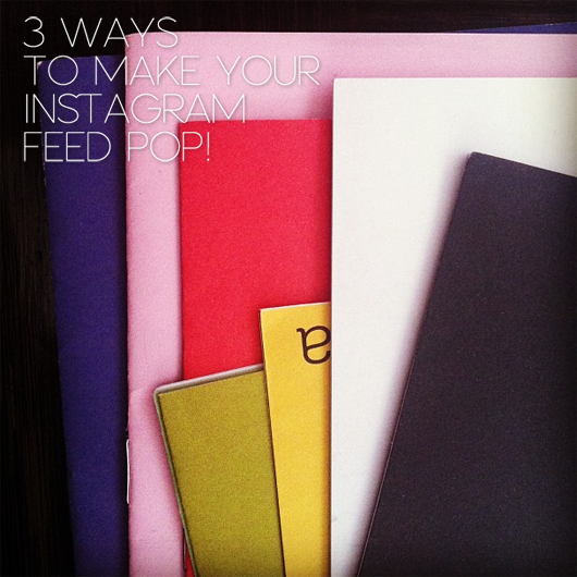
3 ways to make your Instagram feed POP!
Instagram is such a fun and visual way to share sneak peaks into your work and life. But it can get kind of same same if you always take the same type of picture (morning tea, your shoes) and use the same filters.
So here are three ways to mix it up a bit and make your Instagram feed POP!
Try out Instagram video! Find a process you do all the time in your work: it could be priming a canvas, stretching out an embroidered piece, sketching your ideas and make a little video. People love a 'behind the scenes' or glimpse into the creative process.
Tip: If you turn the sound off on your phone, it will help eliminate that bad muffled sound that you often hear on Instagram videos.
Don't have a steady hand and your videos are looking a little bit more Blair witch project than you'd like? A tripod will help maintain a steady shot on any kind of surface. There are lots of smart phone tripods out there (google it!) and even some handy DIY options!
Get some new photo filters If you aren't ready for video then perhaps it's just a matter of making your regular photos a bit more interesting? There are loads of free and low-cost apps out there to make your photos a little more interesting by adding text, compiling images into a collage and more.
I recommend:
- Muzy for photo editing, collages, and more
- Insta picframes, another option for photo collages & picture frames
Add some text
Followers will always be drawn to photos that contain text - it's just the way the human brain works. Luckily there are some lovely apps out there that assist you to add text to your images in beautiful fonts, with just a couple of clicks.
Try:
- A Beautiful Mess for adding hand drawn borders and text
- Piclab for dreamy filters and bold contemporary text
Filters, compilations and text can all add a bit more dimension and interest to your photos. There are thousands more photo editing smartphone apps available, it's just a matter of finding the right ones for you.
And one last thing!
For those of you who have a Wordpress blog or website, don't let your Instagram photos stay inside Instagram. Try:
- Simply Instagram For importing the pics into your sidebar
- DsgnWrks Instagram importer for making your pics into blog posts
- IFTTT also has a myriad of recipes that can turn your Instagram feed into so much more.
So get snapping and make your Instagram feed POP!
----
Susan Goodwin is the designer, sewer and creator of Rocket Fuel, ensuring you are decked out in style while cycling. Read her blog or follow her on Twitter @rocketfuelstyle.
Title page designer: Jessica Hyde
Jessica Hyde has designed the title page for the interview with book designer and illustrator Michelle Mackintosh in our new book Conversations with Creative Women: Volume Two. Today we chat to Jess about her background and future!

What is your art/design/career background? I originally studied Architecture and since graduating in 2007 I have been combining working in that field and exploring my real passion for illustration, paper and graphic design. All of that exploration is channeled into my own little creative studio TRUTH.BE.TOLD, which now includes freelance illustration, custom stationery design, as well as the TRUTH.BE.TOLD stationery and paper goods range.
What drew you to the work of your interviewee, book designer Michelle Mackintosh? I have always dreamed of one day being a book designer, so when I was doing a little research on the talented ladies being profiled in the book and saw that Michelle had my dream job I had to find out more. I also absolutely love her illustrative style. Tell us about the development of your title page design and how you arrived at your concept.
After doing some initial research to find out more about Michelle and her work, I was a little stumped about what direction to take – her work is quite varied and I didn’t want to try and replicate Michelle’s work but I wanted to try and instill a little of the whimsy I saw in her illustrations. I decided to draw inspiration from her choice of mediums and colour palettes in her illustrations and incorporate some of these into the title page design.
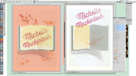
I went through many ideas before settling on the simple idea of an open book as a sort of canvas for ideas and allowing the watercolour and textured style be highlighted. After that all of the elements came together pretty quickly.
What materials or computer programs did you use to create the title page, and how did you then prepare it to be submitted for the book? I used a combination of hand and digital elements to create the title page. I hand painted a series of watercolour washes to create the book pages and accents, which I then layered and shaped in Photoshop. I also drew and painted the lettering by hand before adding it to the digital collage. Finally the grid and background colour was added in Photoshop.
What other fun projects are your working on now? At the moment I’m working on custom stationery for upcoming spring and summer weddings and events, as well as designing my own collection of event stationery, which I will hopefully finish off very soon! I’ve also been working on a whole bunch of new designs and experimenting with screen-printing for my TRUTH.BE.TOLD range.
Thanks Jess! See Jess this Sunday at the Greville St Market (perhaps pop over after our event on Sunday morning!).
And you can pre-order your copy of 'Conversations with Creative Women: Volume Two' featuring Jess' title page design now at our online shop.
Bricks and Mortar: Saint Gertrude Design & Letterpress
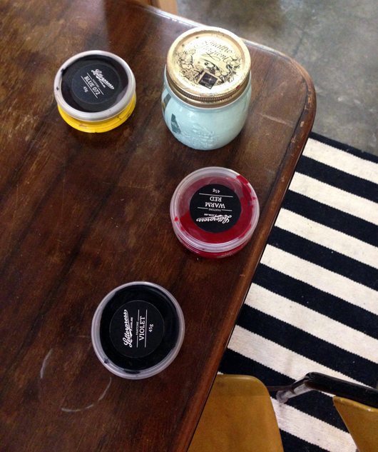
By Catherine Harvey There is something intrinsically beautiful about letterpress that everyone seems to love. Perhaps it's the tactile nature created from the combination of ink on a soft cotton stock. Or maybe it's the knowledge that letterpress is a centuries old art form that is mastered by so few. Whatever the reason, there has definitely been a huge increase in the amount of letterpressed paper products being produced over the last few years.
As a designer, I notice the reactions of clients when they feel something that has been letterpressed and it's generally always the same - moving their fingers over the print whilst 'oohing' and 'aahing'. It is this tactile quality that surpasses many other printing techniques as a favourite of mine. And it seems I am definitely not alone. Amy Constable also shares this love and has taught herself all about this impeccable artistry over a number of years while running her business Saint Gertrude Design & Letterpress.
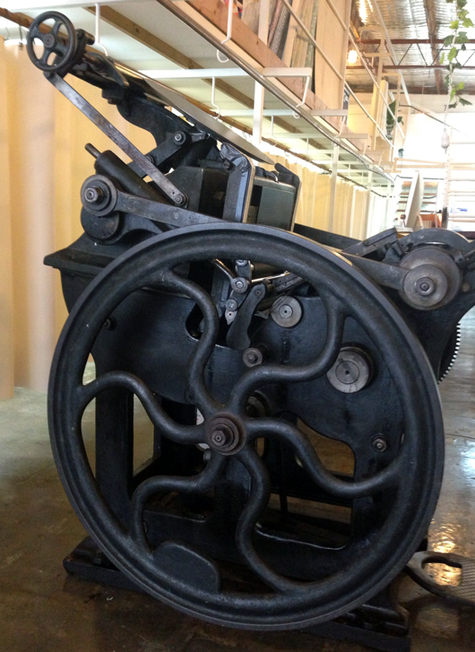
At a time when there wasn't a great deal of information on this centuries-old printing technique, Amy bought herself a 800kg letterpress (affectionately known as Gordon) and began the process of educating herself on the history of letterpress and the knowledge required to actually be able to use the press. Now let me tell you about Gordon… the best word to describe him is impressive. He commands attention and respect from the moment you see him - maybe this is primarily due to his large size or perhaps the fact that he's a very good looking press! The other thing about Gordon is that he is quite daunting and after watching Amy show me how he works, I have a new found appreciation for the skills required to operate a letterpress machine. It is indeed manual labour that requires a lot of love, time and effort. But the results you can achieve are clearly worth this effort.
Amy started Saint Gertrude Design and Letterpress in 2009 and since that time has primarily been involved in creating beautiful wedding stationery. From save-the-date cards to custom designed invites, Amy knows how to achieve the perfect stationery for your big day. In addition to this, Amy has also recently created her own retail collection that includes cards and prints inspired by children's stories.
It all seems to be happening for Amy - including possibly holding some Letterpress Workshops in the future at her new studio.
And this isn't just any studio. Amy and her press now reside in Little Gold Studios (how good is this name!?) in Brunswick. The studio is filled with natural light, lots of plants and is the ideal environment for a creative to thrive. The space is shared by like-minded creatives from a range of other disciplines and I was instantly impressed with how the space had been so beautifully decorated. Let's just say I wanted to leave my job and move in, it was that good.
My afternoon with Amy (and Gordon) was a pleasure and I can only recommend that if you get a chance to attend one of Amy's letterpress workshops, then do. It will be memorable, inspiring and, like Gordon himself, impressive.
Saint Gertrude Design & Letterpress Little Gold Studios 13 Little Gold Street, Brunswick, Victoria 3056 Email: hello@saintgertrude.com.au
All photos by Catherine Harvey.
---------
Catherine Harvey lives and breathes design. Working at one of Melbourne’s top studio’s, she is rarely ever away from her computer. She loves to keep up to date with the design industry in a global and local context and follows too many blogs to count! You can follow her findings here.


