Book review (and member giveaway): Taking Back Retail
For almost every creative with products to sell, having an online commerce option is essential. Even if your sales are mostly through your bricks and mortar store, or your market stall, or wholesale orders, no-one can deny that these days, customers expect that you also sell your wares via your own website or a third-party online marketplace.
The argument for having an online retail presence is at the heart of Taking Back Retail, written and released byPortable founders Andrew Apostola and Simon Goodrich last year. But this easy to digest, information-heavy handbook has lots to offer those looking to succeed in any aspect of the online space - whether it be devising a new website design; figuring out the easiest and more effective social media platform to work for your business; conceiving of new ways to promote your product range; or simply analysing how you're current modes of online selling and marketing are working for you.
Overall, the book hammers home where best to spend your 'business development' budget (which they acknowledge is often limited) to get the best return. This is advice that, as creatives, we often don't get to hear. The team at Portable have made their mistakes along the way in the growth of their own business and side projects, and they are happy to share what they have learned so that we can all benefit.
Taking Back Retail is primarily aimed at those in the fashion industry (to whom Portable's own online shop software is targeted), and many of the case studies within its pages relate to this field. However, in my opinion, retailers, makers and designers of any creative sort will likely benefit from the advice in its pages. Personally, I was surprised I found much of its advice relevant to my own business - the tips on creating interesting blog content, organising and managing an online shop, and making the most of a enewsletter and mailing list database were particularly helpful and prompted me to think about CWC's online presence in a fresh way.
It's an easy read that could potentially have a big impact for you and the future of your creative work.
Lucky for us, the generous folk at Portable have offered 10 paperback copies of Taking Back Retail to CWC members this month. Join CWC before February 28, 2014 to be in the running for a copy, or current CWC members can log in and enter the giveaway here. Winners will be drawn on 1 March and notified shortly after.
Or, if you just want to get your hands on a copy of the book, you can do so in digital or paperback format at the Portable website.
Interview: Helen Roe of The Orange Lantern
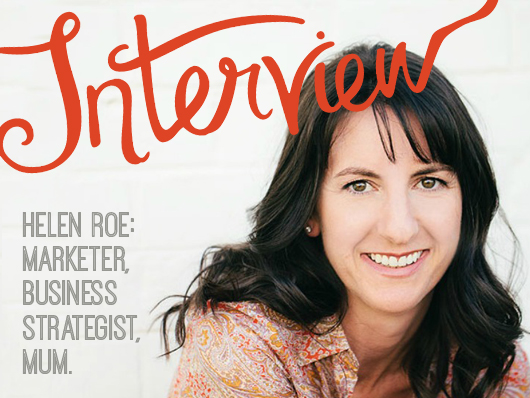 Meet CWC Member Helen Roe: a marketing master, business strategist, mentor and mum. She helps creative people capture and plan their business so they can make a living from what they love to do. She's coming to Melbourne soon to run one of her much-loved creative business planning workshops (details of which can be found at the end of the post), but before she lands we thought we'd get some insight into how she came to do what she loves for a living.
You describe yourself a 'corporate refugee'. What is your background and what is the focus of your business now? My career has included management roles in marketing, sales and business development with global brands like Coca Cola, Colgate Palmolive and Nivea, in Europe. Whilst I enjoyed the journey and amazing experiences my corporate life offered, I felt the need for change in latter years, especially after having my second daughter.
I wanted my work to be an extension of me and the values I held important in my personal life. I wanted to change from mass market marketing to community, connection and customer care. I love being creative in my spare time. I’m a qualified interior designer, I’ve had my own home baking business and have experimented with various other creative endeavours! I also really enjoy connecting with the customer and creating something of value for others.
It wasn’t until I moved to Australia a couple of years ago from Ireland, that it came to me. I found a way to incorporate my skillset and love of all things creative, into a service that helped other creatives with their marketing and business planning. The Orange Lantern was born.
What does a typical day at work involve? A typical work day can vary greatly, which is why I love it! I work mornings and finish early afternoon for school pick-ups. I like to squeeze a morning run in there a couple of times a week, otherwise the day slips by. I’ll do a few hours on the laptop, check in with emails and social media, work on planning, creating or implementing my online programs or business planning workshops. I’ll also schedule some client sessions during the week, either in person or on Skype. Then it’s taxi service for the afternoon, out and about with my daughters for various after school activities. I try and get some work done in the evenings too, when little people are sleeping.
What are some of the challenges you encounter or have encountered in your own business, and how did you work through them? Certainly, when you’re starting out in business it can so exciting but also very overwhelming. There is so much to do and so much to learn that there never seems to be enough time. It took me a while to realize that running your own business will always be a work in progress.
The to do list is never really done. I work on long-term and short-term goals now, so I can see my progress, even the small wins, which helps me stay motivated.
I see perfectionism a lot amongst creatives in business too. Unfortunately, I know it only too well! It leads to procrastination and the ‘it’s not ready yet’ syndrome, where products or programs are never launched or marketed. This ultimately leads to little or no progress in your business. Yes, it’s important to maintain standards but it’s also important to be realistic about what you can achieve on a regular basis.
What's the one mistake you consistently see creative's making in their businesses? It has to be pricing. Getting your pricing right in the beginning can save you so much heartache down the road. I’ve had clients in my business planning workshops unable to plan for growth, expansion into wholesale or third party selling because their pricing strategy is missing key elements. Implementing an effective pricing strategy and understanding how it fits with your overall brand strategy is intrinsic to the success of your business. Yes, your pricing, like your product or designs, can evolve over time but only when it’s based on solid foundations.
In your opinion, what are some of the first steps creatives can take toward making a decent, full-time living from their work? Be fully committed to your work as a business and not just a hobby or something you enjoy doing. Ask yourself what value you have to offer and who is willing to pay for it? What solution do you solve for your customer? It can be a tangible thing or an intangible emotion or feeling. Know what makes you and your offerings unique in the marketplace. One of my favourite quotes from Maya Angelou captures this importance: "People will not remember what you said to them but they will remember how you made them feel."
Have a vision and a plan.Your plan can take any format. It doesn’t have to be a manuscript but it’s important to have something that connects you to your business vision. It may be a vision board, a yearly planner with key events, a visual of your perfect customers, your sales target in big numbers posted on your wall, whatever works for you. I demonstrate lots of tools and strategies in my planning workshops and generally, no two people plan the same way.
Be prepared to market your product and tell your story. Sales & marketing may not be your favourite activities but without them you will not have a business. Pick one or two platforms that work for you and do them consistently. Get help here if you need to. Outsource where you can. This is hard in the beginning when budgets are tight but try and spend your time doing the things you are good at and get help in the areas you’re not so good at.
What is the best piece of advice you've ever received? It would have to be this quote from Chris Brogan: “Your year is made up of days, and those days must be treated like your only hopes and chances exist within them".
I was just back to work after the holidays and in the process of pondering and planning the year ahead in my biz when my eyes fell upon these words. I love this, life is just too short for regrets. Live each day to the fullest and step outside your comfort zone, that’s where the magic happens!
-----
Helen is running her Right-Brain Business Planning Workshop on 1 March here in Melbourne. Early bird tickets finish on January 31! If you book via this link, Helen will generously donate a portion of the ticket price to CWC to help us continue to do the things we do here. Thanks, Helen!
Summer project: Make a Reggie!
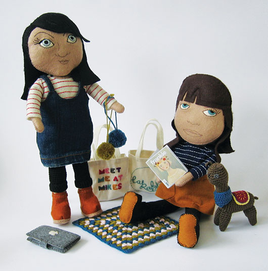
 How cool is this: Sue Halliday (a CWC member who is also behind the scenes at Melbourne's CAE) has instigated a new project called Reginald – The CAE Portrait Prize for Softies 2014.
It's like the Archibald portrait prize, but for soft-toy likenesses of famous folk. Brilliant!
So the challenge for you, creative ladies, is to make a Softie (soft toy) that resembles someone you admire/appreciate/quite like, and submit photographs of your creation along with a photo of the person that the portrait represents. Ten finalists will be selected and asked to send in their actual Softies. An exhibition of the finalists work will occur in the CAE Info Shop in the heart of Melbourne.
The judges are nationally and internationally revered Soft Sculpture / Textile Artist Cat Rabbit, and Pip Lincolne, crafter, and author of many books and the Meet me at Mikes blog (we interviewed her in Conversations Volume One, remember?).
There are a few prizes up for grabs, which you can find out more about here.
Reginald encourages professional makers and novice crafters to enter. Perhaps it is a good project for your local craft group or circle of friends? Kids could enter too! The deadline is 7 March 2014.
More information can be found on the Reginald website including full entry details. Also, be sure to pop over to Instagram and look up @reginald_cae, #Reginald and #makingareggie to see other people's entries.
Title page designer: Carla Hackett
We talked to Carla Hackett a little while ago about her graphic design background and blossoming lettering and illustrative career. Today, we're happy to welcome Carla back to the blog, chatting about putting chalk to board for her title page design for Alischa Herrmann in Conversations with Creative Women: Volume Two.
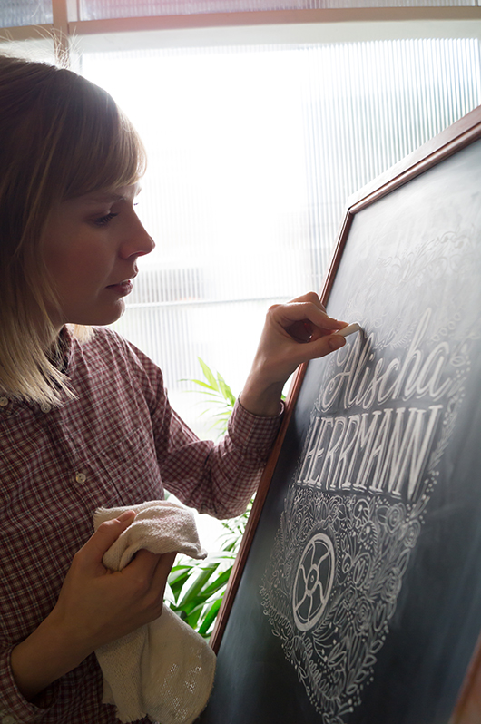
What is your art/design/career background? I grew up in Wagga Wagga NSW, a regional town that as it turns out has a thriving creative community! I went to a very creatively nurturing school and was heavily involved in performing and the arts. (Fun fact: I moonlighted as Crystal Chandelier in a 60’s girl band called The Fabulous Chandeliers for 7 years!). As a kid I would draw everything and had one of those Letraset typeface books and I would draw letters all over my notebooks and do bubble writing for my friends assignments.
I studied Graphic Design at university and then moved to Sydney and worked at some great design agencies for 6 years as an Art Director and Designer. But after a while, I felt a little creatively unfulfilled, so in 2011 I quit my job and moved to Berlin. It was a great time to hit the reset button and to soak up the inspiration of Europe! I like to call them my ‘Bowie years’.
To give myself that time to think really changed everything and it allowed me to start playing again! That’s when I discovered lettering. I went along to a hand lettering workshop with Ken Barber from House Industries and really enjoyed the simplicity of picking up a pencil again.
It was the perfect mix of my design skills, typography and using my hands to illustrate letters. I love that each piece of lettering is unique. It was then a natural progression to start lettering in chalk. I love the ephemeral nature of chalk but also how tactile each piece is. You can see the human hand has been involved.
I returned to Melbourne and found the lovely Little Gold Studios to set up shop and focus on hand lettering.
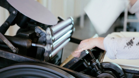
What drew you to the work of your interviewee? I have a deep appreciation for letterpress, and recently had the chance to print one of my own designs on a press that belongs to Saint Gertrude Lettering in Little Gold Studios. The labour of love that goes into printing is all worth it when you see the first impression come off the press. There’s something about the feel of the cotton paper and the impression is really quite special. Being someone who painstakingly hand crafts lettering, I was drawn to illustrating Alischa’s name. There’s also something about the nostalgic quality of chalk that resonates with the tangible nature of the letterpress machines. There is no electronic function involved, it was all done with a human touch by these indestructable and timeless machines.
Tell us about the development of your title page design and how you arrived at your concept. I knew that I definately wanted to create the piece in chalk for that hand made touch. I wanted there to be some elegance in the lettering and also some beautiful detail just like Bespoke’s signature look. I looked closely at Bespoke’s website to get a feel for the kind of design they produce. I also looked at some of my vintage lettering books to get some inspiration for the lettering and floral detail. To include a letterpress element, I googled for images of the Chandler and Price machine and realised how beautiful this piece of machinery is. They certainly don’t make them like that anymore!
The fly wheel is what keeps the momentum of the rollers spinning, you get it going with a foot treadle. The fly wheel is such a beautiful and recognisable part of the letterpress I wanted to include that element surrounded by beautiful flower details.
What materials or computer programs did you use to create the title page, and how did you then prepare it to be submitted for the book? I started with paper and a pencil, sketching out my idea very roughly to get some ideas of composition. I knew I wanted to get a lot of detail into the piece, but knew a lot of that would happen as I drew it on the board.
I drew the piece on my chalkboard at 200% in good ol’ dusty chalk and photographed it so that it would retain the detail when scaled down. I didn’t want to do too much in Photoshop, as I wanted it to look like it was done on the chalkboard. I upped the contrast slightly so that the blacks were black and the whites were white.
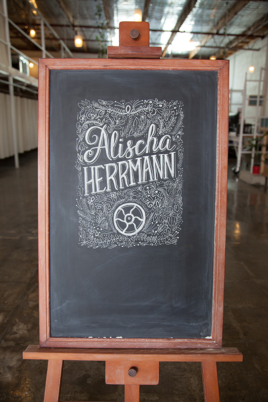 The final chalkboard design was photographed and then tweaked in Photoshop before submitting for the book.
What other fun projects are your working on now? I’m currently working on my first range of hand lettered greeting cards. I’m currently learning how to use a letterpress that is in my studio, so that I can print them with my very own hands!
I’m working on few custom hand lettering pieces for stationery and prints. And recently did some chalk lettering I did was the focus of the Westfield Christmas campaign.
I have a few wedding commissions for wedding season, creating chalk signage and hand lettered wedding stationery suites.
I’m also working with a coffee brand on some lettering for their packaging. Coffee and lettering are my favourite things!
You can find 'Conversations... Volume Two' in our online shop or at select stockists nationally. And be sure to check out Carla's new website at www.carlahackett.com
Title page designer: Laura Blythman
You may remember our interview with Laura Blythman recently. But did you know she also designed the title page for the interview with Ubabub founder and designer Natasha Dumais in our new book Conversations with Creative Women: Volume Two? Today we chat to Laura about her design.
What is your art/design/career background? After completing a BA in Graphic Design, I cut my teeth working in-house at Hallmark Cards Australia, Cristina Re and Typo (Cotton On) before branching out into the freelance world.
Over the years I feel like I've designed pretty much everything under the sun: greeting cards, gift packaging, stationery, home office, home decor, textiles, apparel, custom illustration, hand-lettering, wedding and event stationery, brand identity, blogs, advertising, print collateral and website interface.
I've been lucky to work with many brands over my years as a freelance designer including: T2 teas, Clickon Furniture, Typo, Cotton Kids, A Skulk of Foxes, Lark, Peachy Gift, La De Dah Kids, Mr.Wolf Kids, Stuck On You, Zoo York, Kiitos - Living By Design and Swan Emporium. Not to mention some exciting new projects to be released in the coming months with some more dream clients!
What drew you to the work of your interviewee, Natasha Dumais of Ubabub? I’ve loved the clean and modern aesthetic of Ubabub products for a while now. Ubabub and Natasha have popped up on my radar quite a bit with features on TDF, Pinterest, Instagram and the like. Natasha is a super clever and inspiring local creative.
Tell us about the development of your title page design and how you arrived at your concept. My inspiration is drawn from the geometric shapes that form Ubabub’s branding elements as well as the delicious colour palette of Natasha’s now super famous jumbo ‘Sundae’ print. Concept development began with lots of scribbles, sketching layouts and a heap of ideas – some good and some bad!
What materials or computer programs did you use to create the title page, and how did you then prepare it to be submitted for the book? I scanned my hand drawn shapes and then coloured and created the lettering and composition in illustrator. That’s it. Nice and simple.
What other fun projects are your working on now? So many! To name just a few, I am: - dreaming up and planning Stage 2 of my A Skulk Of Foxes collaborative range (the team at ASOF are so much fun to work with!) - branding and illustrating a cool kids’ web store - illustrating for a linen range collaboration with an artisan bakery - rebranding a vintage market - designing and illustrating a candle box collaboration - branding a cute kids look-book and other printed goods - compiling a range of my illustrations for totes, tees, etc for a super cool new artist collective - doing the brand and web illustrations for an ace jewellery/homewares label - designing a charity T-shirt - trying my hand at a tattoo design - creating a few commissioned artworks, inc paper feather hangings - working on some yardage and print designs for my own dream projects.
Interview: Julia Denes of Woodfolk
For my final interview of 2013, I am delighted to reveal the story behind a creative new accessories label, Woodfolk.
I discovered Woodfolk at the Finders Keepers Market held recently in Sydney, but it was not long before this that Woodfolk was officially launched at Life Instyle Melbourne. Despite its infancy, word of this stylish label is certainly spreading fast.
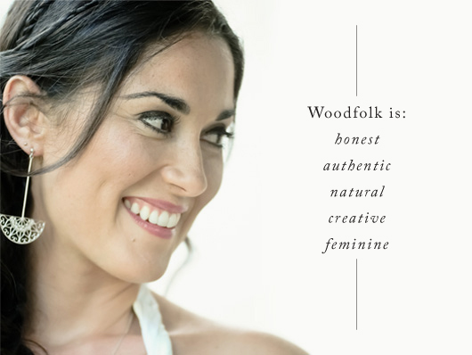
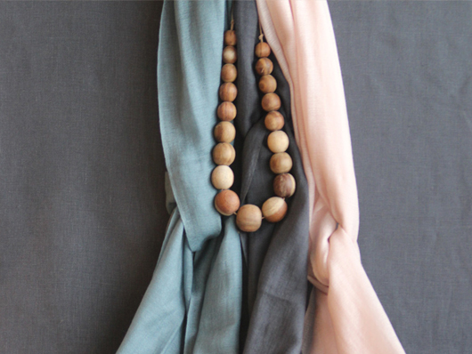
Julia Denes is the founder and jewellery designer behind Woodfolk. Julia created the label as a break from the fast moving modern world in which we live, with the aim to bring you down to earth. Woodfolk achieves this through simple design, a gentle colour palette and by using only natural materials and fabric.
All Woodfolk products are Australian designed and proudly made by Nepali artisans, throughout local and remote areas of Nepal. The Nepali artisans use their master skills to create beautiful and quality accessories through traditional carving, natural dying, knitting and weaving techniques.
What led you down your current path?
I originally studied a Bachelor of Fine Arts at COFA majoring in Photography, before taking off around the world on a two-year travel adventure that took me to 21 different countries. After spending the last six months of my trip in Central America stringing seeds and shells on banana tree vines, I knew jewellery was my calling.
When I got home I straight away enrolled at Enmore Design Centre, got myself an apprenticeship and began learning to hand-make fine jewellery. Over the years I worked for some of Sydney’s most prominent jewellers both designing and making. In 2009 I started my first business Julia Denes Jewellery that specialised in custom one-off pieces.
Starting Woodfolk felt like a very natural progression. The idea was born after feeling the need to work with more earthy materials and all things natural, combined with my love of travel. I worked on the business for about a year before I launched it at Life Instyle Melbourne a few months ago. It’s got such heart to it, I absolutely love working on it and love the response I’ve been getting from stores and customers.
Who do you admire in Australian accessories design?
I have a lot of admiration for natural, authentic, down to earth businesses like Elk, Nancybird and Ink and Spindle, just to name a few. I find it very inspiring the way they run their businesses. I also love and appreciate all the (much needed) real life, motivational work Clare Bowditch is doing.
What has been your greatest career achievement to-date?
Starting my new business Woodfolk has been my greatest and proudest achievement so far. One of the obstacles I faced in the earlier stages was finding the right people to work with overseas to make the wooden components of my jewellery. I knew I could have gone somewhere like China or India and work with a factory, however that seemed to defeat the purpose of my business. So after lots of research and time spent in Nepal, I found the most lovely, talented family to work with and I’m so happy to be supporting them. I already have my eyes set on a couple of other countries for new product ranges as well.
Describe a typical day at work…
I don’t really have a typical day as I’m running two businesses at the moment and wearing many hats. However, mornings generally start with emails and lots of cups of tea. Days can be filled with stringing and finishing all the wood jewellery; making the ceramic jewellery; getting Woodfolk orders ready and sent; preparing for different design markets and trade shows; liaising with stockists and contacting new stores; creating custom jewellery pieces; developing new ideas to build on the Woodfolk range; all the usual business stuff; and the list goes on. I do like to finish my day with some yoga, pilates or a walk to clear my head – otherwise I start to become a crazy person!
What future plans do you have for Woodfolk?
I have a lot of plans for Woodfolk and see a lot of potential. I’m planning to expand the jewellery line to include more ceramic pieces which have had a great response. A new line of natural style market bags and hand-dyed cotton scarves are already in progress, and I’m considering including some homewares to the range for next year. I’m in no rush though, so I’ll let the nature of this business take its course rather than try and do everything at once.
5 Questions in 5 minutes – Getting Personal:
Studio Sounds, what's playing?
Always something chilled like Ray LaMontagne or Birdy.
What are you currently reading?
Daring Greatly by Brene Brown.
What are you looking forward to?
My upcoming (and much needed) holiday to Vietnam with my husband.
Can you share your go to resource for inspiration?
Blogs like The Design Files, Design Sponge, Books Kinokuniya on George St in Sydney (such a great book store) and I’m a total Pinterest addict (find my page at pinterest.com/woodfolknatural)
What is your local area's best kept secret?
There aren't many secrets left unfortunately in Sydney but I can share some favourite spots: Bondi Beach Farmer’s Markets every Saturday; Breakfast at Bread and Circus in Alexandria; and afternoon/evening walks in Centennial Park.
-----
If you've fallen in love with Woodfolk like I have, enquiries can be directed via Julia's website, Facebook or follow her on her blog.
Andrea McArthur has a passion for all things visual and works as a freelance Graphic Designer. Type is her true love and goes weak at the knees over beautiful design. You'll find her sharing design related musings via @andyjane_mc
Title page designer: Amy Constable
Today we chat to Amy Constable, who designed the title page for the interview with stylist Megan Morton in Conversations with Creative Women: Volume Two.

What is your art/design/career background? I began my career at 21 as an aspiring creative copywriter at an ad agency (I had heard that's how Bryce Courtenay got his big break and in typical Gen Y fashion, I assumed copywriting was to an aspiring writer the equivalent of burger-flipping to an aspiring chef). The reality was I spent my days cutting ads out of newspapers, researching small town rags and writing the occasional classified ad. I met a designer there who said my handwriting would make a great font, so as a fun little side-project we began working on 'Amy Sans' together. He coaxed out of me some lettering and typography skills that I'd all but ignored in my pursuit to become a writer and encouraged me to side-step into the visual side of the industry. I created a portfolio, landed a job working as an Art Director's assistant and over the next 6 years, I built up my design and typography skills on the job. I decided I wanted to get more hands-on with my work at about the same time I first discovered letterpress. I doesn't get more hands-on than letterpress and for the last 4 years my little business, Saint Gertrude, has kept me busier (and my hands grubbier!) than I ever imagined possible.
What drew you to the work of your interviewee? Megan Morton is a total design industry celebrity, but what I love most about her is her approachable and slightly eccentric attitude! Her styling projects go beyond the aesthetics of 'what's hot right now' and have a sense of intelligence and individuality to them. I aspire to the same kind of attitude in my own work.
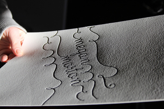
Tell us about the development of your title page design and how you arrived at your concept. One of the things that Megan has played a very valuable role in, is the rise of The School. She isn't precious about her creative process, rather she wants to share it. Styling is a very tactile medium, with shadows and textures playing a lead role in conveying atmosphere, so my concept was a letterpress print, in her signature whimsical handwriting style, and a flat lay photo with retro school props around her letterpressed name. It was a long (but fun!) process trying to maximise the print, props, light and shade for optimum effect.
What materials or computer programs did you use to create the title page, and how did you then prepare it to be submitted for the book? I created the type-based design using Illustrator. Then I had a photopolymer printing plate made and loaded it into my 110-year-old manual printing press. I made about 20 letterpress prints on cotton paper stock, picked the best one, then added the school props in flat lay. I spent almost an entire day with my friend/stylist/collaborator/fellow-eccentric Caroline Buckle who helped me to style and photograph it. And lastly, I took the final photo to Photoshop to get it print ready.
What other fun projects are your working on now? In the footsteps of Megan Morton, I am now working on my proudest project to-date: Letterpress Academy. I'll be running monthly letterpress workshops with designers and illustrators, helping them turn their love projects into prints and sharing with like-minded folk the inky-handed joy of letterpress.


