
Title page designer: Carli Hyland
Carli Hyland designed the title page for the interview with photographer Olga Bennett in our new book Conversations with Creative Women: Volume Two, and today we find out a little more about her...

What is your art/design/career background? I initially studied a Bachelor of Visual Arts with a focus on Photography and Printmaking. Afterwards I was drawn to graphic design as an application of the skills and methods I learnt during my Bachelor. Over the last seven years I have been moving between Australia and The Netherlands where I have been working with numerous and diverse clients. Now I am based in Denmark and I have a business called Studio HyHy.
Studio HyHy is a graphic design studio focused on tactility and simplicity. We combine old school and digital techniques to produce beautifully crafted products, anything from a poster, publication or website.
What drew you to the work of your interviewee? Coming from a photographic background I was naturally attracted to Olga's work. The simplicity in her photographs is poetic and powerful and in many ways also quite graphic.
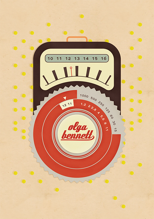
Tell us about the development of your title page design and how you arrived at your concept. I started out with the idea to create a hand water-coloured bokeh effect to blend with the typography of her name. Olga photographs many artists in their studios and I thought it would be interesting to bring in this tactility to the title page. After a few experiments I decided it wasn't really working out so I moved to a more graphic approach and created a retro style light meter. In this way I focused more on the process and technique and let her work speak for itself.
What materials or computer programs did you use to create the title page, and how did you then prepare it to be submitted for the book? For the most part I created the design in Illustrator, I did a bit of hunting around for the right retro style typeface and the final step was in Photoshop where I added a bit of texture to different elements of the design. When I start a design I always check for the technical aspects first and create a blank document accordingly, so then you don't have to migrate it over the final stage.
What other fun projects are your working on now? In August I started working full time with the great folks at Sustainia. Sustainia is part of the Danish think tank Mandagmorgen. We work on bringing together research and solutions around sustainability and communicate them to a broad audience. As the Sustainia graphic designer, I am kept busy with our many publications plus promotional materials and presentations.
Thanks Carli! You can read the interview with photographer Olga Bennett in our new book, now available in paperback and digital form.
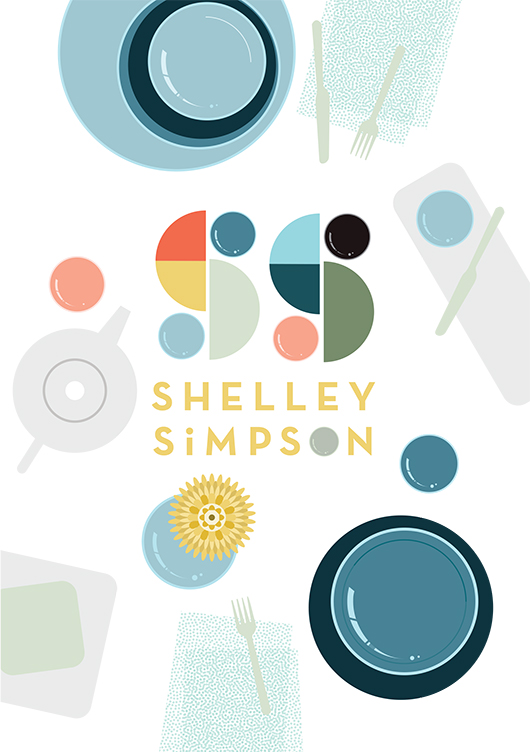
Title page designer: Emma Rickards
To have illustrator Emma Rickards design the title page for Shelley Simpson in 'Conversations with Creative Women: Volume Two' was a no-brainer - Emma is a big fan (and collector) of Shelley's ceramic wares, and both artist's love and celebration of colour, shape and line is evident in their respective work. Today we chat to Emma about her background and how she created the title page design for Shelley's interview.

What is your design background? I originally trained as an art teacher many moons ago, and taught secondary school art and design for ten years. During that time, I also completed a Graduate Diploma in Graphic Design at RMIT. I wanted to see what it was like to work on my own projects, and to spend time ‘doing’ rather than giving myself completely to teaching. Shortly after, I left the classroom in search of new adventures, and began working on my own graphic design projects, lecturing in Art Education at The University of Melbourne and studying a Master of Design at Swinburne Uni. Nowadays, I combine lecturing and graphic design with raising two children, and life is completely bonkers.

What drew you to the work of Shelley Simpson? I’ve been a huge fan of Shelley’s tableware range Mud Australia for some time now, and I’m the lucky owner of a small collection of Mud bowels, plates and cups. Well, it’s an even smaller collection since my husband knocked one off the shelf last month, but let’s not revisit the horror. So naturally, I was keen to celebrate the creator of a product I loved. I knew the simple forms and delicious colour palette of Mud would suit my illustrative style, and I’m also going through a ‘bird’s-eye view of tabletops’ phase at the moment, so the subject matter fit like a glove.
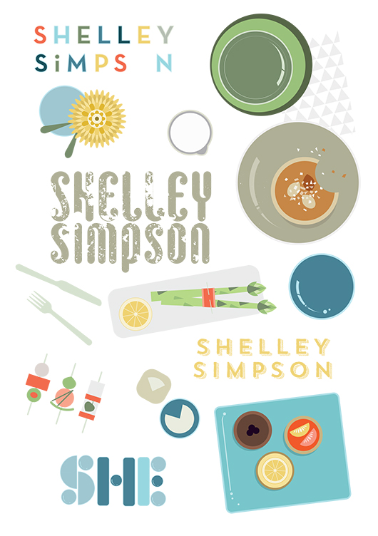
How did you develop your title page design, and arrive at the final concept? I began by compiling a Mud Australia Pinterest board full of lavishly styled shots of past collections, together with bird’s-eye pics of food and table arrangements. These images were referenced as I sketched possible page layouts, and considered how tableware pieces could be arranged into typographic forms. Once on the computer, I also considered stamping Shelley’s name onto a napkin or tablecloth, or creating the letterforms from noodles or spaghetti shapes. Superfluous drawings of food and distracting patterns were slowly discarded in favour of a design where Shelley’s creations could take centre stage. Symmetrical layouts gave way to more scattered, dynamic designs, while a centrally placed tray presented itself as the perfect spot for a title. As an asian-style meal evolved on the screen, ‘Shelley’ took shape from grains of rice, while ‘Simpson’ grew from a sympathetic typeface called Trend. A colour palette was chosen to reflect past Mud collections, with blue tones used to ‘quieten’ the busy scene, and warm accents providing some punch & pop.
What materials/computer programs did you use, and how did you prepare it for the book? Shelley’s title page was created using the Pen, Shape, Gradient & Type tools in Adobe Illustrator and the computer mouse, plain and simple! I’ll often trace a scanned sketch when developing an illustration, but this piece evolved as I played with the relationships of elements, and established a sense of movement, hierarchy and harmony.
What other fun projects are you working on now? I’m currently teaching Visual Art Education as part of the Master of Teaching: Secondary program at The University of Melbourne. It’s fun and challenging in equal parts, thanks to the juggle of mothering small children and having to turn up each week with my brain intact, clothes on and content prepared. I also create classroom resources (booklets, posters, teacher’s notes and a short movie) for teachers of Visual Communication Design, and sell these via my website. I’m really passionate about design education in secondary schools, and I love providing teachers with beautifully designed and useful stuff that will make their job that little bit easier. There are also some illustrated family portraits waiting to be completed in the lead up to Christmas. After that, I might sit on the couch for a couple of nights and watch reruns of The Bachelor.
You'll have to get the book to see the stunning result Emma created for Shelley's interview! Find it online or instore here.
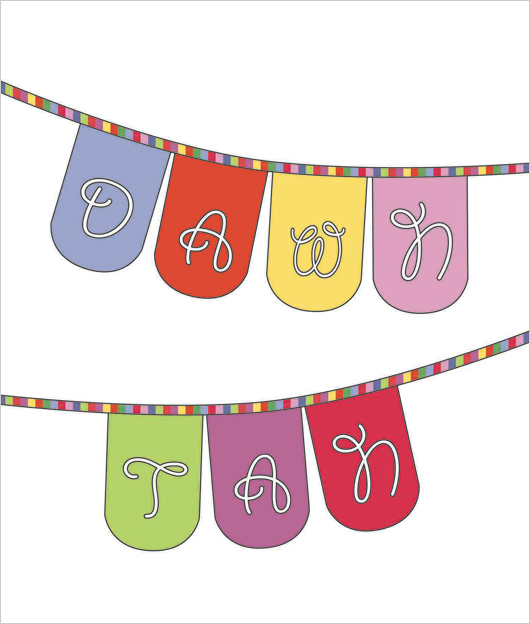
Title page designer: Camille Condon
Today we welcome Camille Condon to the blog, who is probably better known around the internet as Ms Curlypops! Cam designed the title page for the interview with illustrator and artist Dawn Tan in our new book Conversations with Creative Women: Volume Two.

What is your art/design/career background? I’m a self taught designer. I studied art through my early high school years, but then chose to focus on maths and science and received a Bachelor Degree in Manufacturing Technology.
The creative bug always remained within, and although manufacturing was my day job, I spent any free time painting, drawing and creating.
A few years ago, I decided to teach myself to sew, which in turn led to an obsession with fabrics. It seemed to be kind of a natural progression to move into the world of fabric design.
What drew you to the work of your interviewee, illustrator and artist Dawn Tan? I’ve been following Dawn’s career online for quite a few years now. I love her playful, joyous sense of style, and of course, I’m drawn to her wonderful use of colour!
Tell us about the development of your title page design and how you arrived at your concept. I really wanted to design a title page which fitted Dawn’s aesthetic while still staying true to my design style. Luckily we both love colour, and I think we both have a really fun style.
What materials or computer programs did you use to create the title page, and how did you then prepare it to be submitted for the book? To create the title page, I really wanted to combine all my creative skills, and I definitely wanted to design a fabric especially for this project.
The concept sketch was designed using Illustrator. I then created another Illustrator file with all of the elements that were needed to create a digitally printed fabric. I fell in love with Dawn’s Native Flower print so I tried to colour match my fabric designs to that print.
The next step was to send my fabric printing file to Frankie and Swiss in Melbourne to have it printed onto their 295gsm 100% cotton canvas base cloth.
Once the fabric arrived in my letterbox, I put my sewing skills to use and turned it into personalised bunting for Dawn. It was then just a matter of photographing and editing to match my initial concept.
Of course, an original concept drawing doesn’t always end up being as perfect as I’d like! I wasn’t happy with the bunting just hanging in a blank space, so I took my finished photo and digitally added a frame. I’m really happy with the end product.
The extra bonus is that I can gift the personalised bunting to Dawn to keep :)
What other fun projects are your working on now? I’m a bit of a multi-tasker, so I’m always working on lots of things at once. I’ve just designed a new fabric which I’m waiting to have printed. I’ve branched out into wallpaper design and I have a new range of brooches featuring my own laser cut designs combined with my wallpapers.
I also have a stall at The Finders Keepers market in Brisbane this weekend!
Well Cam, we'll miss you at our book launch but if you happen to be in Brisbane this weekend, pop along to Finders Keepers and check out her wares. You can also purchase the book at the Follow stall at the market.
Interview: Carla Hackett
By Andrea McArthur

Carla Hackett has taken her love of type and turned it into a blossoming boutique lettering and design studio called Foxglove Lettering. Foxglove is based in Melbourne at Little Gold Studios, a shared creative space where Carla hand-crafts lettering for a range of clients in creative industries, including fashion, music, food, branding, retail, hospitality, magazines, books, weddings and conferences. Carla established Foxglove Lettering with the aim of bringing a warm, unique, human element to a world dominated by digital fonts and design.
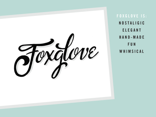
What led you down your current path?
After studying graphic design at university and six years’ working at some of Sydney’s top agencies, I escaped to Berlin to soak up some international inspiration. It was a fantastic city to be based in as the living expenses are a lot lower than Australia and there is lots going on there creatively. Not to mention being on the doorstep of Europe for travel fun times!
I went along to a two-day hand lettering workshop with Ken Barber from House Industries. From that moment I was completely hooked! It was the perfect mix of illustration and typography that really appealed to me. After the workshop, I began feverishly lettering a bunch of personal work. I had a side project called Deutsch Doodles where I illustrated funny German words and it lead to a commission where I illustrated Berlin Bingo, a hipster guide to Berlin.
Once I’d had my ‘Bowie years,’ I decided to move to lovely Melbourne at the end of 2012. I’d always wanted to live here and it really was the best decision as I’ve found there is a great supportive community of creative business owners here. I decided to focus on my lettering and move into Little Gold Studios and start Foxglove Lettering in March this year. It’s been a journey to really take a step back and hit a reset button before finding what I am really passionate about.
Since then it’s been gaining momentum. I had a little boost of inspiration in March, winning a scholarship to go to Clare Bowditch’s Big Hearted Business Conference. Clare saw my chalkboard in my video and asked me to be the first BHB Inspiration Bomb artist. It was that fantastic exposure and going to the conference that really solidified in my mind that I was on the right path to doing what I love and making a living.
Who do you admire in the industry?
There are some amazing letterers who inspire me greatly. They’ve managed to carve a niche career with this specialty skill. Jessica Hische, Erik Marinovich, Mary Kate McDevitt, Jon Contino and Dana Tanamachi. And locally Gemma O’Brien, Dave Foster and Luke Lucas are producing phenomenal work. My studio buddies at Little Gold inspire me everyday with their energy and passion for their creative businesses. It’s amazing to be around.
Do you think hand-lettering is having a resurgence? Why?
Definitely! I think there is a real yearning for hand-crafted things in this digital age. The nostalgia and ephemeral nature of chalk has its own appeal nowadays. My mentor is a former ‘Ticket Writer’. She made a career out of hand lettering signage for department stores in the 1950s and 1960’s. The sign writing courses have cut most of the hand painting part of the course - it’s all done on the computer. I want to learn this skill so that it can live on!
Can you talk about the difference between hand-lettering and other type-related terms?
By definition, lettering is drawing. Lettering is closer friends with illustration than typography. Let’s also just clear up that calligraphy is writing and typography is a predictable and repeatable system of letters - a typeface.
What has been your most favourite project in recent years?
Earlier this year I got to work with my great friend Irena Macri from Eat Drink Paleo who runs Australia’s most popular paleo recipe site. Irena commissioned me to art direct, letter and illustrate the book's cover, chapter introductions and feature pages. All images were chalked by hand and photographed alongside the ingredients and prepared dishes. The best part was getting to eat all of the healthy delicious food once it was photographed!

What does a typical day at work involve for you?
I ride my bike to my studio in Brunswick where I’ll make my Aeropress coffee. Just this short bike ride and sitting down at my desk is a trigger to switch into creative mode. I try to do most of my creative work first up when I have energy and do some business/admin stuff later in the day. My days could be quite varied, some days I could be out on an on-site chalk job, some days I could be lettering on paper or lettering on my chalkboard, or lettering with paint and a brush! It depends on the project. But as long as I have picked up a drawing instrument everyday, I have practiced my craft so I can get better and learn. There’s also emails and business stuff to stay on top of and posting behind the scenes pictures to Instagram and Facebook!
What future plans do you have for your lettering business?
I really want to keep honing my craft and practicing lettering in all forms. This will mean making time for personal work amongst client work. I feel some great momentum happening, and I’m super excited for more great opportunities for collaborating with interesting brands and Creative Directors on some super fun projects. I’m also learning the ways of combining creativity and business so that I can continue to make a living doing what I love.
I’m working on producing a small range of hand lettered greeting cards as a side-product with my soon to be letterpress printing skills. I eventually would like to run workshops to teach people the process of lettering. I’ve had a few enquiries already!
5 Questions in 5 minutes – Getting Personal:
Studio Sounds, what's playing?
We have rdio set up on a mini iPad in the studio so everyone can control the music from their computer so we always listening to our collection on random rotation. But in particular we’ve been loving the new Snakadaktal - Sleep in the Water. We also love 60’s girl band ditties!
What are you currently reading?
Manage Your Day-to-Day by 99U. It has some fantastic interviews with people like Seth Godin and Stephan Sagmeister on how they manage to do great creative work in these times of many distractions.
What are you looking forward to?
I am super excited to be doing a letterpress workshop with Amy from St Gertrude Design. Amy is going to teach a few designers how to use her 100 year-old press ‘Gordon’ (who moved in Little Gold Studios two months ago) so that eventually we can print our own designs. This is an inaugural workshop and will be open to other designers in the future.
I’m also looking forward to getting back to nature in late December down in Tasmania. We’ll be camping at Freycinet National Park with some hiking, relaxing, sampling the local wine and food, and also get over to the amazing Mona for some art inspiration.
Can you share your go to resource for inspiration?
I have some fantastic lettering books from Louise Fili - ‘Scripts’ and ‘Vintage Type and Graphics’ full of her personal collection of vintage lettering and my 1959 Photo Lettering Catalogue full of original hand-lettered typefaces that Don Draper would have used!
I love seeing behind the scenes work of other letterers and artists on Instagram. On the web, I follow Friends of Type and Type Everything blog amongst others. But there is lettering and type all around us everyday that I find really inspiring.
What is your local areas best kept secret?
It’s probably not so secret with the Brunswick hipsters, but when I found Dejour Jeans I was so excited! $50 jeans in lots of colours with free tailoring? Yes please! I must also mention Los Hermanos for great Mexican food and the cute little Save Yourself designer boutique in Sparta Place that sells my favourite Lime Crime lipsticks.
-----
After reading all of this type and lettering goodness I'm inspired to pull out the brush pens and chalk! If you would like to contact Carla please see all her details below.
Carla Hackett / Foxglove Lettering Website: carlahackett.com Email: carla@carlahackett.com Instagram: @carlahackett Twitter: @canarycarla Facebook: /carla.hackett.lettering
Andrea McArthur has a passion for all things visual. Type is her true love and goes weak at the knees over beautiful design. Andrea works as a freelance graphic designer in Brisbane by day and lectures in graphic design by night. You will find her sharing design related goodness via @andyjane_mc
Title page designer: Kristen Willis
Today we welcome multidiciplinary designer Kristen Willis to the blog, who designed the title page for the interview with film and television director Shirley Barrett in our new book Conversations with Creative Women: Volume Two.

What is your art/design/career background? My creative streak was developed and encouraged from a very early age by playing shop assistant (at 4 years old) in my Nonna's Singer sewing shop. I was constantly exposed to textiles and patterns which dictated creative projects such as drawing all over tables, designing and pattern-making fashion for my dollies and gluing my fingers together crafting paddle-pop structures for my Smurf figurines… The perfect playground for creativity, I was in heaven.
Through my adolescence, fine art became a prominent attribute as I regularly participated in Qld Regional Youth Exhibitions and Competitions. This active envolvement naturally lead to the pursuit of a Bachelor in Visual Arts, majoring with Honours in Printmaking and Drawing in 2006, and enrolment into Shillington College– School of Graphic Design in 2011.
Now as a creative freelancer, I continue to expand my interests by liaising with Graphic Design studios, Creative Contractors and sourcing my own little clientele for those special one-on-one projects.
What drew you to the work of your interviewee, film and television director Shirley Barrett? As an avid follower/junky towards various Australian produced television series, my creative mind exploded at the thought of representing the fantastic film production visionary, Shirley Barrett. What an unbelievable opportunity this is, to show tribute to such a successful industrious icon.
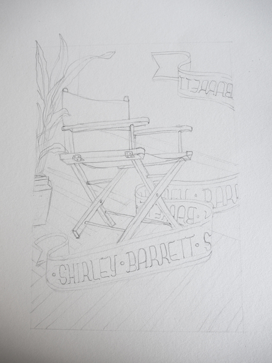
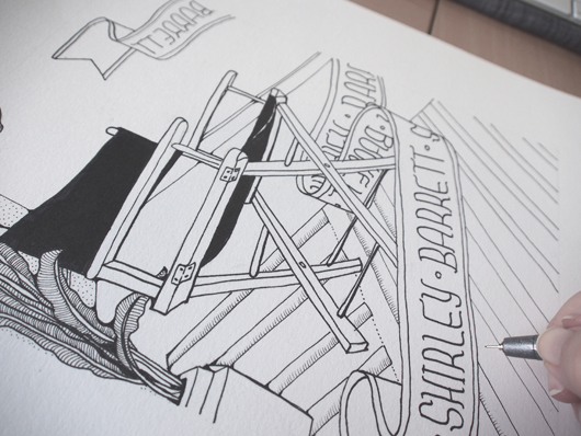
Tell us about the development of your title page design and how you arrived at your concept? With a little background research, black ink and piece of acid-free rag-paper, I decided to hand-draw a highly detailed illustration of a director's chair, prominently placed with in a warm, inviting, eclectic room. This is a celebratory piece, playing tribute to Barrett's creative endeavours and industry achievements.
What materials or computer programs did you use to create the title page, and how did you then prepare it to be submitted for the book? As a mixed-media artist, I literally utilise as many creative platforms as possible. I achieve this by wearing my Printmaker's hat and approach the piece in layers. The composition was initially sketched out in graphite, and then delicately inked in with a fine-tip black marker by hand. The second stage of the process is to scan and digitally colourise the illustration on-screen by using Adobe Photoshop CS6. For this piece I have used both flat colours and textures to create a further sense of depth. The overall outcome is a smooth, clean piece of modern design with a print-art 'touch'. With the click of a button, I was then able save the artwork in a suitable file-type ready for publication.
What other fun projects are you working on now? I have a few really interesting projects on the go right now; such as iPhone graphics for an upcoming zombie game (yes, zombies), illustrative panels for Queensland Museum, art direction and design for a children's storybook, and an ever-going expanding series of illustrative artworks called 'Animalia' which explores the quirky connections between animals and human personality-characteristics.

Title page designer: Louise Walker
Today we welcome Louise Walker to the blog. Louise designed the title page for the interview with designers Kat Macleod, Chloe Quigley and Simone Elder of Orotolan in our new book Conversations with Creative Women: Volume Two.
What is your art/design/career background? In 2011 I completed year 12 with a perfect score in Visual Communication Design and was chosen for the VCE Top Designs Awards. In 2012 I began studying Visual Communication Design at Monash University, a course that I am very passionate about.
Alongside university I work as the Graphic Designer for Salvatore Malatesta, the successful owner of many Melbourne cafes such as St Ali. In this job I have designed everything from café menus, to merchandising, vehicle ‘wrap’ designs, cycling gear, and been the Creative Director of the St Ali food stall(s) at Melbourne’s Big Day Out music festival 2013.
I have also been involved in design/art competitions, group exhibitions, and have had work featured in various publications. I was most recently selected for the Melbourne Threesome Typographic Exhibition (2013) where I worked along side Hofstede Design studio and a successful design graduate to produce a fantastic collaborative poster.
What drew you to the work of your interviewees, the ladies at Ortolan? Out of all the women interviewed in this volume, I felt the three women working at Ortolan design studio were one of the most relevant and relatable to me. I love their use of bold patterns and illustrative designs. Illustration is one of my favourite parts of being a designer, so I really admire Kat Macleod’s strong talent in that field. It’s such an inspiration to see how successful Kat, Chloe, and Simone have been in achieving some wonderful graphic designs.
Tell us about the development of your title page design and how you arrived at your concept. To begin my creative process I researched Ortolan’s website and familiarized myself with their particular design style. It was evident there was a strong collective input into their designs, as they clearly work well together as a team.
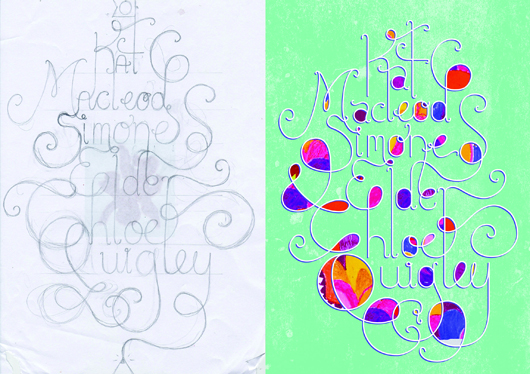
With these concepts in mind, I began sketching. I initially started working in the hand-sketched style that was used in many of Ortolan’s brandings, but I found my designs just didn’t suit the look I wanted to achieve. Leaving the ink and watercolours, I went back to basics using pencil and paper. I began sketching the three names in a design that joined each name together and weaved all the lines around each other. I wanted to emphasis the collaborative nature of Ortolan’s beautiful studio work.
My best sketch was then scanned and used as a guide for creating a digital version in Adobe Illustrator. From there, I went back and forth between Illustrator and Photoshop until I was happy with my final design.
What materials or computer programs did you use to create the title page, and how did you then prepare it to be submitted for the book? I usually begin a project manually with pen or pencil. So for the title page, I started by playing around with pencil and paper and, after a few roughs, came up with a more consolidated idea. Though still in it’s rough stages, I scanned in my sketch and brought it into a new file in Illustrator. I made it my bottom layer, and built up my layers on top. Using a drawing tablet is essential for this stage. I then use other programs like Photoshop to make further edits and play around with colour, scale, and texture. I decided to add some patterns from Ortolan’s work into my title page design, as to better illustrate their bright and friendly style. Then it was just a matter of sending it off, ready for print!
What other fun projects are your working on now? I am always working on something new and interesting, whether it’s designing tattoos for a university project, creating a logo for an upcoming event in Melbourne, or working on some business cards for a new client. I always enjoy what I do as no two jobs are the same!
Thanks Louise! There's less than a month until 'Conversations with Creative Women: Volume Two' is released, and I can't wait to see this page in print. Have you ordered your copy?.
Title page designer: Jessica Hyde
Jessica Hyde has designed the title page for the interview with book designer and illustrator Michelle Mackintosh in our new book Conversations with Creative Women: Volume Two. Today we chat to Jess about her background and future!

What is your art/design/career background? I originally studied Architecture and since graduating in 2007 I have been combining working in that field and exploring my real passion for illustration, paper and graphic design. All of that exploration is channeled into my own little creative studio TRUTH.BE.TOLD, which now includes freelance illustration, custom stationery design, as well as the TRUTH.BE.TOLD stationery and paper goods range.
What drew you to the work of your interviewee, book designer Michelle Mackintosh? I have always dreamed of one day being a book designer, so when I was doing a little research on the talented ladies being profiled in the book and saw that Michelle had my dream job I had to find out more. I also absolutely love her illustrative style. Tell us about the development of your title page design and how you arrived at your concept.
After doing some initial research to find out more about Michelle and her work, I was a little stumped about what direction to take – her work is quite varied and I didn’t want to try and replicate Michelle’s work but I wanted to try and instill a little of the whimsy I saw in her illustrations. I decided to draw inspiration from her choice of mediums and colour palettes in her illustrations and incorporate some of these into the title page design.
I went through many ideas before settling on the simple idea of an open book as a sort of canvas for ideas and allowing the watercolour and textured style be highlighted. After that all of the elements came together pretty quickly.

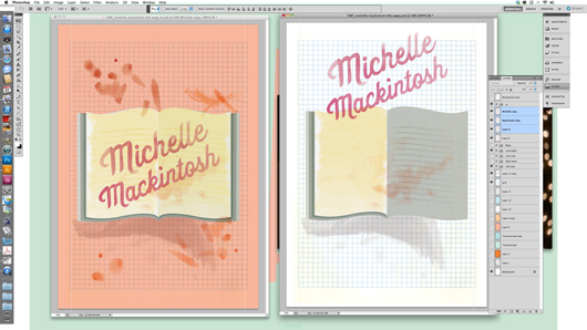
What materials or computer programs did you use to create the title page, and how did you then prepare it to be submitted for the book? I used a combination of hand and digital elements to create the title page. I hand painted a series of watercolour washes to create the book pages and accents, which I then layered and shaped in Photoshop. I also drew and painted the lettering by hand before adding it to the digital collage. Finally the grid and background colour was added in Photoshop.
What other fun projects are your working on now? At the moment I’m working on custom stationery for upcoming spring and summer weddings and events, as well as designing my own collection of event stationery, which I will hopefully finish off very soon! I’ve also been working on a whole bunch of new designs and experimenting with screen-printing for my TRUTH.BE.TOLD range.
Thanks Jess! See Jess this Sunday at the Greville St Market (perhaps pop over after our event on Sunday morning!).
And you can pre-order your copy of 'Conversations with Creative Women: Volume Two' featuring Jess' title page design now at our online shop.