Fluoro-pop: The art of Rowena Martinich
You’ve probably walked past one and the sight has demanded a second glance. Rowena Martinich describes her art works as “fluoro-pop abstract expressionism.” Visually, they are vibrant, striking and bright and are a welcome sight in the tedium of a grey Melbourne Winter.
Rowena is an artist whose use of colour in the transient, everyday space has become a signature. Her work is often displayed in the spaces of the everyday to challenge the notion that ‘art’ can only exist within the conventional gallery space.
The everyday settings of Rowena’s works add to their immersive nature, capturing all of your attention.
Martinich calls herself ‘an abstract expressionist with a difference.’ While her work is sometimes displayed in an art gallery she is more likely to transform through her use of colour an unconventional display space such as a retail store front.
Rowena says the idea of displaying artwork strictly within the gallery system is very limiting both for the audience and the artist. Instead, she is inspired by architecture and interiors, which strongly influence her artwork and how it can fit into that scenario.
“I feel that art should be accessible and enriching, so making it public is the first step. I also love the idea of transforming people’s experience of a space simply by adding expressive layers of colour,” she says.
Rowena believes that everyday spaces are often not given a second glance until an ‘intervention’ of some kind, viewing her artwork as an “activator of urban space, particularly transient spaces, often passed through without a moment of thought.”
“Through my work one can experience the everyday, but differently. What may ordinarily be an empty interval – a non-experience in passing from one place to another – can be altered by the experience of walking through or past one of my works,” says Rowena.
There is something very free, fluid and natural about Rowena’s work. It captures a boundless creative energy. The artist processes a myriad of thoughts during the creative process. "When I am deeply focused on a work, I am in my own world of problem solving, specifically balancing the painting, its layers and colour compositions.”
Rowena works with acrylic on canvas, colour-fast acrylic for exterior public works and acrylic on vinyl adhered onto glass for window installations.
“Most of my painting is done with large brushes these days, however I have been known to use mops and brooms to create extra large brush strokes on public works, as well as chemical sprayers for a splattery effect.
“I build up layers of colours, starting with large areas of block colour then gradually add layers of dripping colour. With each layer I need to be sure that the one below is dry enough that the colours will not mix. I also ensure the paint retains the perfect consistency so it doesn’t run too quickly, or isn't too thick that it won’t run at all. I also try and take regular breaks in the fresh air!” she says.
Rowena has bold hopes and dreams for the future and these inspire her to create. Key among these include painting a trackside marquee for the Melbourne Racing Carnival and a fashion collaboration comprising beachwear and surfboards.
Most of all however, the acknowledgement of her work is her greatest inspiration. Rowena says she loves how art allows her to interact with the public, especially when working onsite on murals. “Even without a shared language, I have found that art can enable exchange and break down any cross-cultural barriers.”
-------
Liz is a communications professional and freelance writer from Melbourne. Inspired by the city’s artistic endeavours she likes taking photographs, exploring the design world and has developed a great interest in all things art. Passionate about documenting and sharing the unique projects, people and possibilities in the creative community, Liz is excited by what lies ahead. Liz’s own blog will be launched soon…In the meantime, she’s happy being a twit.
Bricks and Mortar: Bequeath & Bestow
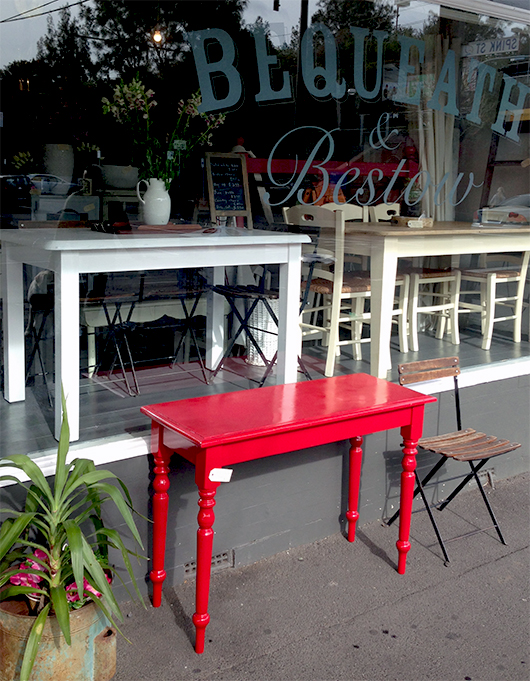
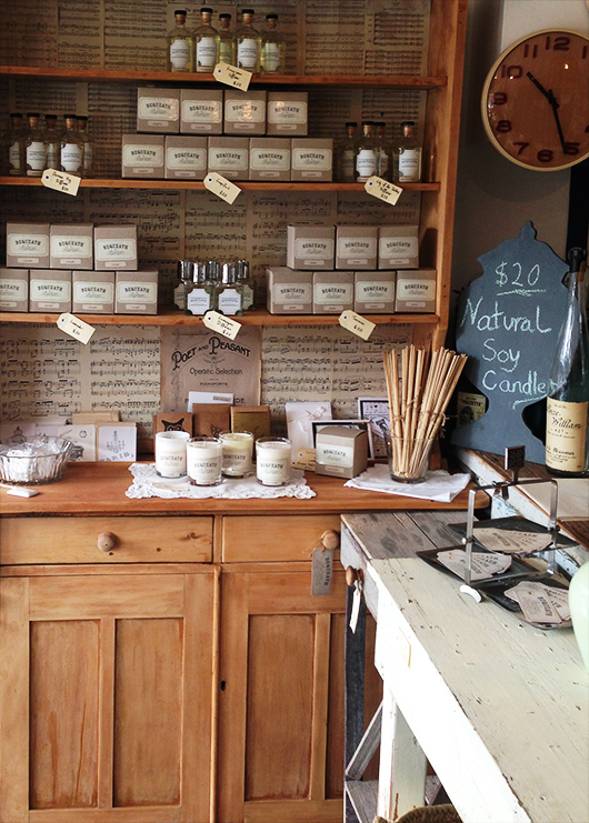
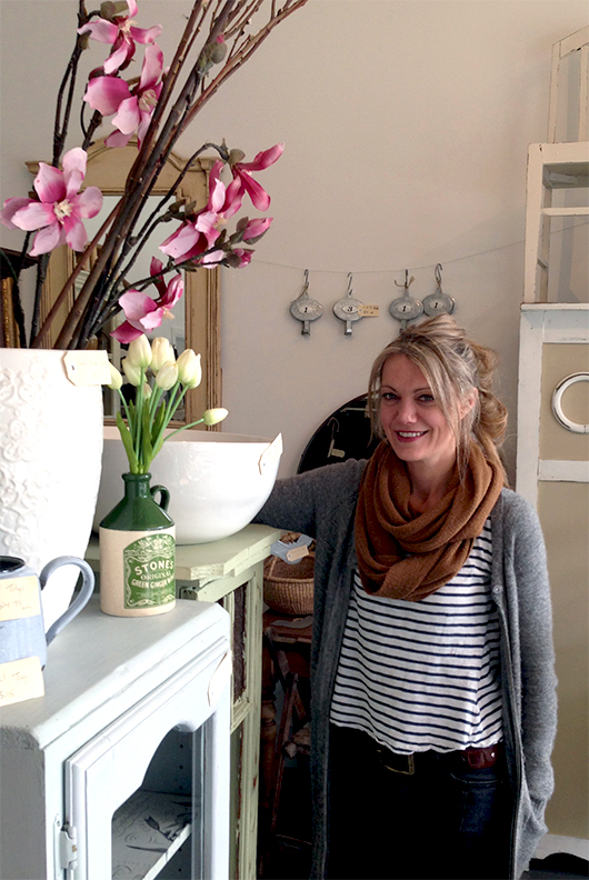
By Catherine Harvey Bequeath & Bestow is a vintage furniture and homewares boutique owned by Chella Monaghan. Chella not only owns this store, she also manages it full time - sourcing all the unique items and restoring all of the pieces of furniture herself. What this creates is an eclectic mix of 'one-offs' that would easily satisfy a range of tastes.
Although the store is relatively new (having opened in July 2012), and also relatively small, within it contains some of the most lovely and affordable pieces of furniture that I have seen.
Chella's has added her own personal touch to the many items and in this way it is definitely an easy store to come back to again and again. Fortunately, since the stock changes quite quickly, you can return and enjoy a unique experience each time you walk in - what you saw in the store last week has probably sold, but it has also been replaced with another equally amazing item.
In addition to keeping up with the demands of a retail space, Chella devotes a lot of her time to ensuring that Bequeath and Bestow's Facebook page stays current and provides an accessible way for customers to find out what is in store now or what may be coming into the shop in the future, along with the prices. The Facebook page describes the store perfectly. "We have an eclectic mix, so whether you are after the French provincial look, a bit of rustic, a little taste of industrial, something up cycled and reinvented for a new life or maybe just the quirky, please drop by."
Chella has embraced the shop's location on Brighton's Martin Street and has even joined the Traders Association to promote and help attract more people to the area. The street itself, I must admit, does seem to lack it's own identity and sense of community. But although Martin Street may not currently be a destination in itself, Bequeath & Bestow certainly is.
144 Martin Street, Brighton, Victoria 3186 Phone: (03) 9596 7591 Wednesday - Friday: 10am – 5pm Saturday: 10am – 4pm Sunday: 10am – 2pm
Catherine Harvey lives and breathes design. Working at one of Melbourne’s top studio’s, she is rarely ever away from her computer. She loves to keep up to date with the design industry in a global and local context and follows too many blogs to count! You can follow her findings here.
New eBook: Graphic Design Speak - General advice, technical tips and jargon defined for non-graphic designers
by Tess McCabe It's finally done. If you follow me (Tess McCabe / @tessmccabe) on Instagram you might have seen glimpses of a project I've been working on lately. I'm really thrilled to finally reveal it here: my new eBook Graphic Design Speak.
Graphic Design Speak is about giving non-graphic-designers a working knowledge of the words and concepts graphic designers commonly use, without explaining the history of graphic design or going overboard with the technical talk.
As a graphic designer, this information is well known to me - but I recognise it's extremely important and useful for non-graphic-designers (meaning makers, interior designers, publicists, writers, musicians, bloggers, performers... anyone in a creative role themselves or who works with a graphic designer) to know as well.
The 27-page eBook explains:
- Basic colour terms like Pantone, CMYK, RGB and what they mean
- Common file types and where you use them (a.k.a. Why can't my printer just get my logo from my website and put it on my business card?)
- How to distinguish a high-resolution image from a low-resolution one (a.k.a. A journalist has asked for a high-resolution image for a story about me, but how do I know which one of these image files to send?!)
- The standard paper and envelope sizes
- Facts about fonts
- And over 85 common words and phrases us graphic designers throw around willy nilly.
Those multiple back-and-forth emails with your techy-nerd friend or frantic late-night forum-reading can be avoided with this helpful little handbook! And you will feel empowered with knowledge and enjoy a better working relationship with graphic design professionals as a result.
The book is available to download for the extremely reasonable cost of $11.00 only at our online shop. AND Included is a low-ink-use black and white version for printing at home, if you prefer the paper kind of reference tool.
I hope you find it useful!
Organise Me: 7 Tips for Keeping Your Creativity Flowing Through Winter
 Winter is creeping into its third month, and for many of us, the Winter blues are starting to take their toll. Whilst I’m beginning to embrace Winter, the long cloudy days seem to drain my creativity. So I am determined to overcome this with a little bit of organising.
Here are my top tips for keeping the creativity flowing:
- Schedule Down Time - Get out that calendar and mark out blocks of time where you will stop working on current projects and do something different that’s fun for you. You could try a self-directed project or even give yourself permission to see that movie you really want to see in the middle of a 'work day'.
- Rug Up and Get Outside - This is important for everyone, but especially for those who work from home. Get out your coat, warm boots, grab a scarf and some gloves and go for a walk. It doesn’t matter if it’s around the block or to a cafe. The fresh air will clear your head and give you time to brainstorm.
- Take Time Out to Read a Book in a Coffee Shop - The book could be fiction or something related to your field. I find that it’s hard to justify reading when you’re surrounded by work, so leave the space, warm up with a hot drink and escape into that book that you’ve not had time to read.
- Visit a Gallery - Pick an exhibition that isn’t about your line of work and allow yourself to be inspired by how other creatives work. It may bring you some perspective on your own work, or it might just be a fun day out.
- Dance It Out - The blues come easily this time of year, so when you get the chance (maybe at home) - crank up your favourite songs and dance like no one’s watching.
- Try a New Craft - Winter is a great time to learn something new that keeps your chilly hands busy. It could be crochet, knitting or even drawing. Just something that’s been on your to-try list. You don’t have to be amazing at it for it to be fun.
- Catch up with Friends - Winter is for hibernating, but it can be great to make a point to catch up with friends that you don’t see too often. Go out for dinner or invite them over for a night of laughter and catching up on the couch. If you’re feeling really adventurous you could all organise a fun weekend away.
I hope these will help keep the winter blues at bay and keep the creativity flowing. Thankfully Spring is not too far off now and the warmer weather will (hopefully) return soon!
Dannielle is a blogger, serial organiser and passionate traveller. She has a secret love of 90s teen movies and can often be found on Twitter. In 2013, Dannielle packed up her life in Melbourne into one suitcase and moved to Canada to make her crazy dream of a more adventurous life happen. But she quickly found the inspiration she was searching for was in Melbourne and has returned home. She’s recently started a new project on creating a happy (organised) home which you can see here.
Book Review: The Creative Seed - How To Enrich Your Life Through Creativity by Lilian Wissink
by Janine Fitzpatrick
 Creativity is something many of us strive to incorporate in our lives. For some it is a burning passion, for others it's a secret held close to the hearts, while in some cases it's just a niggling feeling that there is "something more" we would like to be doing in life.
In The Creative Seed - How To enrich Your Life Through Creativity Lilian Wissink, a Counselling Psychologist, gives us a template for how to introduce more creativity into our world.
The first half of the book is devoted to helping unearth which sphere of creativity is best for the individual reader. In activities ranging from exploring childhood memories, creating timelines of significant creative moments in our life to working out what we value most, Wissink helps to trigger a sense of which area of creativity speaks most loudly to us. Along the way she debunks a number of creative myths such as; you have to be born creative, it's a secondary pursuit after the bills are paid, you've got to mad to be creative, it's a mysterious journey available only to select few and you've got to start your creative life early. Wissink crosses off each myth with a well-thought response which gives hope to all those who have put their creative selves on the back-burner.
In Part Two of The Creative Seed Wissink draws on her psychology background to give clear strategies for engaging in the ups and downs of a creative life. Dealing with the negativity of friends and family, combating our own inner critic, overcoming procrastination and dealing with stress Wissink has a plan for all of the key issues faced when attempting to introduce more creativity into an already overloaded life.
The Creative Seed reminded me of the importance of finding space to be more creative. It also broke down the creative process itself and the obstacles which stand in the way of achieving a creative life. It inspired a sense that it is possible to find the "something more" and unearth the creative passion no matter what your age or experience.
Janine Fitzpatrick blogs at Shambolic Living where readers get to feel far happier about their lives when they experience the chaos of hers. She is coming to terms with being the mother of two teenagers, has given up on the dream of a tidy house and still plans to write a book one day.
5 tips for landing your dream creative job
 This Saturday CWC is heading to Sydney for our next event and the ladies at Shillington College have generously donated their space to us for the talk.
It's also getting to the time of year when students begin preparing their portfolios and job applications for work after their courses end. As someone who has been there I can attest to the fact that it is a daunting prospect, and any advice in that area is always appreciated!
So I asked Thea Powell and Tanya Ruxton at Shillington what they suggest students (and indeed anyone looking for a new position or career change) do to increase their chances of landing that dream role. "Getting that dream job can be hard." says Thea, "and to be honest, there's not one single thing that alone will ensure you get that job you've always wanted. But we do have a few tips for design graduates that'll help get a foot in the door."
Here's what Thea and Tanya recommend:
1. Read the job description. Carefully. Don't presume you know what your potential employer wants. What they really want to see is that you can follow direction. What file type are they after? How many samples of your work do they want to see? They might specify you put "Happy Green Tree-Frog" as the email subject. Who knows. Check and double check what's required.
2. Personalise your application. Your grandma might have told you a fair few times how important it is to make a good first impression. And your grandma would be right. Your application is the first thing an employer sees, and it should make an impact. Don't hold back - remember, studios want to see your personality.
3. Sweat the small stuff. A spelling or grammar error can make or break an application. Sure, you're not being hired to be a copywriter. But you are being hired as a designer who has excellent attention to detail.
4. Know your portfolio inside out. You've won that prized first interview. Congratulations! Now to talk through your portfolio. Employers love seeing what you can do, but what they really want to hear is your reasoning behind each project. If it would make you feel more prepared, write down key points about each piece, and read over them the night before your interview.
5. Be passionate. Show them who you are. Let's face it - you'll spend a lot of time with your co-workers. They'll be looking for someone who will work well in their studio. Be friendly, be passionate - and at the risk of sounding like Oprah, be you.
Tanya adds, "Overall, the most important thing is to never, ever give up. If you really want to work with a certain studio, keep trying. Determination pays off."
Great advice, thanks ladies!
If you'd like to chat to Tanya and Thea a bit more about folio preparation, they will be at our talk on Saturday. Or you can find out more about Shillington at their website.
Women from History: May Morris
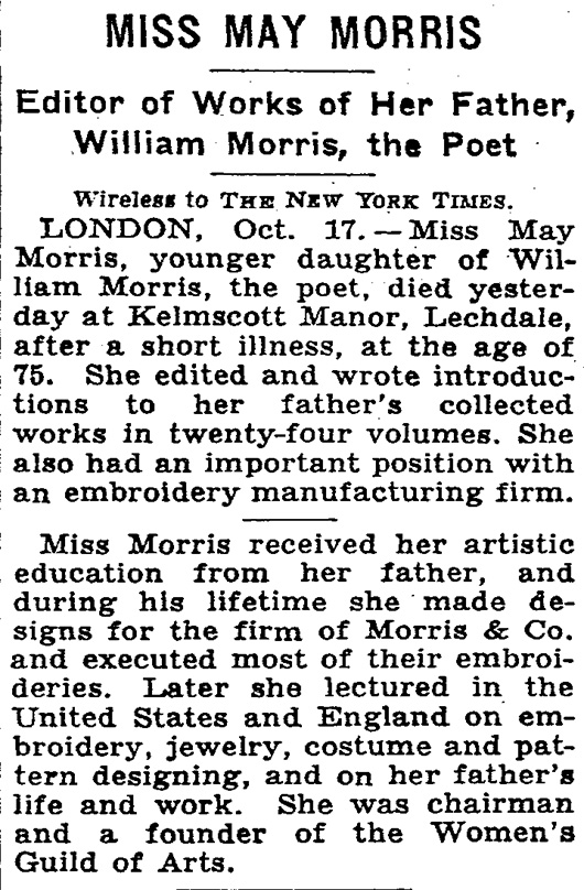
By Julia Ritson May Morris was an embroiderer, jeweller and editor who lived her life overshadowed by her famous father - the arts and craft doyen William Morris.
The Morris family were craft makers who extolled the virtues of a pre-mechanised world. They were living in a world where the word Master had come to mean Master of others, rather than Master of a craft. They preferred the mastery of craft concept.
The Arts and Crafts movement they were part of looked back to the medieval world with a focus on textiles, wood, metal work, and interior design. Plus a little medieval poetry thrown in.
The family business sold medievally themed items to the emerging English middles classes in the late 19th century.
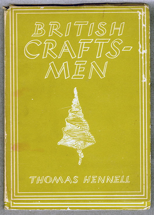
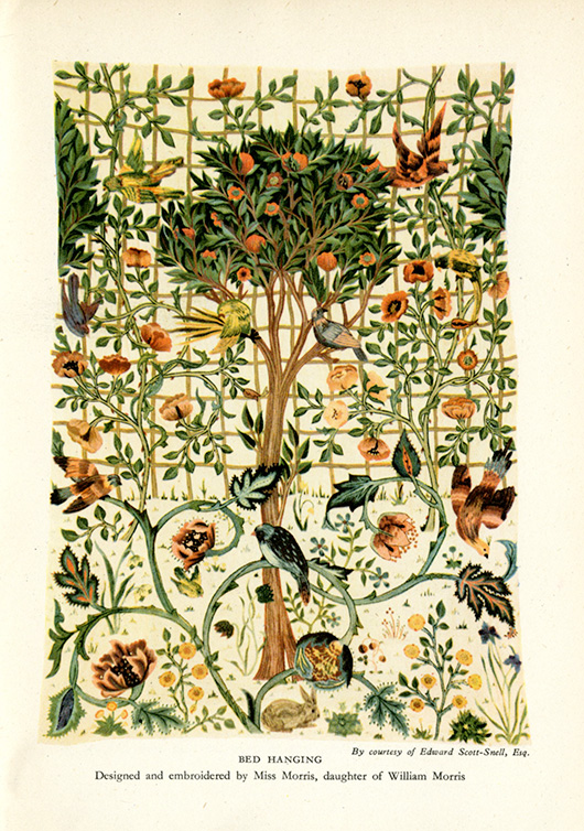
I first came across the work of May Morris in this British Craftsmen book written in the 1940s.
May Morris' work was featured.
The William Morris company resurrected the concept of free-form embroidery. The idea of "Art needlework" highlighted freehand stitching and shading in silk threads to achieve a more expressive result, rather than the formulaic templates of the typical embroidery of the mid-19th century.
May Morris trained at the South Kensington School of Design and at the age of 23 took over the management of the embroidery section of Morris & Co from her father. A very capable young lady.
May Morris went on to write a wonderful book called "Decorative Needlework."
"Chain-stitch has been so called because it imitates, more or less, the links of a simple chain. It is the foremost and most familiar of all similar stitches. It has a very definite character of its own, and though apt to become a little monotonous, is from its laborious and enduring- nature well suited to work that may be subjected to much wear and tear. In the accompanying diagram it will be seen that each little loop grows out of the last; the needle follows the exact direction in which the line of stitches is to lie."
May's insights on colour are worth sharing.
"Of blue choose those shades that have the pure, slightly grey, tone of indigo dye (varying somewhat, of course, on different materials). The quality of this colour is singularly beautiful, and not easy to describe except by negatives : it is neither slatey, nor too hot, nor too cold, nor does it lean to that unutterably coarse green-blue, libellously called ' peacock ' blue ; it has different tones - brilliant sometimes, and sometimes quiet - reminding one now of the grey-blue of a distant landscape, and now of the intense blue of a midday summer sky - if anything can resemble that.
Of reds, we have first a pure central red, between crimson and scarlet (for in the pure colour neither blue nor yellow should predominate), but this is a difficult shade to use; by far the most useful are those 'impure' shades which are modified by yellow, as, for instance, flesh-pink, salmon, orange, and scarlet; or by blue, as rose-pink, blood-red, and deep purple-red. The more delicate of such shades can be freely used where a central red, overpowering in its intensity, cannot. A warning, however, against abuse of warm orange and scarlet, which colours are the more valuable the more sparingly employed, and as dainty little spots of colour treasures indeed.
The most valuable colour next to blue is green, or, rather, equally valuable in its different way, being to some people more restful to the eye and brain.
Here, again, we see the force of the positive and relative value of colours : a cold, strong green, not in itself very pleasing, placed against a clear brilliant yellow, gathers depth and force which it would otherwise lack ; a blue-green may strike the right note in a certain place, but if its use be exaggerated may blemish all. Now, there are certain greens which are brilliant and rich, and, when employed broken with other colours, produce a fine effect; but when a green is to be largely used, it should be chosen of a greyer, soberer shade, such as the eye rests on without fatigue. Avoid like poison the yellowish-brown green of a sickly hue that professes to be ' artistic,' and looks like nothing but corruption, and avoid also a hard metallic green, which, after all, would not easily seduce a novice, as it is very obtrusive in its unloveliness.
Certain definite sets of green will be necessary ; full, pure yellow-green, greyish-green, and blue-green, two or three shades of each. The brilliant pure green that we admire in a single spring leaf is impossible to use in large masses, nor does Nature, whose all-pervading colour is green, give us these acute notes in unbroken mass. You have only to look at the effect of light and shade in a tree in full spring foliage, with the browns and greys of its twigs, to realise this fact: the great masses of green meadow-land, besides showing a variety of colour that may be overlooked in a careless glance, have a tenderness of tone that is quite beyond and above any possible imitation in art.
For a central yellow choose a clear, full colour that is neither sickly and greenish, nor inclined to red and hot in tone. Of impure yellows, pale orange and a warm pinkish shade that inclines to copper are useful, besides the buff and brownish shades that will sometimes be wanted for special purposes. These, I think, include all the yellow shades that you need trouble about. A certain experience is wanted for the successful use of yellow, so that those who take a special delight in the intrinsic beauty of this fine colour will do well to avoid too enthusiastic an introduction of it into their work.
Purple again is one of the 'difficult' colours with which we must, as it were, hit upon the exactly right tones to use. There are two valuable purples - a rather full red-purple, tending to russet, and a dusky grey-purple, which is, if the right tone is obtained, a very beautiful, and, if I may say so, poetic colour."
A poetic lady.
Julia Ritson is a Melbourne artist. Her paintings investigate colour, abstraction and a long-standing fascination with the grid. Julia has enriched and extended her studio practice with a series of limited edition art scarves. She also produces an online journal.


